ASK ANTHONY: LET THERE BE LIGHT! REFITTING YOUR HOME’S INCANDESCENT LIGHTING TO LED
To see the original blog post on debradobbs.com, click here
Swapping out your incandescent lightbulbs for LEDs has several benefits. These include saving money on your electric bill, superior light quality, less impact on the environment and replacing bulbs once every decade or two instead of every few months.
But shopping for LEDs can be a dizzying experience. Aside from the bevy of bulb shapes to choose from, there are terms such as lumens and Kelvin. On top of that, there’s a seemingly endless array of light types and colors, such as daylight, warm white… it all can be overwhelming. Chicago Interior Designer Anthony Michaeltalks about LED lighting, and why he insists on it for his client projects, especially now that LED lights are dimmable!
If you’re thinking of making the switch, here are Anthony’s suggestions of what you should know about LEDs and selecting the best replacements.
How LED Bulbs Differ From Incandescent Bulbs
Light output versus heat waste. “LED” stands for “light-emitting diode.” While we won’t get into the nitty-gritty about how they work, LEDs are vastly different from incandescent bulbs in terms of the light output compared with the heat produced. The U.S. Environmental Protection Agency , says that LED technology converts 95 percent of the energy to light and only 5 percent is wasted as heat.
Incandescents are pretty much the opposite. They convert only 10 percent of the energy into light, while 90 percent is wasted as heat. Heat produced by LED lights is absorbed into an integral “heat sink,” which prevents the bulb from overheating. Incandescents just throw all that excess heat directly into the room, which can place added stress on air conditioning systems during the summer.
Flexibility in light direction. Light produced by an LED is directional or focused, whereas incandescent bulbs throw light in all directions. Directional light makes the LED more efficient because the light can be focused for specific applications. LED light strips are a commonly used type.
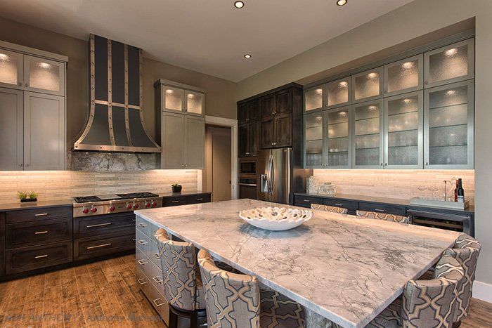
Anthony says that one of the big reasons that he uses LED now is because “LED lighting has been color corrected in recent years, and I can recess them without producing a visible light source.” He continues “In the past, LED produced dots of light on a strip.” You’ve likely heard or noticed that the old status quo incandescent lightbulb casts a yellowish light. This incandescent yellow glow is also referred to as “warm white” or “soft white.” While it’s what most of us grew up with, when compared to cooler light colors, incandescent light can appear dingy. “What might be surprising is that cooler tones of light are actually more natural, as daylight is cool and bright,” says Anthony.
But to understand light color, you need to first understand a couple of terms. The Correlated Color Temperature, or CCT, is the color of light emitted by a bulb in terms of a “light appearance number” that correlates to a Kelvin (K) temperature scale. As you can see on the image, the lower the Kelvin number, the yellower the light; the higher the number, the bluer the light.
Standard incandescents are around 2,700K, while 4,100K is a crisp, whiter light, and 5,000K represents daylight. Unlike incandescents, LEDs are available in a number of Kelvin options to fit a variety of homeowners’ lighting needs. Bulb manufacturers must provide this number on the lighting facts label on the packaging.
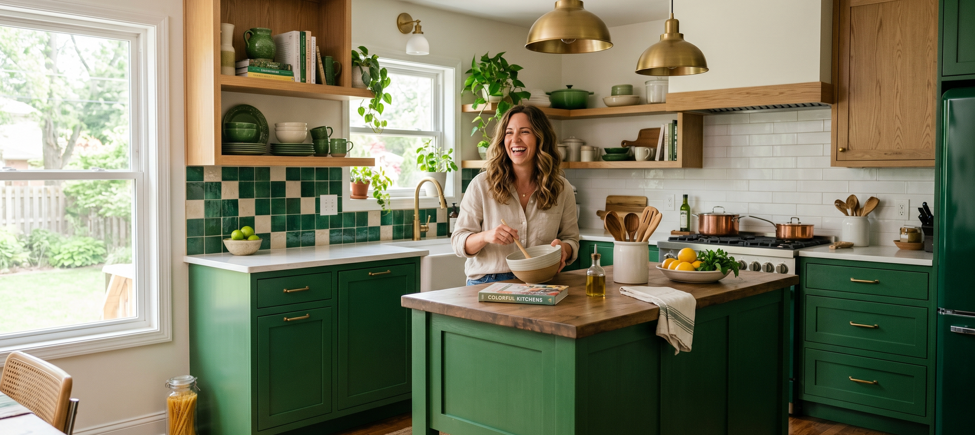
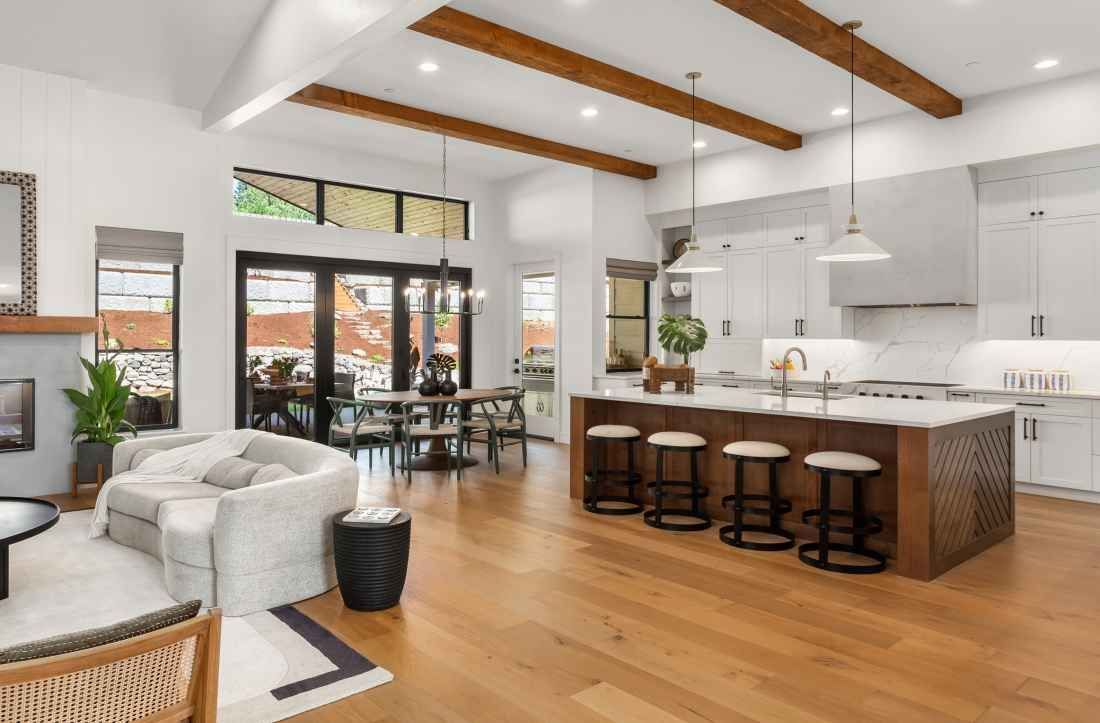
Lighting Kitchen Cabinet Interiors
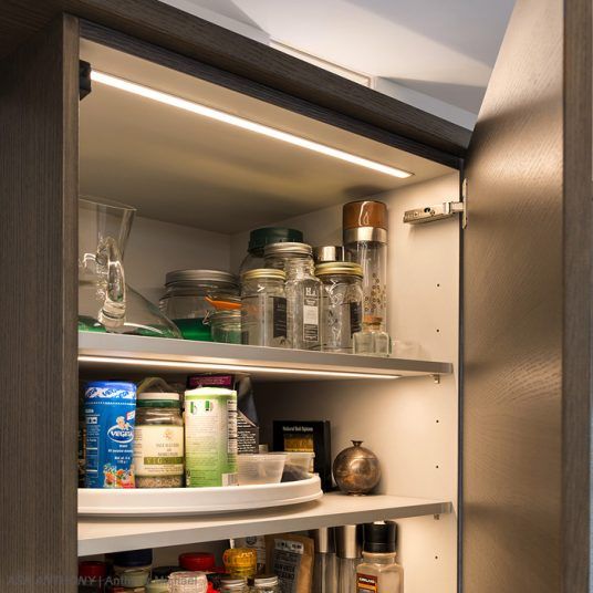
One of the first things many people do when they head into the kitchen is turn on the lights and go to the fridge, which already has a light. When you open your cabinets, wouldn’t it also be nice to have light in there, too?
The best lighting solution for cabinet interiors is to install Light Channel Millworkon the underside of each shelf, a couple of inches from the front of the cabinets. This accurately lights items in each cabinet while avoiding any shadow in the front. The great thing about Light Channel Millwork is that it’s available in a wide variety of lengths made to order, ranging from 2 to 96 inches, and it’s easy for electricians to install.
Understanding Brightness
When picking out lighting, don’t just think of wattage, because that’s only how much energy is being used by the bulb or light source. Rather, think more about the actual amount of light that is being produced, measured in lumens (the amount of light produced by a light source) and footcandles. The amount of footcandles needed on countertops depends on the age of the occupants. As we age, the lenses of our eyes begin to yellow and become much denser, which affects how much light we see. 50 footcandles is standard, but people over 50 years old may need 100 footcandles or more.
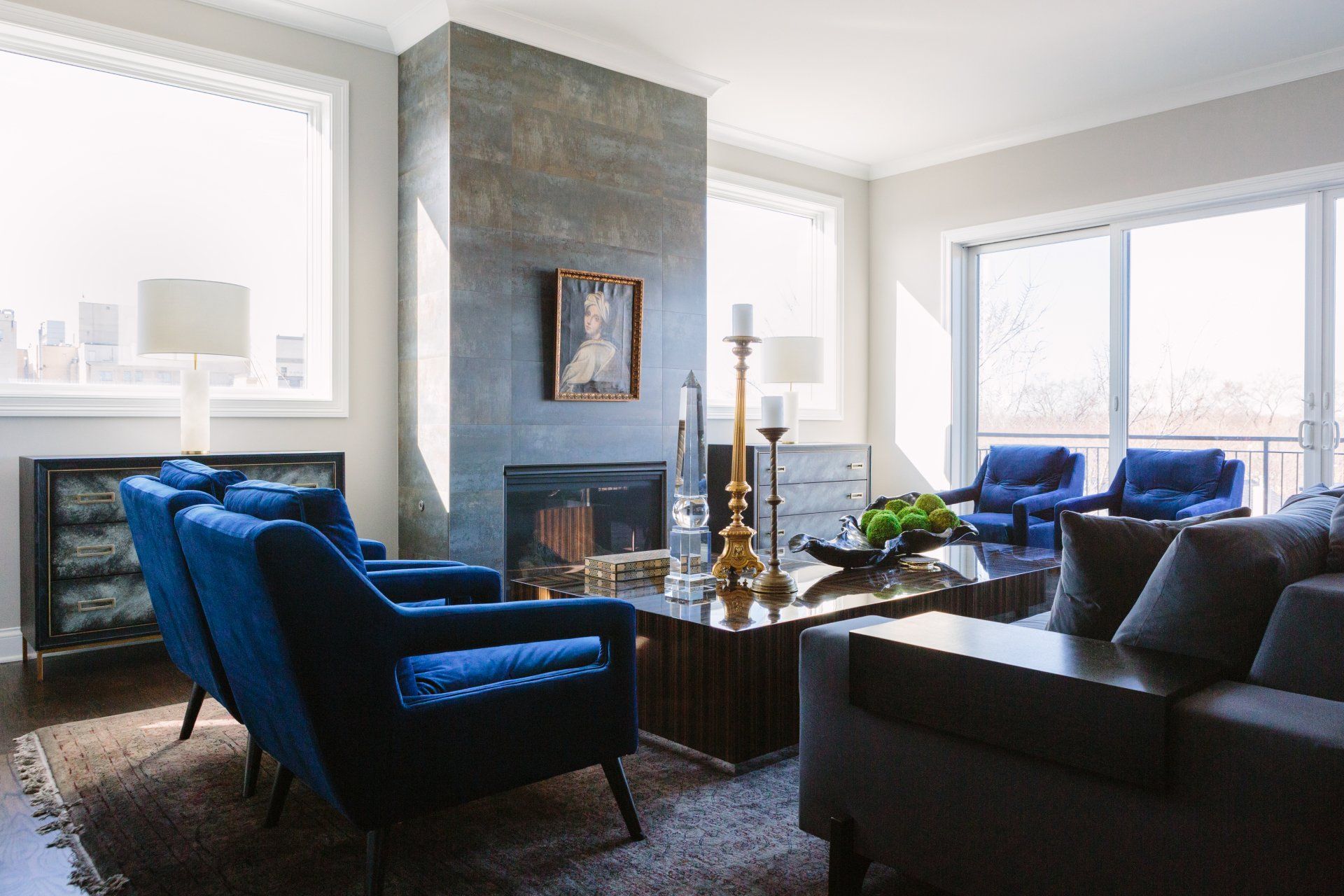
Art Lighting
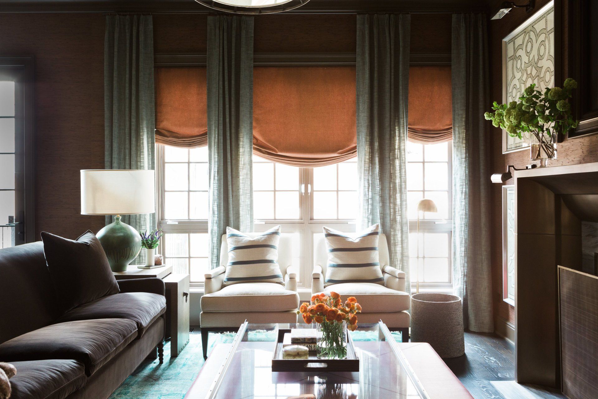
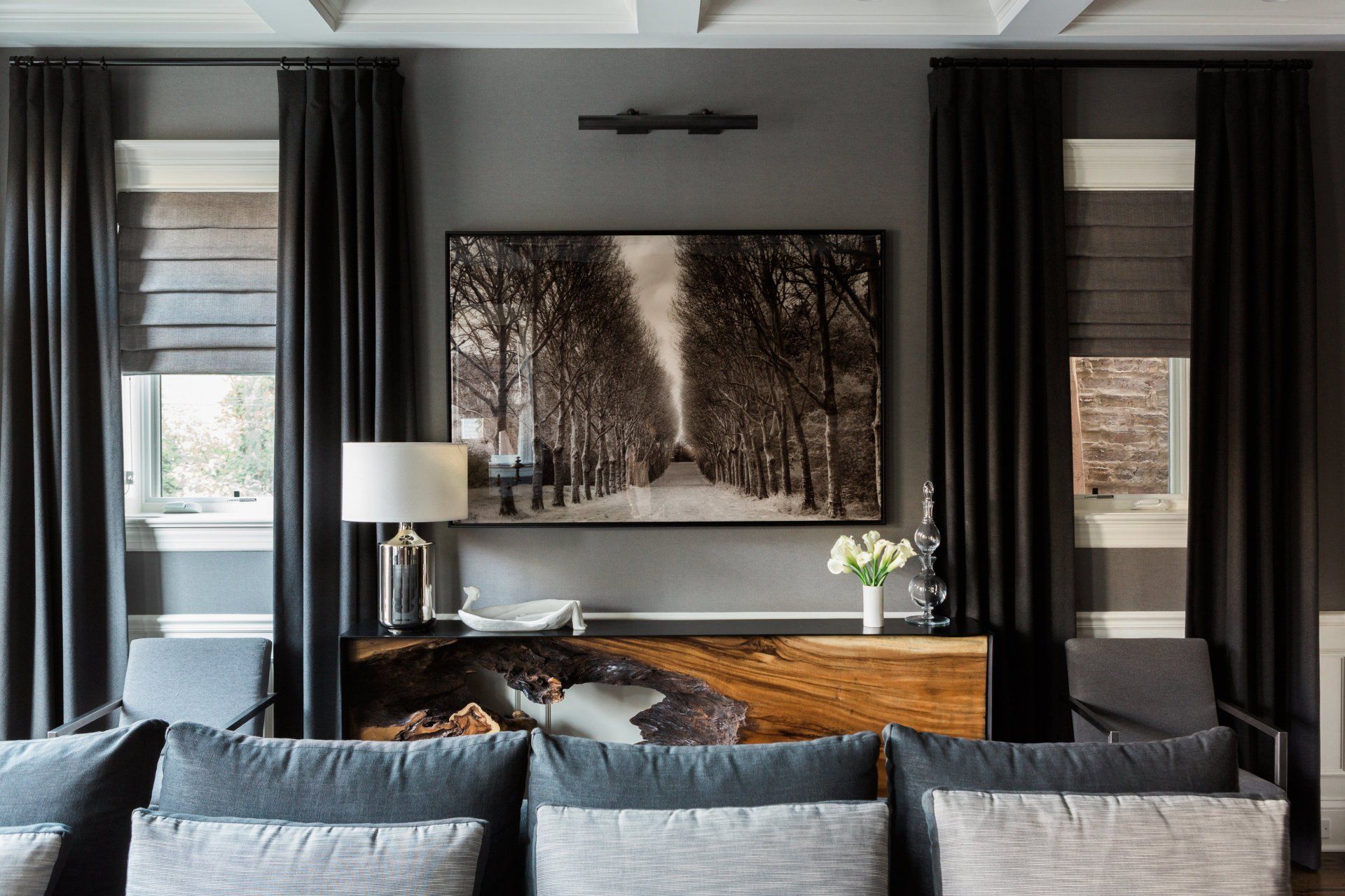
“We specially comission pieces of art for many of our projects” says Anthony Michael. If you have artwork on your walls, there are a variety of ways to light it well. Accent heads mounted to the ceiling, or on monorail/track should be positioned so that the light shines at a 30-degree angle onto the artwork. You can also install plug-in LED picture lights with 90+ CRI for an easy retrofit solution.
Recessed Lighting
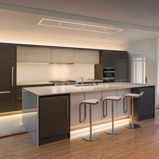
Recessed lighting can help fill in the gaps for general lighting. When choosing recessed lights, take the beam spread and measurements of the space into account. If you have an eight foot ceiling and an island that is four feet wide, you will need a beam spread to match. To avoid reflected glare on shiny countertops, it’s best to avoid direct downlights; cross-illumination can help in this case.
If you have existing cans, LED retrofit trim kits and/or retrofit LEDs bulbs are a great option; they come in a wide variety and are easy to install. Be sure to select an LED bulb that will fit the recessed can; Soraa MR16 LEDs deliver the best CRI and beam spread, run cool and use 1/5 the wattage of halogen bulbs (7-10 watts vs 50 watts). Green Creative and TCP are also great brands for energy-efficient LED light bulbs.
While they may seem more expensive at initial purchase, they outlast incandescent lamps by 15 times (i.e. 30,000 hours compared to 2,000 hours).
“People tend to underestimate the effect that lighting plays in the overall design of a room, the right lighting makes all of the difference, and is not only flattering to the appearance of your home, but also to you!” says Anthony.
Frequently Asked Questions
How can I improve kitchen cabinet lighting?
Install Light Channel Millwork under shelves for even, shadow-free illumination.
How much light do I need for countertops?
Aim for 50 footcandles, but people over 50 may need 100+ for better visibility.
How can I upgrade recessed lighting to LED?
Use LED retrofit trim kits or bulbs in existing cans. Look for brands like Soraa for high CRI and low energy use.
Live Brilliantly
Stay Positive
Be Happy,
Anthony Michael
Originally posted on Debra Dobbs