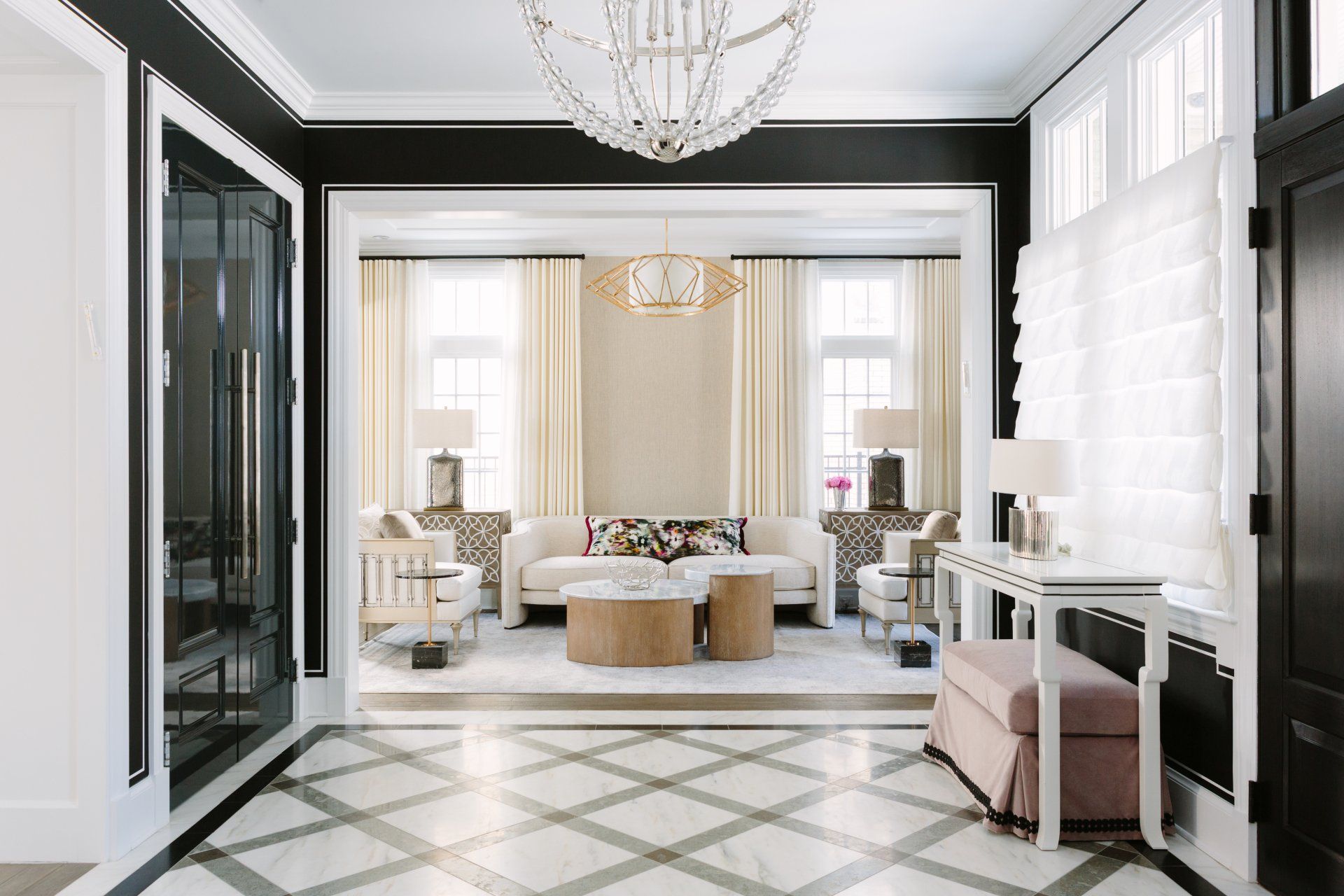
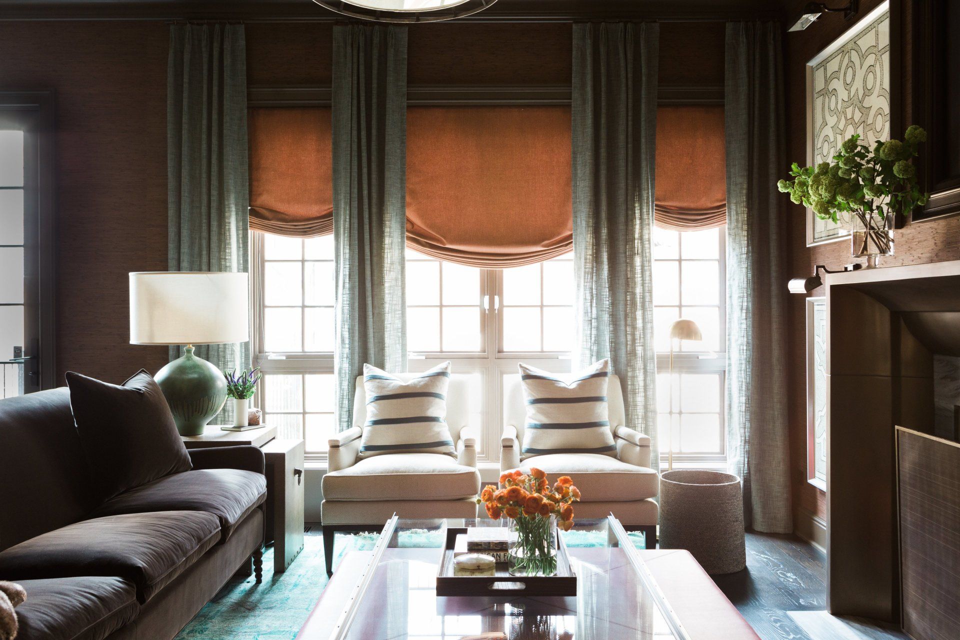
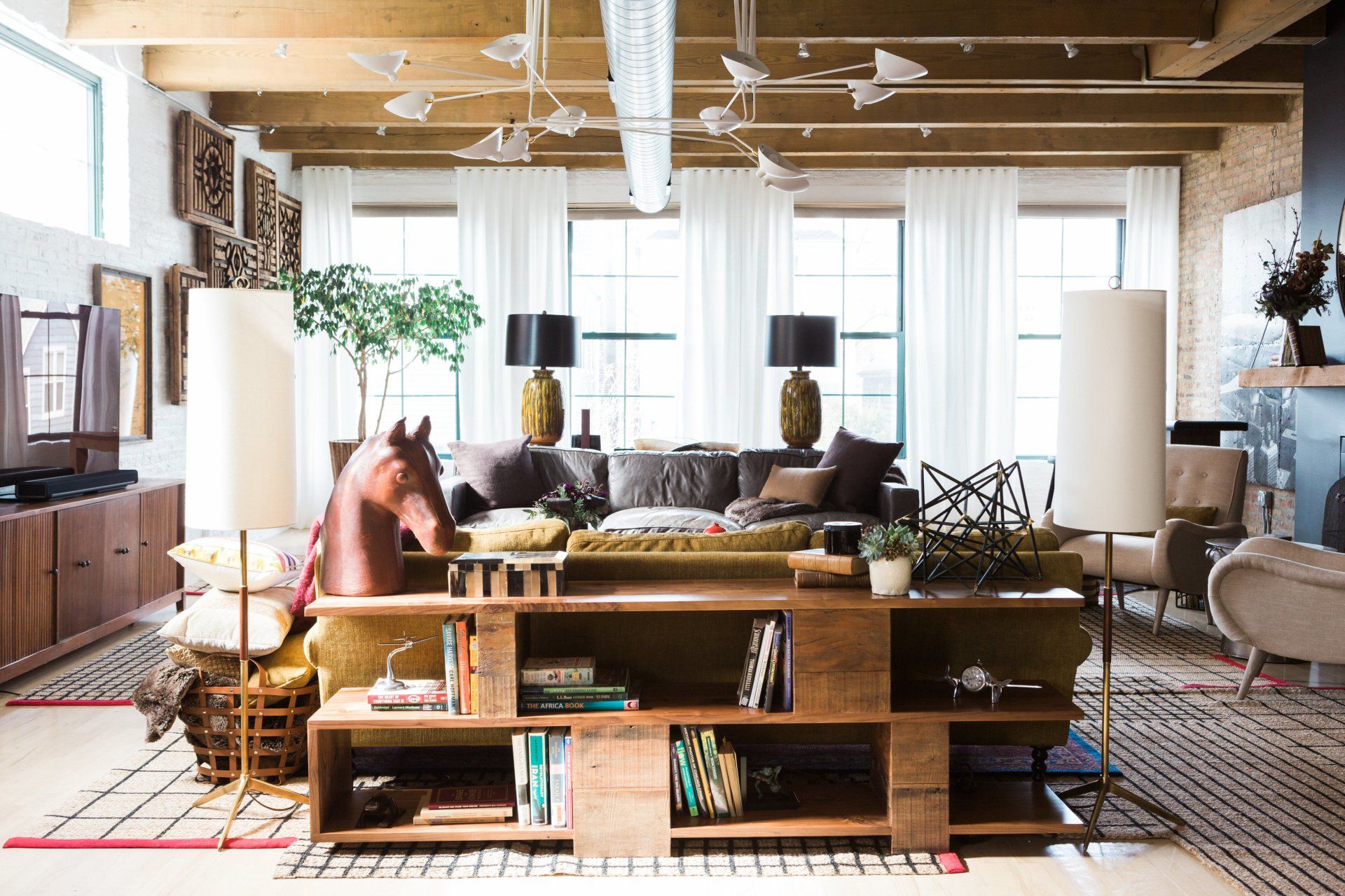
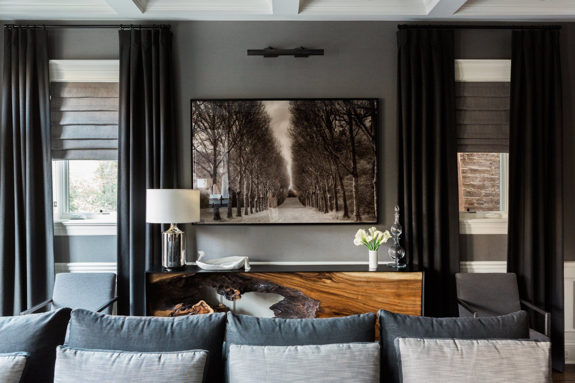
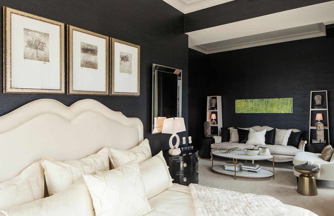
Elevated interiors, tailored for Chicago’s finest

VIEW PROJECTS

AWARD-WINNING INTERIOR DESIGNER

Meet Anthony Michael

Anthony is regularly named as one of the top interior designers in Chicago and various metropolitan areas such as San Francisco, NYC, Naples, New Buffalo, Scottsdale, Miami, Los Angeles, Belair, Nassau Bahamas and more in addition to numerous other projects in Chicago and the suburbs.


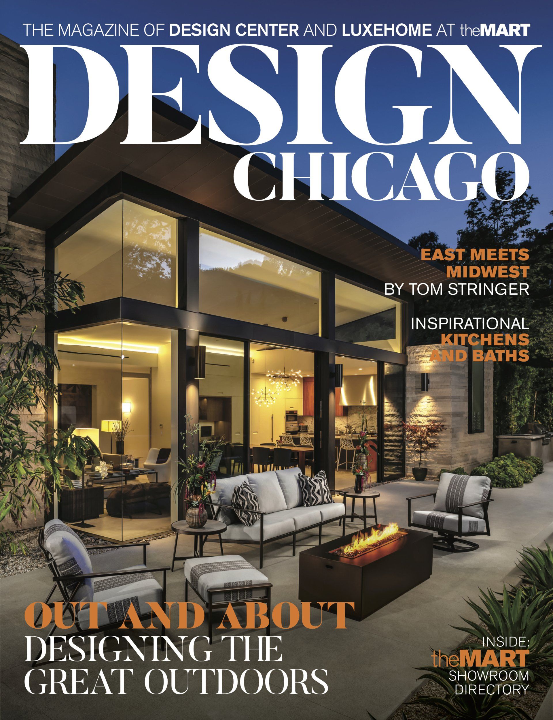
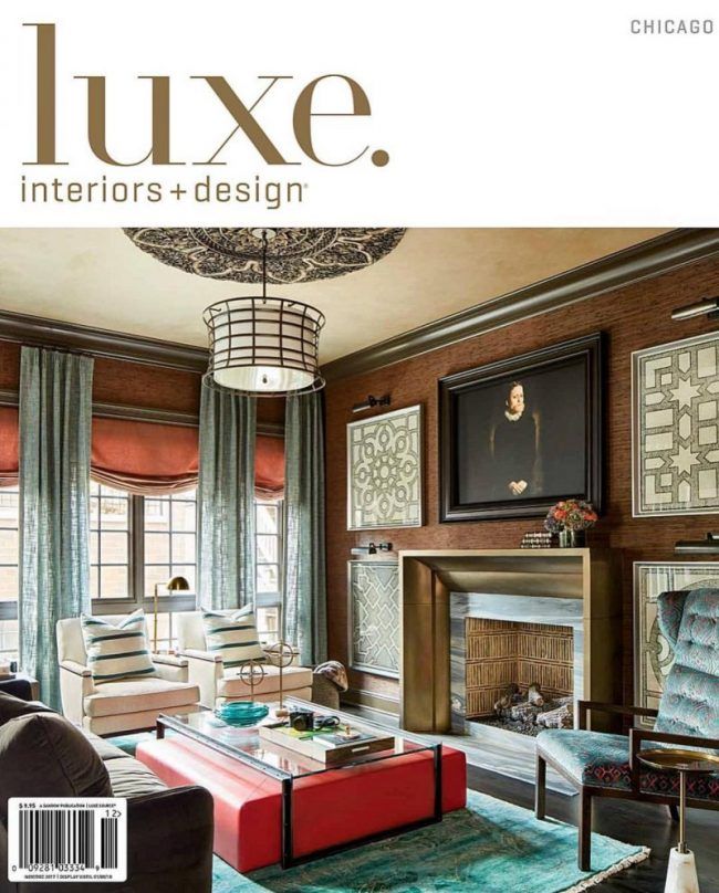
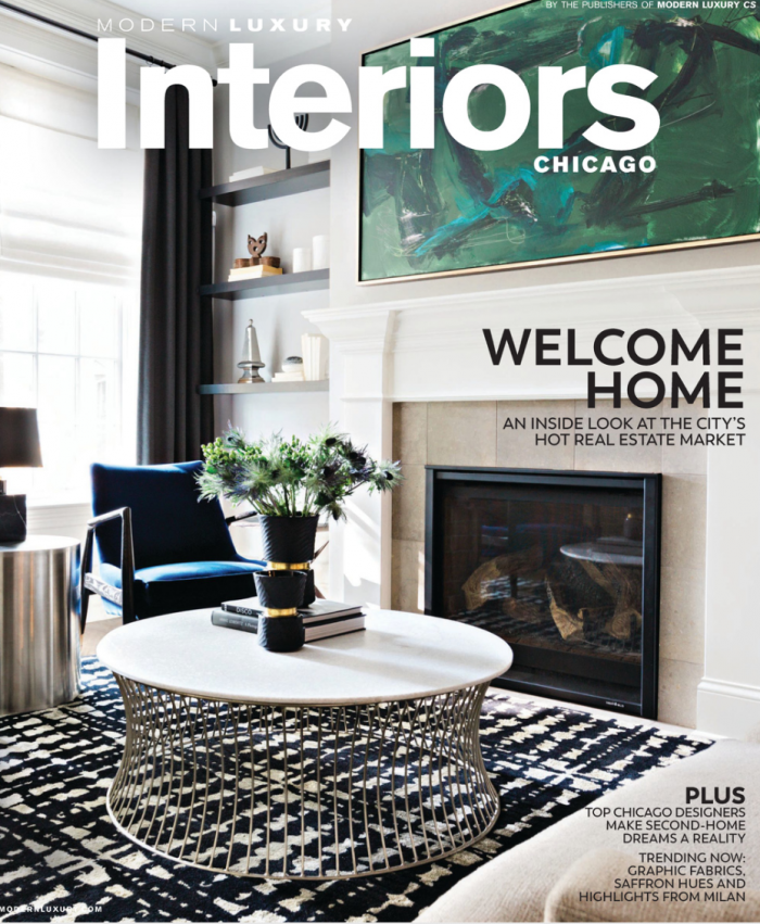
With offices in Chicago and Los Angeles, he works with bicoastal clients. His work has been featured in LUXE as a LUXE Gold Designer, House Beautiful, Traditional Home, The Wall Street Journal, Architectural Digest, Modern Luxury and more. 


With over 35 years of experience, Anthony Michael is to interior design what Sir Alec Guinness was to acting— able to handle radically different roles, his talent comfortably manifesting itself behind many faces. While hard to typecast, he dares to cross the lines of convention to try what is visually bold and dramatic , but never jarring.

MORE ABOUT US

FEATURED PROJECTS

We selected Anthony Michael Interior Design for our new city condo. We are more than thrilled with the outcome- from wall coverings to lighting,  furniture & light construction. 

Their edge mixed with classic traditional was exactly what we were looking for. Sophisticated elegance!! Every team member was a compliment to each other.

- Frank Cuomo

FEATURED PRESS

FROM THE BLOG

February 19, 2026
While paint colors and furniture get a lot of attention, the floor is truly the foundation of a room’s entire design and feel. In 2026, flooring trends are all about combining personality with performance. Many homeowners are moving toward choices that are both beautiful and practical for their lifestyles. Here are the top trends designers are loving, from the return of classic materials to cutting-edge technological advancements in flooring. 1. Rich and Warm Hardwoods This trend is a return to warmth, a shift away from the cool-toned grays and ultra-light bleached woods that have been popular for the last decade. It focuses on midrange to deep wood tones that feel inviting and timeless. Rich and warm hardwoods connect to a broader desire for cozy, comfortable and natural-feeling interiors, which pair well with biophilic design. Consider these key details and examples: Wood species: White oak remains a top choice, but it’s now being finished with warmer, more natural tones. Walnut, with its deep, rich chocolatey hues, is also seeing a resurgence. Finishes: The trend favors low-sheen finishes, like matte or satin. These hide scratches better than high-gloss and allow the natural grain and texture of the wood to shine. Character wood: There’s a growing appreciation for wood with more natural imperfections — like knots and mineral streaks — which adds unique character and a rustic yet refined look. If this style resonates with you, All American Flooring can help apply it to your home. It’s the premier Dallas-area expert for achieving this classic aesthetic because it specializes in hardwood restaining and refinishing services. Its team can help you customize new floors to achieve a precise custom color or update your existing floors with a new, on-trend warm stain. If you’re wondering where you can buy high-quality hardwood flooring in Dallas, this flooring company also has you covered. 2. Pattern Play and Parquetry The floor is the focal point with this trend, which involves arranging flooring — usually wood, but also tile — in geometric patterns instead of a traditional straight-lay installation. It adds an immediate “wow” factor and a bespoke feel to any room, elevating the floor from a simple surface to a primary design feature. Here are some popular patterns: Herringbone: Rectangular planks are laid in a staggered, interlocking V-shape. It’s a classic, sophisticated pattern often seen in historic European apartments. Chevron: The planks are also in V-shape placements, but their ends are cut at an angle so they meet at a perfect point. This creates a clean, continuous “arrow” effect that can make a room feel longer or wider. Basket weave: The planks are arranged into square modules, with each neighboring square laid in a perpendicular direction. The final look resembles the interwoven pattern of a woven basket, offering a charming, traditional feel. Creating these intricate patterns is not a simple DIY task. It requires incredible precision, skill and expertise to ensure the lines are straight and the design is flawless. Footprints Floors is a great partner for this trend. It specializes in executing complex arrangements, ensuring your investment in materials results in a beautiful finished floor. 3. Natural and Sustainable Materials This popular style centers on flooring made from renewable or recyclable resources, with an emphasis on low-volatile organic compound materials for better indoor air quality. It’s driven by a growing environmental consciousness and a desire for healthier homes. These materials often offer unique aesthetics not found in traditional options, such as: Cork: This is naturally insulating, soft and comfortable underfoot and hypoallergenic. It comes from the bark of a cork oak tree, which is not cut down in the process. Bamboo: Because it regenerates quickly, bamboo is highly renewable. It’s also hard and durable, often stronger than many hardwoods. Reclaimed wood: Salvaged from old barns, factories and warehouses, each reclaimed wood plank has a history, patina and character that’s impossible to replicate. It’s the ultimate in recycling. Embracing this trend is easier with Floor Coverings International , thanks to its mobile showroom. Materials like cork and bamboo often have unique textures and colors that are best viewed in your home’s lighting, next to your own furniture and wall colors, which the service allows you to do. Find the Perfect Foundation for Your Style Flooring today is about personal expression. Whether you’re looking to buy high-quality hardwood flooring for that timeless warmth or embracing sustainability with cork, there are more high-quality options than ever. The best choice is the one that reflects your taste and meets the functional demands of your household. The right floor is more than just a material — it’s the canvas on which life’s moments are painted, setting the stage for a home you’ll love for years to come.
February 19, 2026
Before anyone notices your coffee table or comments on your throw pillows, they register your color story. The palette you choose does more than set the mood — it quietly governs every design decision that follows. It influences the furniture you’re drawn to, the materials you tolerate, the amount of visual stimulation you can comfortably live with and even how large or intimate your space feels. If you strip your interior design down to its foundation, color temperature is often where the divide begins. On one side, you’ll find frosty minimalism. On the other, toasty maximalism. And while most homes fall somewhere between the two, your palette choice usually reveals which direction you instinctively lean. Frosty Minimalism vs. Toasty Maximalism Frosty minimalism tends to favor cooler tones, such as crisp whites, muted blues, soft charcoals, pale sage and occasionally icy blush or lavender. These colors create clarity and visual calmness , enhancing focus. They reflect light, enhance architectural lines and minimize distraction. The effect is controlled, restrained and intentional. In contrast, toasty maximalism leans into warmth. Think terracotta, ochre, rust, deep emerald, burgundy, caramel, chocolate brown and layered jewel tones. These hues absorb light rather than bounce it back. They create intimacy and make a room feel collected, layered and emotionally expressive. The difference is atmospheric. Cooler palettes expand space and quiet it. Warmer palettes condense space and energize it. And once you commit to one temperature direction, your decor naturally follows. How Palette Choice Shapes Your Entire Interior Color isn’t just a finishing touch. It’s a framework, and once it’s established, it influences nearly every element in your home. Furniture Selection A cool, frosty palette pairs naturally with streamlined silhouettes. You’ll likely gravitate toward furniture with clean lines, minimal ornamentations and neutral upholstery. Light oak, ash, blackened steel, matte finishes and glass all harmonize with cooler schemes. Ornate carving or heavily textured fabrics can feel visually loud against a restrained palette. In a toasty minimalist space, furniture becomes more sculptural and expressive. Rounded shades, velvet upholstery, carved wood, vintage prices and statement chairs feel at home. Walnut, brass, antique gold and richly stained woods complement warm palettes. In this setting, contrast is welcomed rather than avoided. Texture and Material Choices Cool-toned minimalism often embraces materials that reinforce simplicity , like linen, cotton, plaster and light woods. Surfaces tend to feel matte or softly reflective rather than glossy. Texture is subtle, not dominant. Warmer maximalist interiors rely heavily on texture for depth. Think velvet drapery, patterned rugs, embroidered cushions, aged leather, dark woods and mixed metals. Layering is intentional and visible. The room is meant to feel tactile and dimensional. Lighting Decisions Lighting behaves differently depending on color temperature. In minimalism, natural light is often prioritized. Sheer window treatments, reflective surfaces, and strategically placed mirrors enhance brightness. Artificial lighting tends to be soft white or cool-neutral to maintain the clean aesthetic. Maximalism thrives under warm, golden lighting. Table lamps, sconces and layered ambient lighting create pools of glow that deepen the richness of warm hues. In these interiors, lighting is less about maximizing brightness and more about creating atmosphere.  Art and Decorative Objects In cooler minimalist spaces, art is often oversized and restrained. A single large abstract piece, black-and-white photography or minimal line drawings reinforce simplicity. Decorative objects are curated and sparse. Negative space is intentional. In maximalist interiors, walls can become storytelling canvases. Gallery walls, mixed frames, layered textiles, bold prints and collected objects all coexist. Warm palettes provide cohesion even when patterns and eras vary. Perception of Space Cool colors visually recede, making rooms feel larger and more open. This is one reason frosty minimalism often appeals to apartment dwellers or those seeking a sense of spaciousness. Warm colors advance, making rooms feel closer and more intimate. In larger homes or high-ceilinged spaces, toasty maximalism can make rooms feel grounded and inviting. Design Ideas Across the Spectrum If you lean toward frosty minimalism, anchor your space in layered whites, cool grays and soft charcoal, then introduce quiet contrast through matte black fixtures or pale woods like ash and white oak. Incorporate sculptural lighting, simple ceramics and one oversized piece of art rather than multiple smaller accents. Keep surfaces intentional and uncluttered. For those who appreciate warmth but don’t want to commit fully to saturated maximalism, taupe white is an exceptional choice. It’s a warm, welcoming hue that combines soft beige and gray undertones. It carries an earthy calmness that softens a space without overwhelming it. If you’re drawn to toasty maximalism, begin with a warm base such as terracotta, ochre, caramel or deep olive. Layer upholstered seating in jewel tones, incorporate walnut or richly stained woods, and introduce brass or antique gold accents for depth. The Palette Is the Blueprint Ultimately, your color palette is the quiet authority behind every design choice you make, shaping how your home looks and how it feels to live in. Whether you gravitate toward cool, frosty tones that create clarity and openness or warm, toasty hues that build intimacy and depth, that temperature decision becomes the foundation of your home decor.
February 5, 2026
Every year, the interior design world pauses to see what direction color trends might take next. When Pantone announced its 2026 Color of the Year as Cloud Dancer, the reaction was immediate and divided. Some designers welcomed the calm, airy tone. Others saw it as a step backwards after years of richer, more expressive palettes.  For homeowners planning a renovation or refresh, the bigger question is practical rather than theoretical/ Does this muted, off-white tone mean minimalist interiors are about to dominate again? If so, do you have to follow? What Is "Cloud Dancer?" Cloud Dancer — or PANTONE 11-4201 — sits firmly in the soft neutral family. Pantone describes it as gentle, atmospheric and restorative. It’s a shade meant to suggest pause and comfort rather than drama. Visually, it reads as a diaphanous white with gray undertones, closer to mist than to bright gallery white. The intent is clear. After years of visual noise and saturation trends, the color signals restraint. The message, however, has not landed well with everyone. Industry commentaries include polite skepticism and outright disappointment, and many designers view the selection as underwhelming. Homeowners value color-forward interiors and are not keen on any return to blank-feeling spaces. Recall 2025 and the Reign of Warmth and Personality The frustration around Cloud Dancer makes more sense when you look at recent interior design history. Over the past few years, interiors have moved decisively away from cool grays and stark whites. Homeowners embraced warmer, moodier palettes that felt personal and lived-in. Recently, fall pigment trends pointed to deep, comforting hues like terracotta and brick red that signaled familiarity and warmth to match Mocha Moose — the 2025 Color of the Year. Compared with those saturated, expressive tones, Cloud Dancer feels almost withdrawn. The contrast is sharp enough that you may see it as an invitation to rewind the clock to minimalism. Why You Don't Have to Follow the Leader Pantone's Color of the Year is often treated like a rulebook, but it isn't one. It's a signal, not a directive. Cloud Dancer may reflect a collective craving for calm, yet that doesn't mean your home has to drift toward sparse rooms and barely-there palettes. One reason neutral trends gain so much power is because of long-standing myths about color that scare homeowners into “neutral” territory. Perhaps you still believe lighter shades are the only way to make a space feel open, or that bold tones will automatically overwhelm a room. That thinking lingers even though it no longer reflects how designers and painters actually work. Challenging views on core interior color rules point out that dark shades, layered palettes and non-white ceilings can all work beautifully when balanced with light, texture and flow. The goal is to create a space that feels intentional and personal. Cloud Dancer does not override that, and you shouldn't read it as permission to erase color, contrast or warmth from your home. Instead, Pantone's Color of the Year 2026 can become the canvas upon which you create a lighter and more energized style. 5 Ways to Use Cloud Dancer Without Being Boring If Cloud Dancer pleases you, but you want to avoid a bland result, treat it as a supporting player. Pantone's own palette guidance leaves plenty of room for expression: Place it quietly with bolder choices: Cloud Dancer works best when it steps back. Use it on walls to give visual breathing room to statement furniture, oversized art or dramatic lighting. Pair it with muted color: Avoid minimalist-white interiors by pairing them with powdered pastels, dusty blues or softened greens for dimension and a relaxed mood. These chromatically diverse combinations speak of thoughtful selection that eliminates sterile spaces. Warm it with organic materials: Immediately shift the tone from sterile to lived-in with natural wood, woven textures, stone and plants. A pale backdrop soon becomes inviting. Introduce contrast through depth: Deep accent colors, aged metals or rich fabrics prevent Cloud Dancer from dominating the room. Contrast adds weight without tipping into visual chaos. Use it selectively: A single room or surface can benefit from a lighter neutral. That doesn't require your entire home to follow suit. Each of these approaches keeps your palette open and expressive, even when the base stays calm. The Verdict: Is Minimalism Making a Comeback? It's easy to read Pantone’s 2026 pick as a swing back toward minimalist interiors — especially after years of warmer, more personality-driven spaces — but trends rarely move in straight lines. Instead, they overlap, react and adapt. Just recently, designers were celebrating deeper, comforting hues that leaned into familiarity and warmth. That shift simply made room for another option. Cloud Dancer sits alongside those colors, not in opposition to them. Introducing the airy, atmospheric tone may bring some relief to overly saturated visual scapes. The almost-white hue may read as fresh and clean when paired with supporting pastels or rich metallic tones. A Bigger Takeaway Cloud Dancer may reflect a cultural moment that values pause and ease, but it doesn't demand a return to pale, stripped-back interiors. Minimalism is a choice, not your default setting. Neutral colors only become boring when they're treated as the whole story instead of the background. Your home still gets to feel warm, layered and unmistakably yours. Trends can inform your decisions, but they shouldn't limit them.
Show more