Are You a Frosty Minimalist or a Toasty Maximalist? How Palette Picks Define Your Decor
Before anyone notices your coffee table or comments on your throw pillows, they register your color story. The palette you choose does more than set the mood — it quietly governs every design decision that follows. It influences the furniture you’re drawn to, the materials you tolerate, the amount of visual stimulation you can comfortably live with and even how large or intimate your space feels.
If you strip your interior design down to its foundation, color temperature is often where the divide begins. On one side, you’ll find frosty minimalism. On the other, toasty maximalism. And while most homes fall somewhere between the two, your palette choice usually reveals which direction you instinctively lean.
Frosty Minimalism vs. Toasty Maximalism
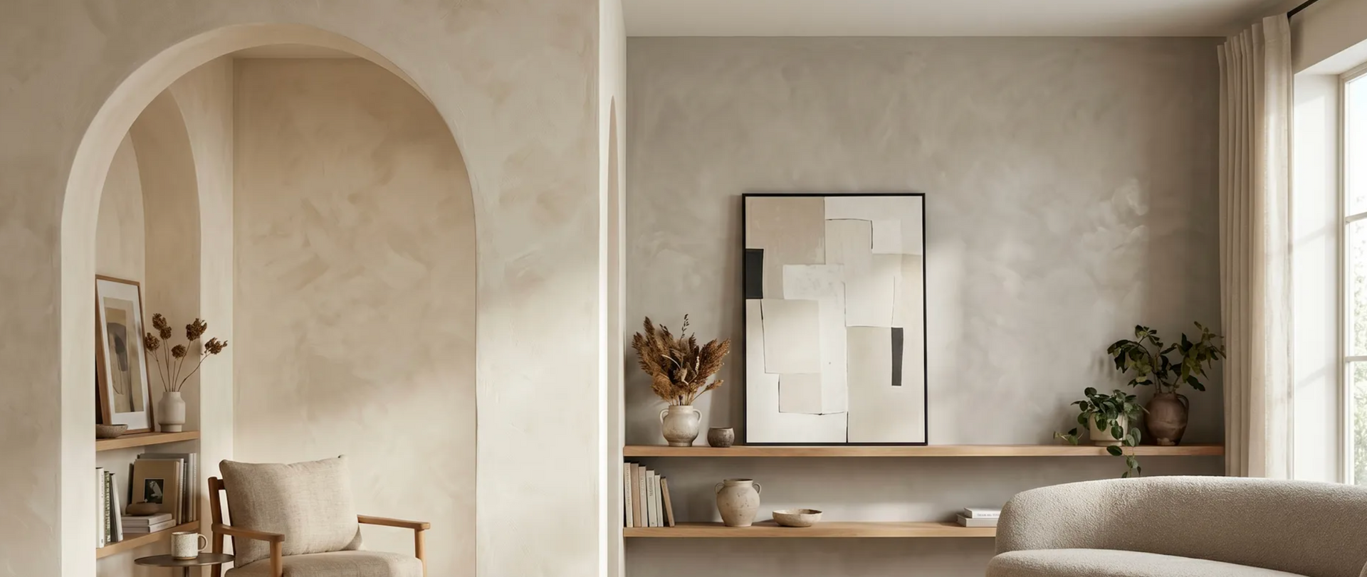
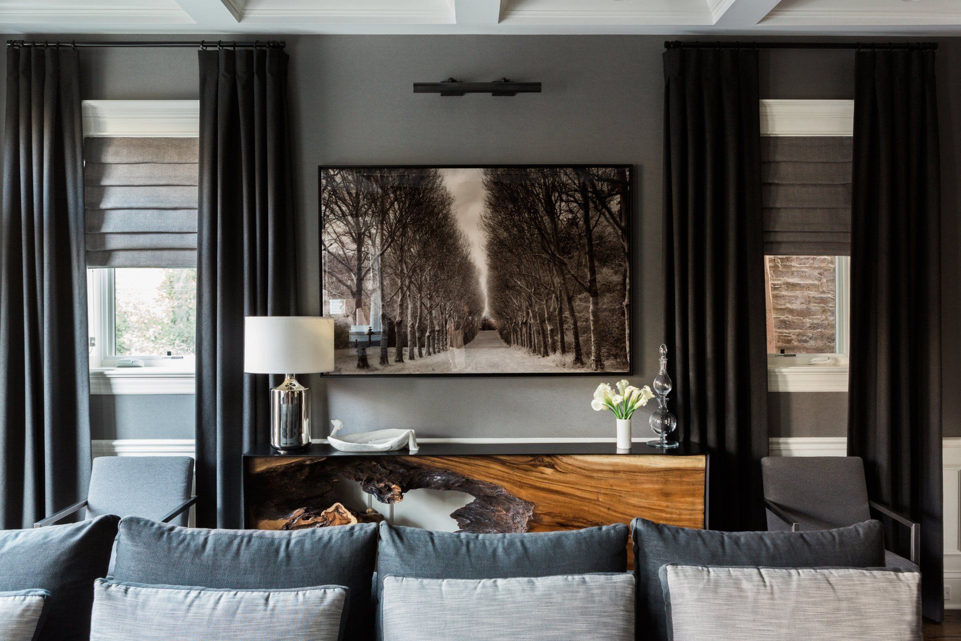
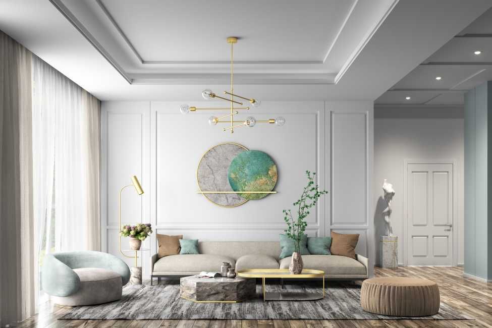
Frosty minimalism tends to favor cooler tones, such as crisp whites, muted blues, soft charcoals, pale sage and occasionally icy blush or lavender. These colors create clarity and visual calmness, enhancing focus. They reflect light, enhance architectural lines and minimize distraction. The effect is controlled, restrained and intentional.
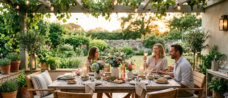
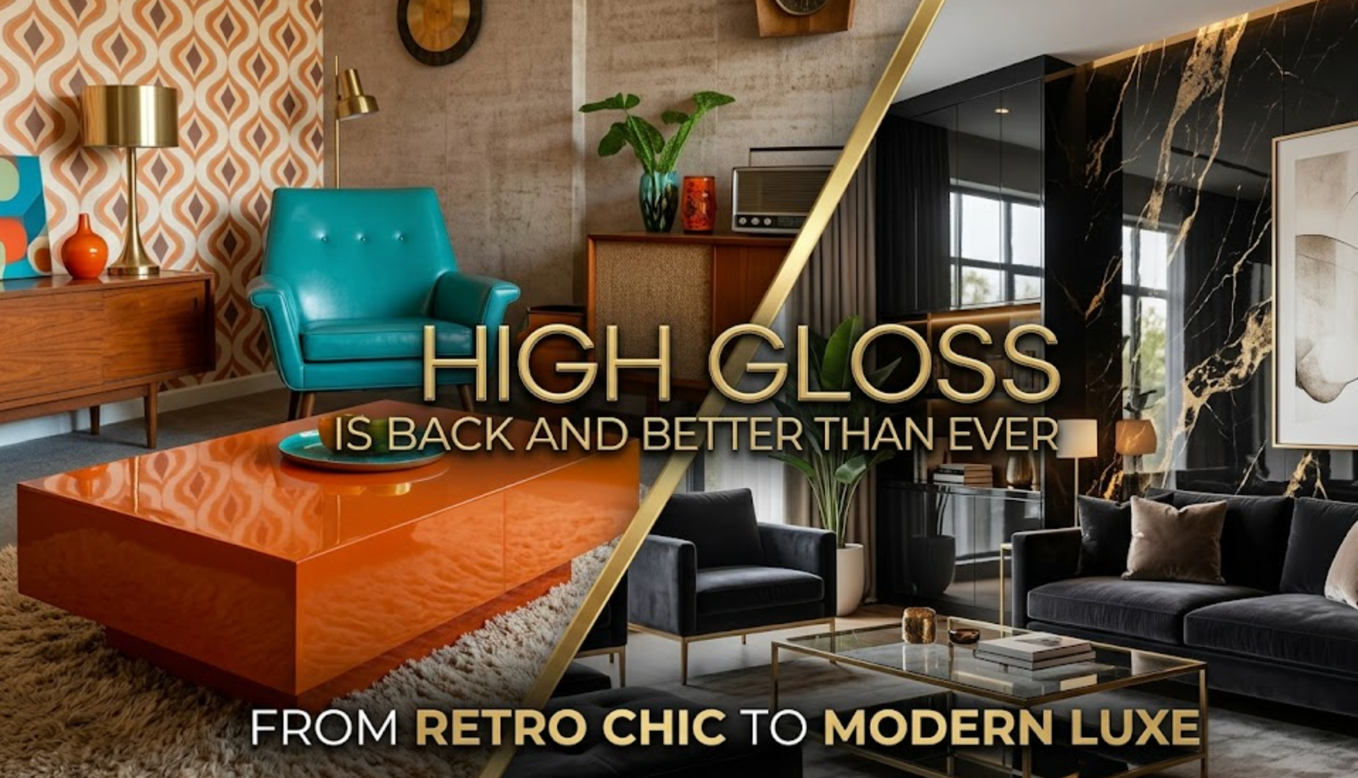
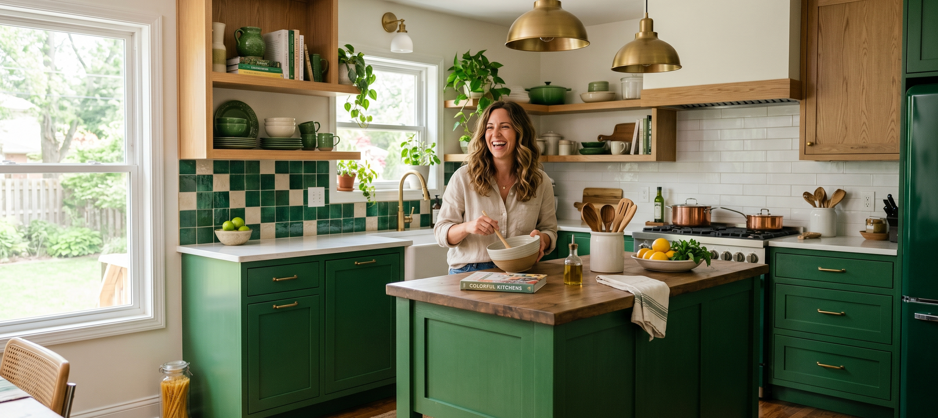
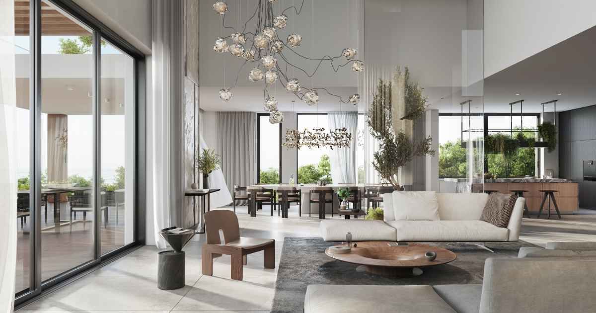
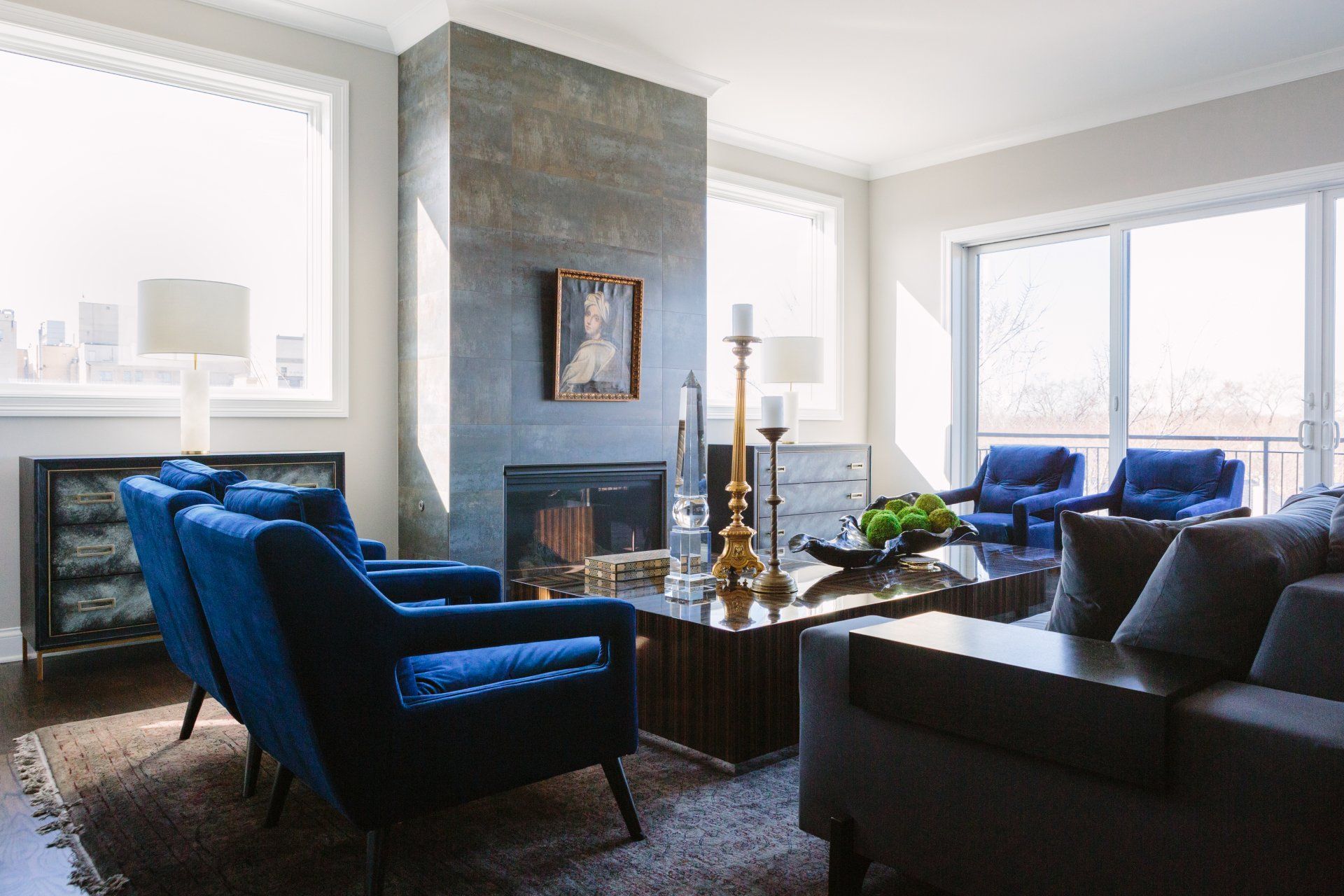
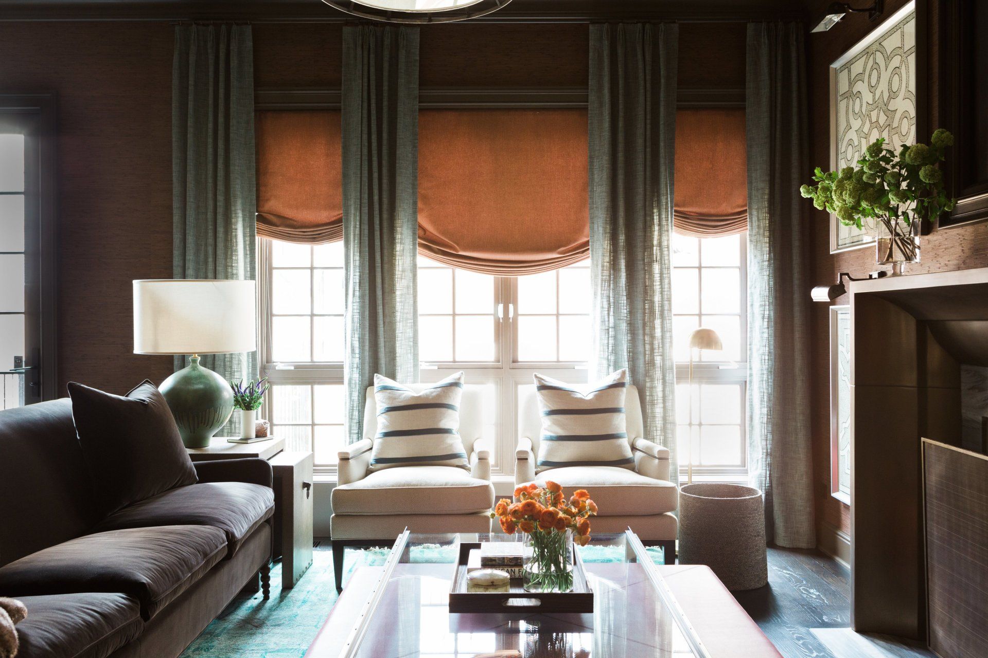
In contrast, toasty maximalism leans into warmth. Think terracotta, ochre, rust, deep emerald, burgundy, caramel, chocolate brown and layered jewel tones. These hues absorb light rather than bounce it back. They create intimacy and make a room feel collected, layered and emotionally expressive.
The difference is atmospheric. Cooler palettes expand space and quiet it. Warmer palettes condense space and energize it. And once you commit to one temperature direction, your decor naturally follows.
How Palette Choice Shapes Your Entire Interior
Color isn’t just a finishing touch. It’s a framework, and once it’s established, it influences nearly every element in your home.
Furniture Selection
A cool, frosty palette pairs naturally with streamlined silhouettes. You’ll likely gravitate toward furniture with clean lines, minimal ornamentations and neutral upholstery. Light oak, ash, blackened steel, matte finishes and glass all harmonize with cooler schemes. Ornate carving or heavily textured fabrics can feel visually loud against a restrained palette.
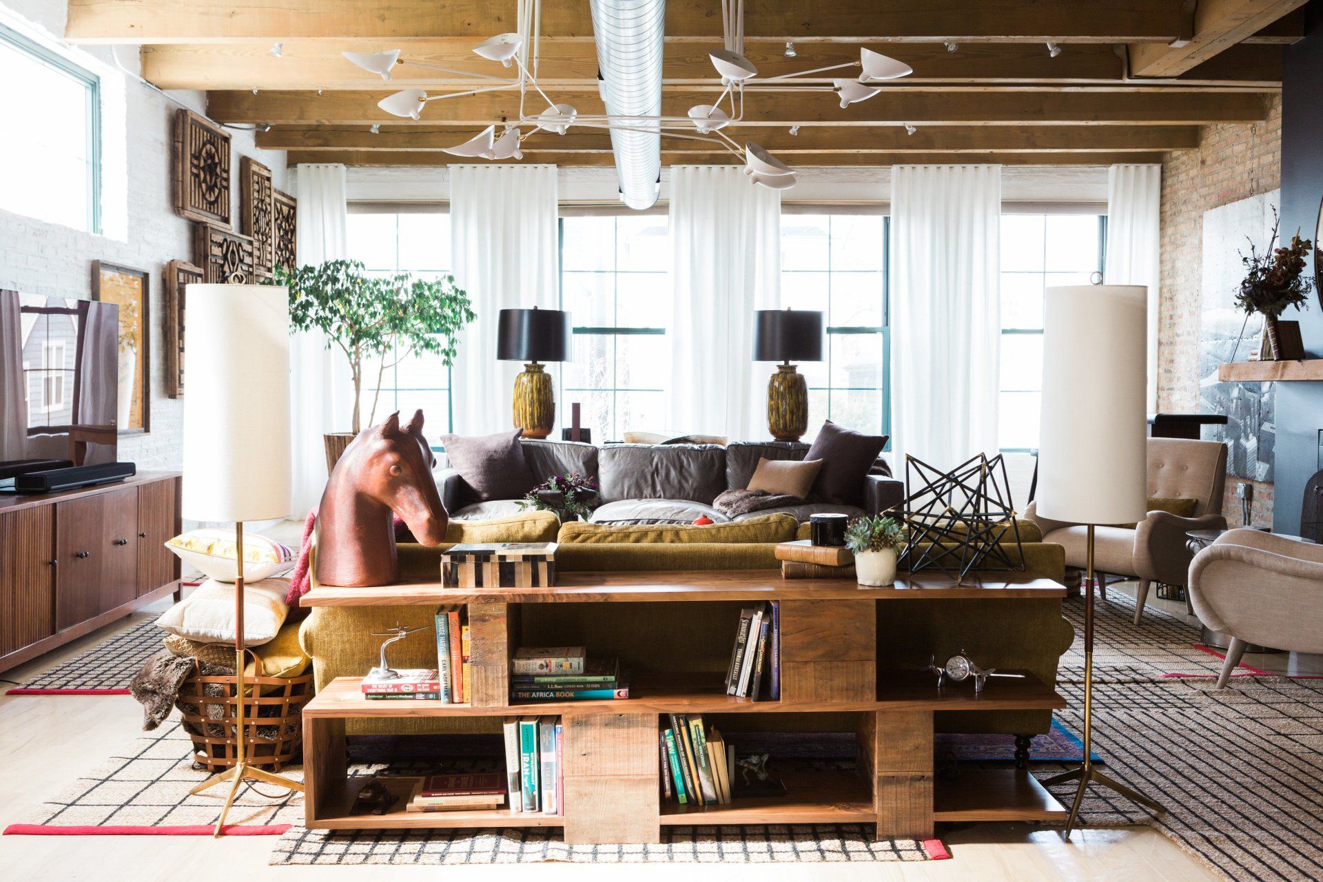
In a toasty minimalist space, furniture becomes more sculptural and expressive. Rounded shades, velvet upholstery, carved wood, vintage prices and statement chairs feel at home. Walnut, brass, antique gold and richly stained woods complement warm palettes. In this setting, contrast is welcomed rather than avoided.
Texture and Material Choices
Cool-toned minimalism often embraces materials that reinforce simplicity, like linen, cotton, plaster and light woods. Surfaces tend to feel matte or softly reflective rather than glossy. Texture is subtle, not dominant.
Warmer maximalist interiors rely heavily on texture for depth. Think velvet drapery, patterned rugs, embroidered cushions, aged leather, dark woods and mixed metals. Layering is intentional and visible. The room is meant to feel tactile and dimensional.
Lighting Decisions
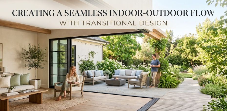
Lighting behaves differently depending on color temperature. In minimalism, natural light is often prioritized. Sheer window treatments, reflective surfaces, and strategically placed mirrors enhance brightness. Artificial lighting tends to be soft white or cool-neutral to maintain the clean aesthetic.
Maximalism thrives under warm, golden lighting. Table lamps, sconces and layered ambient lighting create pools of glow that deepen the richness of warm hues. In these interiors, lighting is less about maximizing brightness and more about creating atmosphere.
Art and Decorative Objects
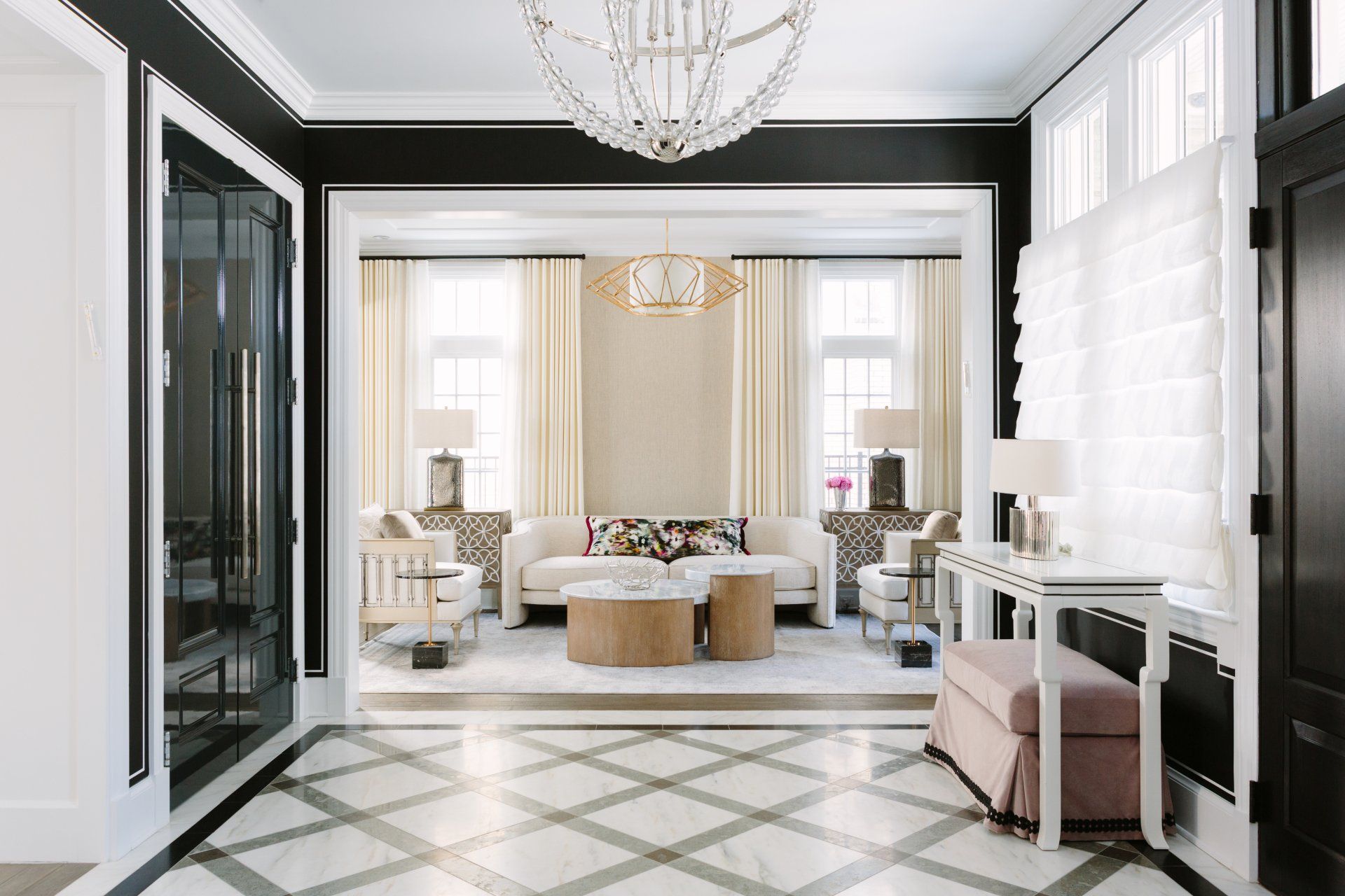
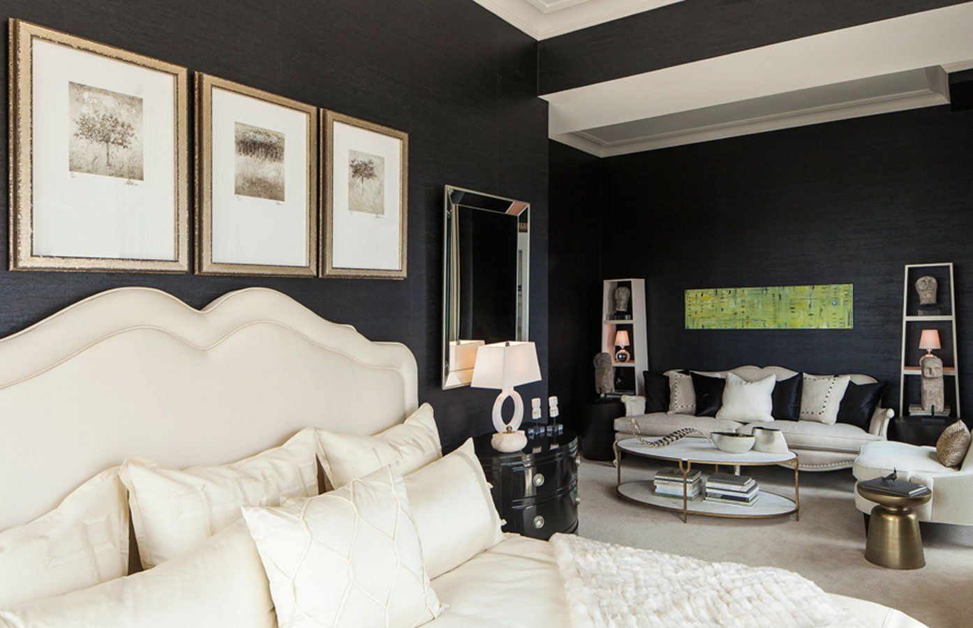
In cooler minimalist spaces, art is often oversized and restrained. A single large abstract piece, black-and-white photography or minimal line drawings reinforce simplicity. Decorative objects are curated and sparse. Negative space is intentional.
In maximalist interiors, walls can become storytelling canvases. Gallery walls, mixed frames, layered textiles, bold prints and collected objects all coexist. Warm palettes provide cohesion even when patterns and eras vary.
Perception of Space
Cool colors visually recede, making rooms feel larger and more open. This is one reason frosty minimalism often appeals to apartment dwellers or those seeking a sense of spaciousness.
Warm colors advance, making rooms feel closer and more intimate. In larger homes or high-ceilinged spaces, toasty maximalism can make rooms feel grounded and inviting.
Design Ideas Across the Spectrum
If you lean toward frosty minimalism, anchor your space in layered whites, cool grays and soft charcoal, then introduce quiet contrast through matte black fixtures or pale woods like ash and white oak. Incorporate sculptural lighting, simple ceramics and one oversized piece of art rather than multiple smaller accents. Keep surfaces intentional and uncluttered.
For those who appreciate warmth but don’t want to commit fully to saturated maximalism, taupe white is an exceptional choice. It’s a warm, welcoming hue that
combines soft beige and gray undertones. It carries an earthy calmness that softens a space without overwhelming it.
If you’re drawn to toasty maximalism, begin
with a warm base such as terracotta, ochre, caramel or deep olive. Layer upholstered seating in jewel tones, incorporate walnut or richly stained woods, and introduce brass or antique gold accents for depth.
The Palette Is the Blueprint
Ultimately, your color palette is the quiet authority behind every design choice you make, shaping how your home looks and how it feels to live in. Whether you gravitate toward cool, frosty tones that create clarity and openness or warm, toasty hues that build intimacy and depth, that temperature decision becomes the foundation of your home decor.