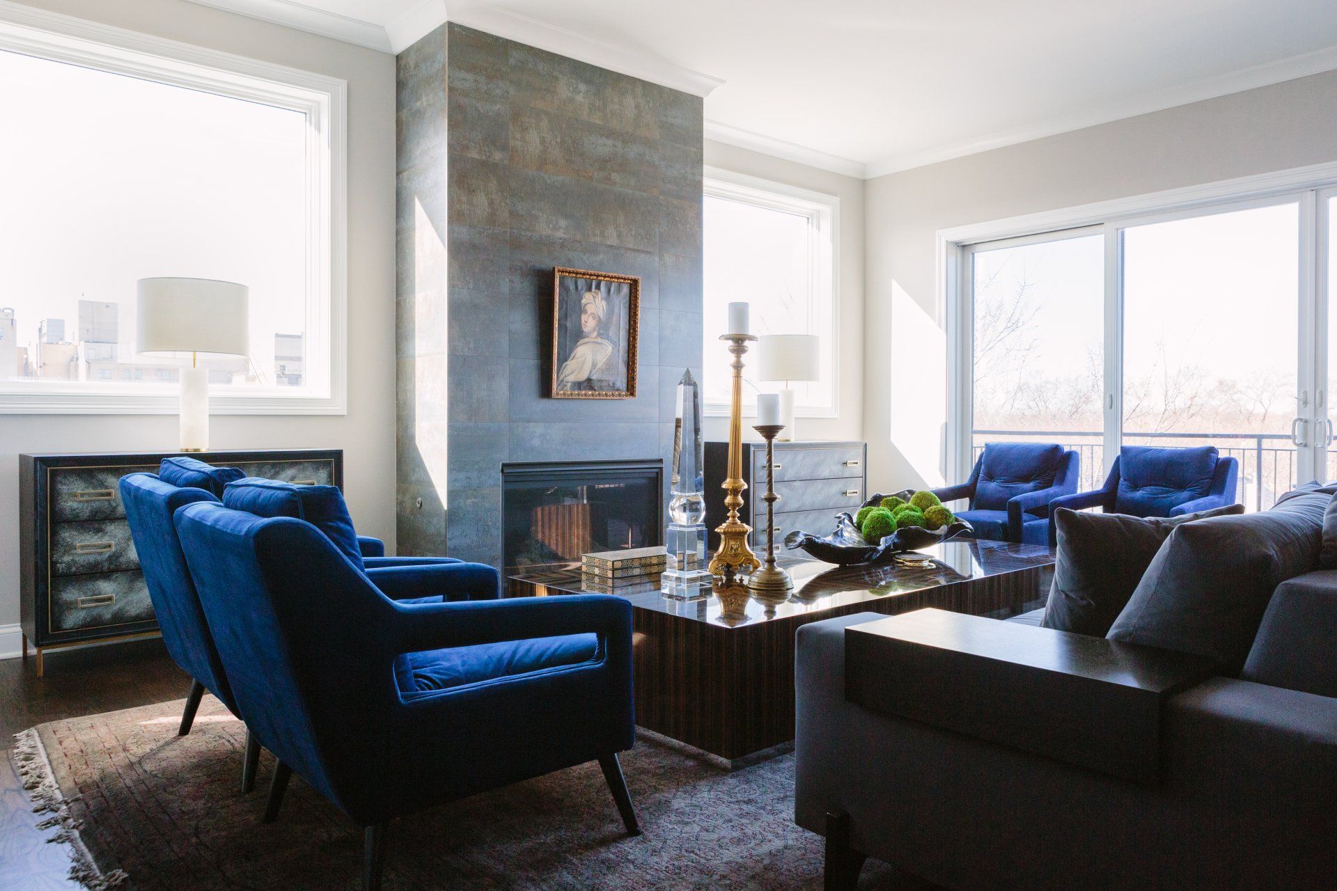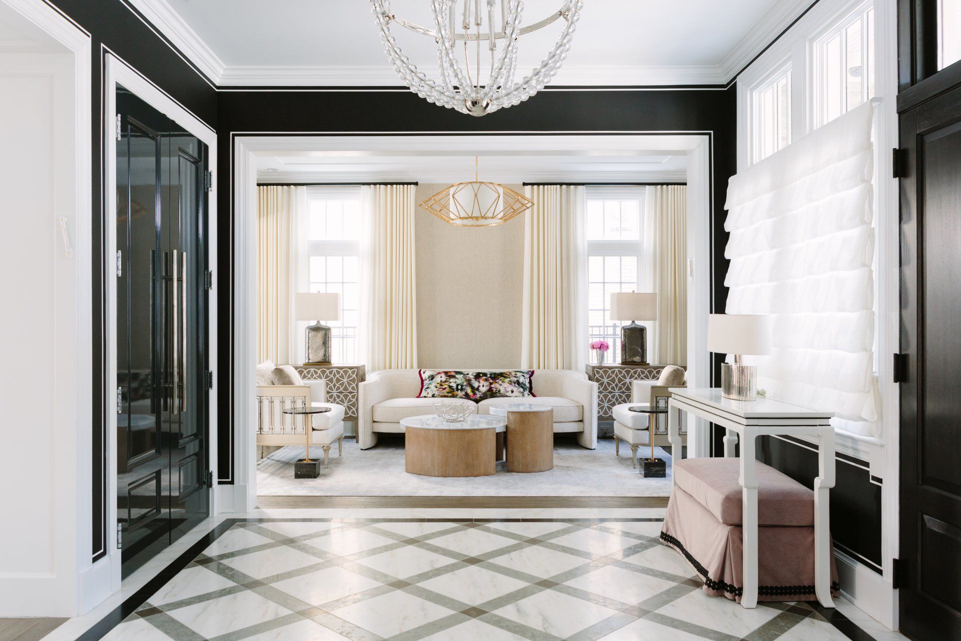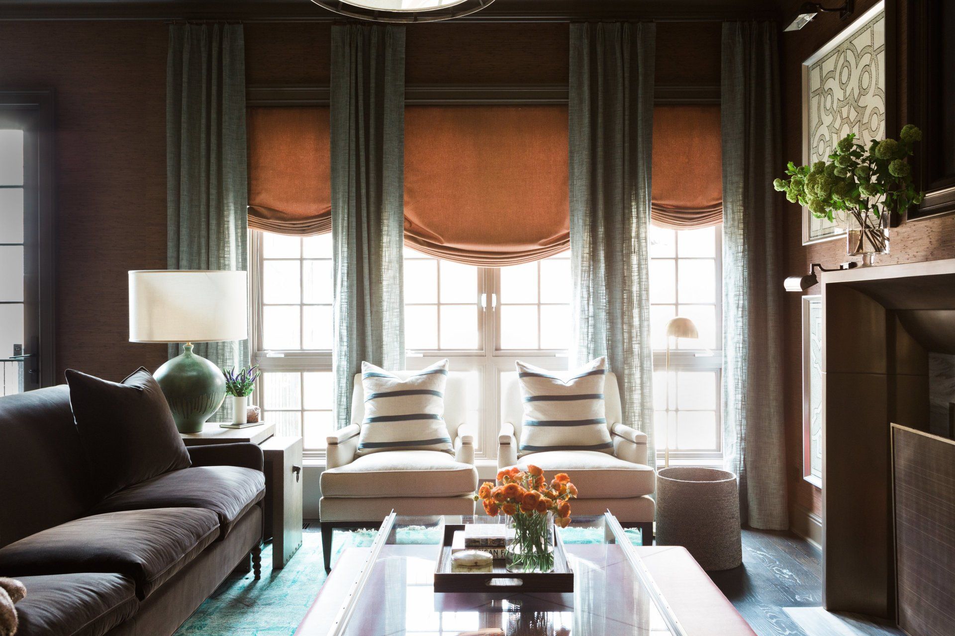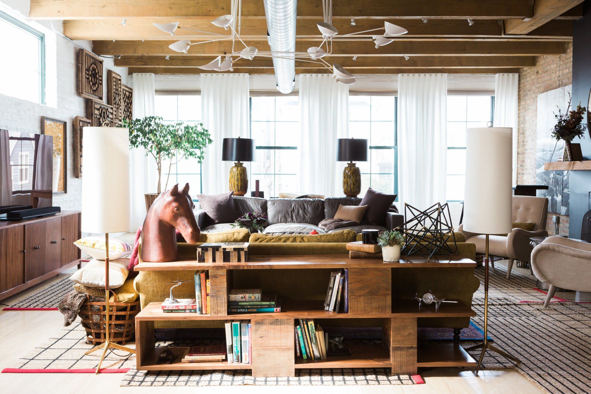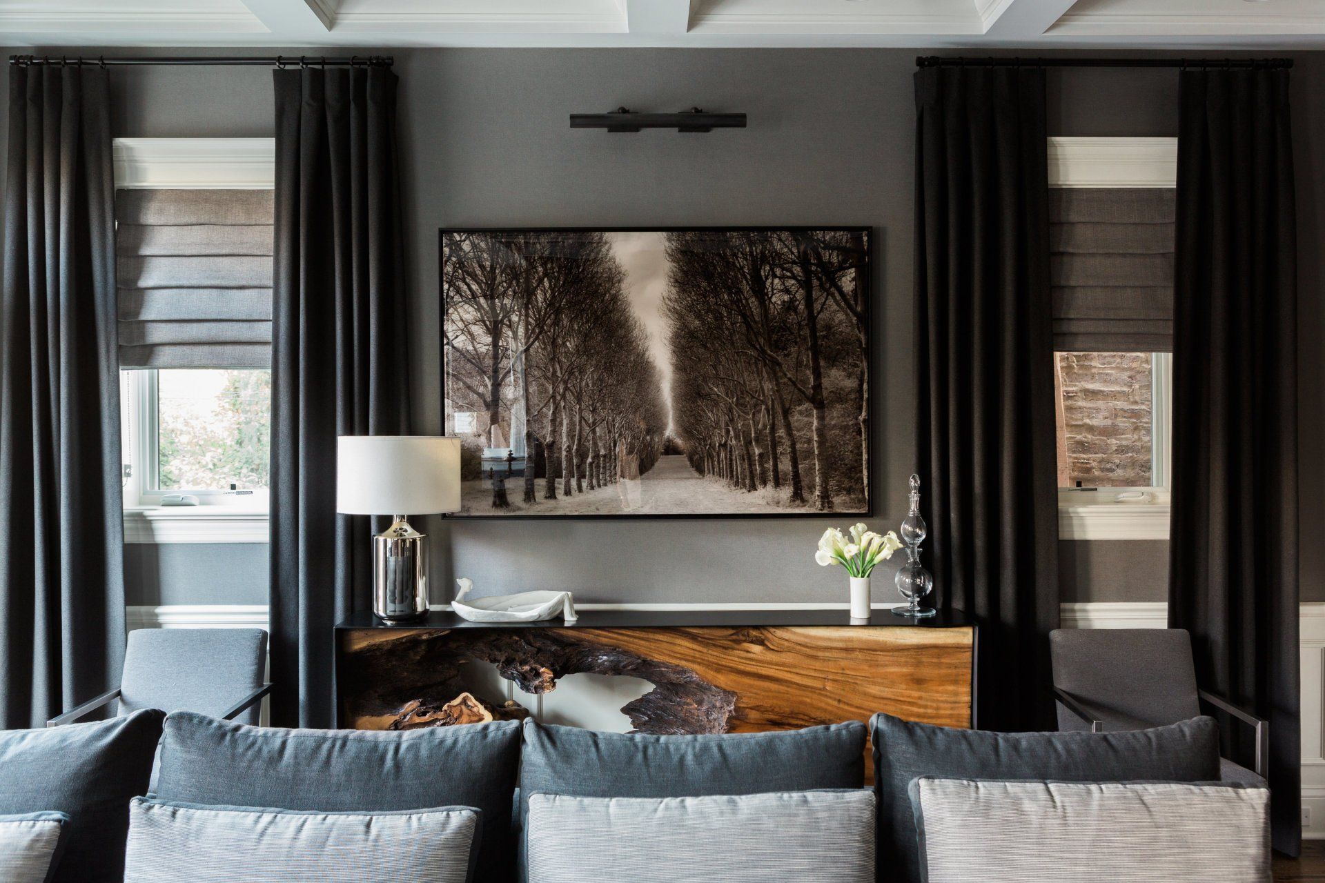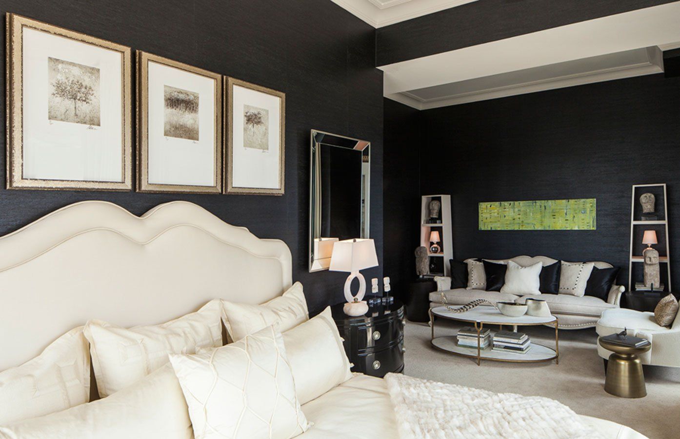
Designing a Kid-Friendly Home Without Sacrificing Style
Anthony Michael • September 4, 2024
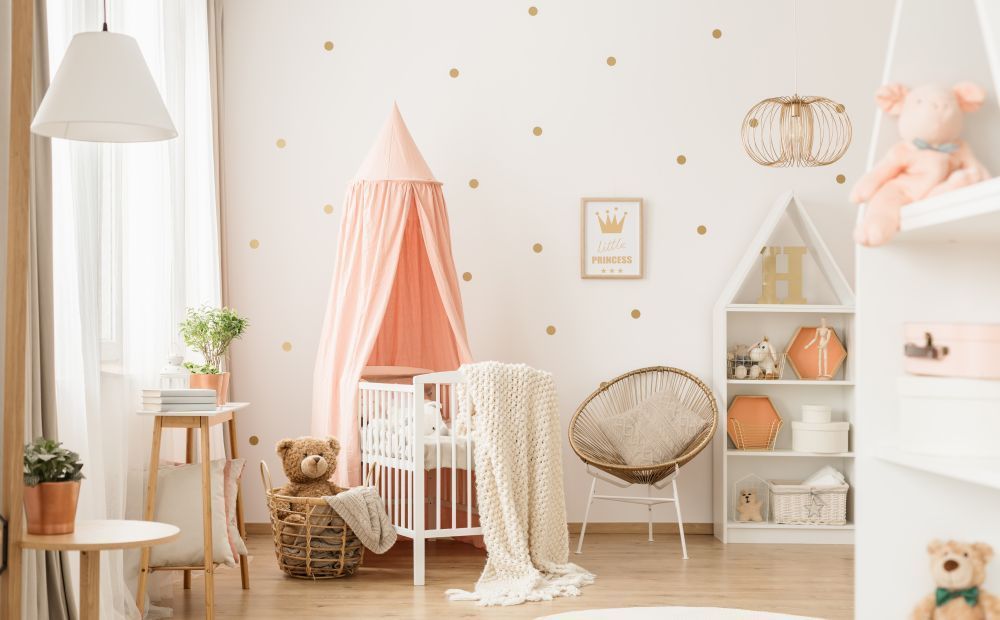
Creating a kid-friendly interior design that balances safety, functionality, and style is essential for a home that caters to the needs of both children and adults. It’s possible to design a space that is both stylish and conducive to a family-friendly environment, allowing for a seamless blend of aesthetics and practicality.
1. Choose Durable Fabrics
When it comes to kid-friendly interior design
, selecting durable and stain-resistant fabrics is a must. Opt for materials like microfiber or leather that can withstand spills, stains, and wear. Teflon-coated fabrics are also a great choice, as they offer protection against spills and are easy to clean. For an added layer of protection, consider furniture with removable covers that can be washed as needed.
2. Incorporate Rounded Furniture
Safety is paramount in a home with children. Rounded furniture edges are a key component of child-safe home decor. Sharp corners on coffee tables, chairs, and other pieces can pose a hazard to young children. Instead, choose furniture with rounded edges to reduce the risk of injuries. Not only does this add an element of safety, but it also creates a softer, more inviting look in your home.
3. Create Ample Storage Solutions
Children come with a lot of stuff—from toys and books to clothes and school supplies. To maintain a stylish family home, it’s important to incorporate plenty of storage. Built-in shelves, storage benches, and ottomans with hidden compartments are excellent options for keeping your home clutter-free. By integrating storage into your kid-friendly interior design, you can keep your space organized while maintaining a sleek aesthetic.
4. Opt for Easy-to-Clean Surfaces
A kid- friendly interior design
should also include surfaces that are easy to clean. This applies to everything from countertops to flooring. Consider using materials like quartz or granite for countertops, as they are both durable and easy to wipe down. For flooring, laminate, vinyl, or tile are excellent choices that can withstand spills and scratches. Avoid materials like marble or wood that may require more maintenance and are prone to damage.
5. Design Multi-Functional Spaces
When designing a home that accommodates both style and functionality, multi-functional spaces are key. For example, a living room can double as a playroom by incorporating furniture that serves multiple purposes. A stylish coffee table with storage can house toys, while a sleek sofa bed can provide extra sleeping space for guests. Functional spaces for families ensure that your home is adaptable and practical for every member of the family.
6. Incorporate Playful Yet Elegant Decor
Just because you’re designing a home with children
in mind doesn’t mean you have to sacrifice style. Playful yet elegant decor can add a touch of whimsy to your space while still maintaining a sophisticated look. Think of using vibrant colors, fun patterns, and unique artwork to create a lively atmosphere. At the same time, balance these playful elements with more subdued tones and classic pieces to keep the overall design cohesive and chic.
7. Prioritize Child-Safe Home Decor
Safety should always be a top priority in any kid-friendly interior design. This includes choosing decor that is free of small, detachable parts that could pose a choking hazard and avoiding items made from fragile materials like glass. Instead, opt for decor that is sturdy and child-proof, such as shatterproof picture frames, soft rugs, and padded furniture. Child-safe
home
decor doesn’t have to be boring—there are plenty of stylish options available that cater to both aesthetics and safety.
8. Invest in Durable Interior Design
To ensure your home can withstand the wear and tear that comes with family life, invest in durable interior design. This means choosing furniture, flooring, and other materials that are built to last. High-quality pieces may come with a higher price tag, but they will save you money in the long run by reducing the need for replacements. Durable design doesn’t mean compromising on style; many durable materials are available in a wide range of styles to suit your taste.
9. Future-Proof Your Design Choices
As your children grow, their needs and preferences will change. A kid-friendly interior design should take future growth into account. Consider opting for flexible layouts and furniture that can adapt to different stages of life. For instance, an open-plan living space may be ideal for young children, while partitioned areas might be more suitable for older kids seeking privacy. By future-proofing your home, you create a space that evolves with your family.
10. Incorporate Family-Friendly Technology
In today’s digital age, technology plays a significant role in home design. Kid-friendly interior design can be enhanced by incorporating technology that makes life easier for both parents and children. For example, smart home systems can help you monitor your home’s safety, while child-friendly devices like tablets or smart speakers can provide entertainment and educational opportunities. Just be sure to choose technology that is safe and easy for children to use.
FAQs
1. How can I make my living room kid-friendly without sacrificing style?
To create a kid-friendly yet stylish living room, opt for durable fabrics, rounded furniture, and plenty of storage. Incorporate playful decor elements in a way that complements the overall aesthetic. Multi-functional furniture, such as storage ottomans or coffee tables with hidden compartments, can help keep the space organized and clutter-free.
2. What materials are best for a kid-friendly home?
Materials that are durable, easy to clean, and resistant to spills and stains are ideal for a kid-friendly home. Consider using microfiber, leather, or Teflon-coated fabrics for upholstery, and opt for laminate, vinyl, or tile flooring. Quartz or granite countertops are also excellent choices for kitchens and bathrooms.
3. How can I make my home safe for children?
Safety is key in a kid-friendly interior design. Choose furniture with rounded edges, opt for child-safe decor, and avoid fragile materials. Incorporate plenty of storage to keep the space clutter-free and reduce tripping hazards. Consider using child-proof locks on cabinets and securing heavy furniture to the walls to prevent tipping.
Conclusion
Designing a kid-friendly interior design that doesn’t compromise on style is entirely possible with careful planning and thoughtful choices. By focusing on durability, safety, and functionality, you can create a beautiful and practical space that caters to the needs of your entire family. Incorporating playful yet elegant decor, multi-functional spaces, and future-proof designs ensures that your home remains stylish and adaptable as your family grows.
Ready to create your dream family home? Visit Anthony Michael Interior Design
to learn more about our services and start your journey towards a stylish, kid-friendly home today.
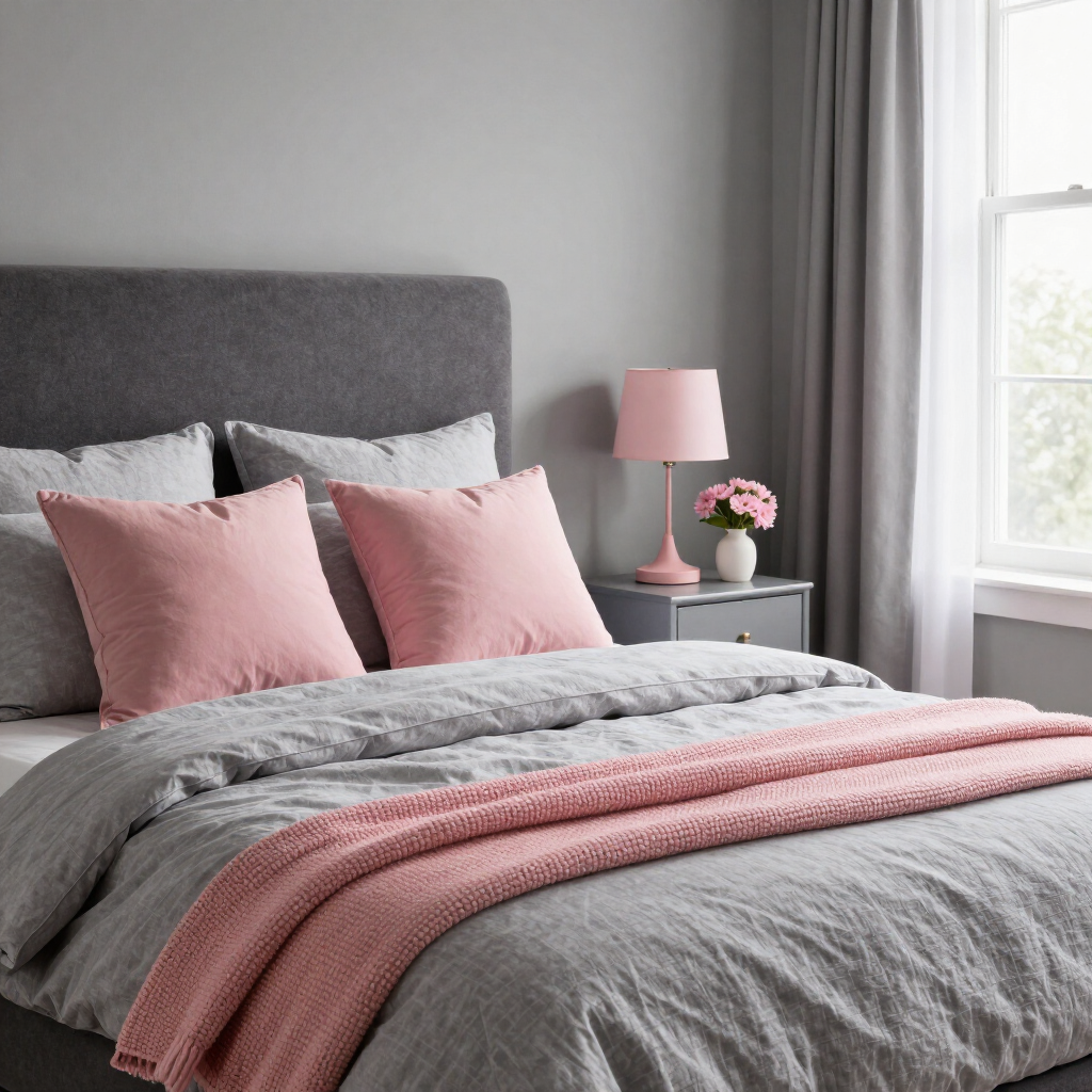
Stepping out of a neutral comfort zone can feel scary, especially when it comes to your home interior. You don’t have to worry — many 2027 color-of-the-year picks work beautifully in surprising, expressive pairings. Designers are embracing rich, layered combinations that bring warmth, depth and character back into the home. Whether you want to refresh your interior walls, upgrade your furniture or boost your curb appeal, these five unexpected 2027 color pairings can be easily tested in low-commitment ways. Brown and Beige Can Soften Blue in a Living Room California Paints' Quiet Peace, named a top 2027 color of the year , redefines how people approach deep blues. The color was designed primarily as a soothing, grounding neutral rather than a loud accent. As a result, Quiet Peace anchors a room with a serene sense of balance. Try pairing this rich shade with subtle wood tones, such as earthy browns and creamy beiges. The restorative, nature-inspired palette creates a cozy feeling. You can start small and use this color combination through a soft wool throw blanket draped over a tan leather sofa. Another easy application is placing an upholstered accent chair against a beige wall. Green and Brick Red Work Beautifully in a Front Yard When people think about updating exterior brick, their first instinct is often to stick with white trim. Benjamin Moore’s Webster Green offers an unexpected yet striking match for classic red brick exteriors. The color draws out the natural, earthy undertones of fired brick, improving your home’s curb appeal. Use your front yard to test this high-impact combination in small, flexible ways. Incorporating plants in front of your bushes or along your entry walkway can make your home feel more inviting. Repeat the green through details like painted planters, a wreath, updated house numbers or a doormat. These accents let you echo Webster Green against brick without repainting the entire exterior. Pink Can Brighten Gray in a Bedroom Gray bedrooms have dominated interior design for years. However, standard grays can occasionally feel a bit flat or utilitarian on their own. Valspar's 2027 forecast solves this by pairing Moon Shot, a warm-toned gray, with Cottage Door, a grayed-out blue, and a creamy pink such as Apricot Blush. This soft palette creates a balanced mood that feels sophisticated , restful and gently energizing. If your room currently features gray bedding or light gray walls, introduce these colors in tiny, low-risk doses. For example, you can add a pair of textured blush accent pillows or a folded gray-blue throw blanket. Rose and Chocolate Brown Mix Well in a Dining Room For a long time, dining spaces relied on safe, low-contrast wood tones or strict monochrome furniture sets. C2 Paint breaks that mold by pairing Pueblo, a warm, dusty rose hue, with "Death by Chocolate," a deep, luxurious brown. Contrasting rich cocoa tones with soft rose has emerged as a favorite way to add instant elegance and intimacy to gathering spaces. You can easily sample this look at your dining table by reupholstering seat cushions with a warm rose or terracotta fabric. You can also drape a rich chocolate-brown linen runner on a rose-toned table to see how the dark contrast grounds the softer base color. Taupe and a Touch of Green Blend Effortlessly in an Entryway Entryways and hallways serve as the ultimate low-stakes testing grounds for new color ideas. Little Greene’s Marle, an elegant and dynamic taupe, provides a good base for such transitional areas. When paired with a vibrant garden-green accent, taupe transforms into a rich, sophisticated backdrop. Even a small pop of green against a taupe wall creates an inviting, memorable first impression as soon as you step through the front door. To ensure the combination feels intentional rather than overwhelming, apply the 60-30-10 design rule. Let taupe serve as your dominant 60% base color on the walls, balance it with 30% secondary neutral tones on woodwork or flooring and reserve the deep garden green for your 10% accent line. It All Starts with One Small Change These 2027 forecasts celebrate creative expression through simple, low-risk experimentation. By introducing new shades in manageable doses, you can watch how colors interact with your existing decor and lighting. You can use peel-and-stick samples, pillow covers, planters or small decor first to test the color pairings before committing to something bolder. Watch your space transform with these small, delightful color combinations.

Picture a chilly morning, a crackling fireplace and a soft, well-loved quilt draped over your favorite chair. Vintage quilts have quietly slipped out of the linen closet to become fall's most versatile design feature. Here's why they're surging in popularity, what's fueling the trend and how you can use one to make your home wonderfully cozy this season. Quilts Are Stepping Into the Spotlight Not long ago, a vintage quilt lived on a guest bed or in a keepsake box. Now you'll spot them draped over living room sofas, spread across bedrooms and folded by the front door as everyday design statements. House Beautiful points to an ongoing shift toward authenticity in design, where handcrafted one-of-a-kind pieces feel special again. Even the runway has joined in, since designers like Bode have worked antique quilts into modern clothing, with every quilt carrying a real link to the past. Thrifting and Nostalgia Are Fueling This Vintage Quilt Revival Think of a Saturday morning at an estate sale, coffee in hand, flipping through a stack of folded quilts. Plenty of people share that ritual. A 2025 Mercari-commissioned survey by Talker Research found that thrifting is a regular activity for 66% of Americans , with 72% of those specifically aiming to save money. Home decor ranked as the second most popular category for thrift purchases at 45%, behind clothing at 71. However, alongside the money-saving angle, 42% also love hunting for one-of-a-kind finds that a big-box store rarely offers. Chances are you've felt the pull too, away from mass-produced decor and toward pieces that carry history, character and a touch of nostalgia. Vintage Quilts Bring Character New Textiles Cannot Replicate Years of washing and snuggling can mellow a quilt's colors, soften its cotton and relax its seams. That gentle wear can give a vintage quilt a patina you cannot manufacture , even when a reproduction looks lovely. So if your find has a faded patch or a loose stitch, celebrate it. Those little marks read like chapters in the quilt's story, and they add to its charm. Even a damaged quilt can find a second life if you're feeling crafty. Cut the best sections into cushion covers for your sofa. Since every vintage quilt is unique, yours brings its own personality, which is exactly why it adapts well to so many rooms and styles. A Single Quilt Can Transform Nearly Any Room in Your Home One vintage quilt can change jobs as you move from space to space. Try these ideas: Layer it at the foot of your bed or under a duvet for a pop of color and extra warmth on cool nights. Drape it over the back of a sofa or accent chair so it's always within reach for movie night. Hang it on the wall as textile art, especially if the pattern is bold or the story is sentimental. Fold it over a bench, ottoman or window seat to give an entryway or reading nook a soft, lived-in touch. Toss it over a porch rocker so you can sip cider outside on crisp evenings. Want a corner that practically begs you to curl up with a book? Drape your quilt over a reading chair and pair it with warm-toned throw pillows for an extra layer of autumn warmth. Orange, red and yellow shades add easy festive color, and picking one or two hues already hiding in the quilt's pattern keeps everything working together. The Right Fall Color Palette Makes Your Quilt Feel Intentional Once you've chosen a quilt, the colors around it decide whether the room feels pulled together or random. Fall offers many beautiful color schemes, from gold and rust to plum and deep creek green, so you can find or style a quilt that suits the palette you love. If your space leans moody, jewel tones like Bordeaux can create a dramatic corner. If you'd like something sunnier, golden shades such as amber and camel can glow beside a cream sofa, and rust-forward looks warm up against nearly any neutral wall. Smooth Modern Accents Keep a Layered Quilt From Feeling Cluttered Balancing cozy textures with smooth and polished surfaces like glass or metal can help a space look curated, rather than overwhelming. Some easy ideas for achieving this include: Setting a glass vase or lantern nearby for a sleek, light-catching contrast. Swapping in metal picture frames or a polished mirror to balance the quilt's soft texture. Placing a ceramic vase or bowl on a side table for a clean, smooth focal point. Sliding a mirrored or metallic tray under a candle so it reflects light across the room. Standing a lamp with a glossy metal base beside your quilted chair for a warm, glowing finish. Your Home Is Ready for Its Coziest, Most Personal Fall Yet Vintage quilts can bring warmth, history and personality into your home in one soft, stitched-together package. Start small by draping a single quilt over your favorite chair, then watch how quickly the room starts to feel like fall. Grab a coffee, hit a flea market this weekend and get ready to fall head over heels for your coziest season yet.
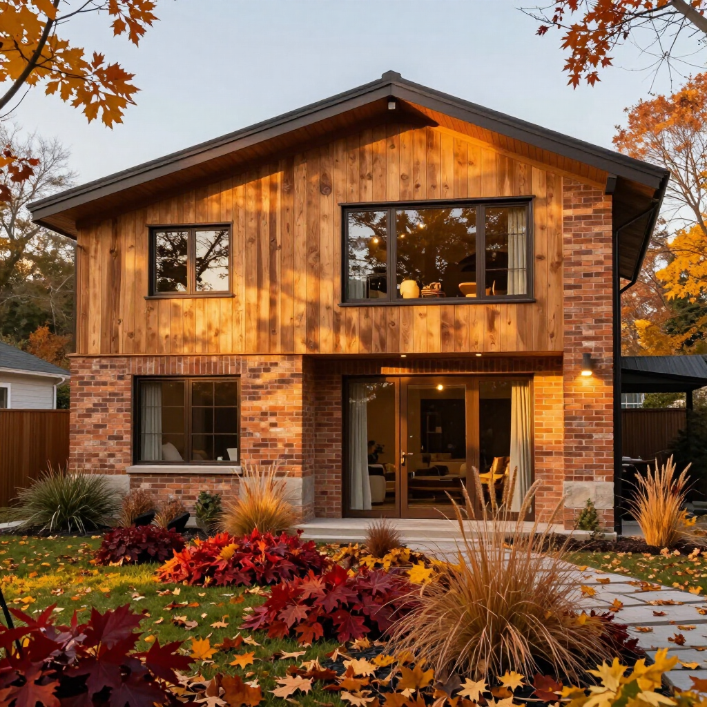
Autumn is a great excuse to bring richer color into your home. You can make a room feel cozier, more dramatic and even more spacious by adding deep reds, earthy greens, moody blues and warm browns. You don’t need to repaint every visible surface of your home to get the effect, either. Simply adding a bold cabinet, an accent wall or a carefully chosen piece of furniture can give your home a seasonal refresh. Which Bold Colors Are Trending This Autumn? Autumn naturally lends itself to richer, deeper colors, from the changing leaves outside to the warmer tones often used indoors. This season, you can expect to see plenty of the following colors: Burgundy and oxblood: These deep reds bring warmth and drama to living rooms, dining areas and bedrooms. Interest in burgundy among designers rose from 7% in 2025 to 21% in 2026, according to 1stDibs’ 2026 Interior Design Trends survey. Chocolate and espresso brown: These earthy shades create a cozy, grounded look. Chocolate brown was selected by 33% of designers surveyed by 1stDibs, nearly twice its 17% share in 2022. Deep and mossy greens: Green can bring an earthy, restful quality indoors. Deeper hues like forest and olive green are now sharing space with the sage green trend of the last decade. Terracotta and burnt orange: These warmer shades bring some of autumn’s outdoor palette inside without relying on traditional pumpkin orange. Ochre and mustard yellow: Butter yellow may have solidified its status as a major trend over the last few years, backed by a massive 324% year-over-year spike in global searches between February and May 2024-2025. However, prepare to see deeper yellows, such as ochre and mustard yellow, this season. How Can Bold Hues Change the Mood of a Room? Color can influence how you experience a space. Green typically evokes the feeling of harmony , tranquility and growth, which makes the color a natural fit for bedrooms, home offices or a quiet corner. Blue, on the other hand, is linked with inner reflections, so it may suit spaces where you want a calmer atmosphere. Warmer hues can create a different effect. Burgundy and chocolate brown may make living rooms and dining areas feel richer and cozier, while ochre can bring energy to a darker room. You can then adjust the effect by changing how much of the color you use. How Can You Use Bold Colors to Change the Feel of a Space? Going bold can be a little intimidating if you usually stick to neutral colors in your interior design. You might love the idea of a deep burgundy wall or forest green for cabinets, but the thought of living with that color every day is another story. However, you don’t have to pick between bold and neutral, as you can simply bring them together. Neutrals are still a favorite for a reason. The NKBA Annual 2026 Kitchen Trends Report found that 96% of people chose neutral colors as the most popular kitchen palette. These colors are easy to pair with bolder shades when you want a little more personality. The trick is to use neutrals as your base, then let one bold hue take the spotlight. You can follow the 60-30-10 rule, with 60% of the room in your main color, 30% in a secondary shade, and 10% in an accent. Creamy walls, natural wood and a few burgundy details can give plenty of autumn color without making the whole room feel like a commitment. Here are a few ways to bring that mix into your home. Create Depth With a Dark Accent Wall A dark, saturated wall can make a room look deeper by drawing the eye toward it. Try painting the far wall of a small room in a rich shade to give the space more depth. You can use the same idea to balance an awkward layout. In a long room, a bold wall at the end can give the space more structure and create a clear focal point. Keep the other walls lighter so the darker shade stands out. Make a Small Space More Intentional With Color Small rooms can be excellent places to experiment. A powder room, pantry, hallway or reading nook gives you a contained area for a stronger shade. Try deep green in a small bathroom or burgundy in a cozy reading corner. Pair the color with warm white, cream, natural wood or other lighter finishes to keep the room from feeling too heavy. Use Bold Cabinetry as the Main Event Cabinets usually take up a large part of a kitchen, so changing their color can quickly transform the room. Some of the most popular colors are saturated jewel tones, earthy dark hues and spicy warm accents. Before committing, view color samples beside your flooring, walls and countertops. Keep in mind that lighting can change how a color looks throughout the day, so check your samples in both natural and artificial light. Let Your Home Fall for Color This fall, let your home have a little fun with color. Choose a hue that suits your mood, then give it a strategic place to shine. One bold wall, a colorful cabinet or a statement chair can give your space a whole new personality.
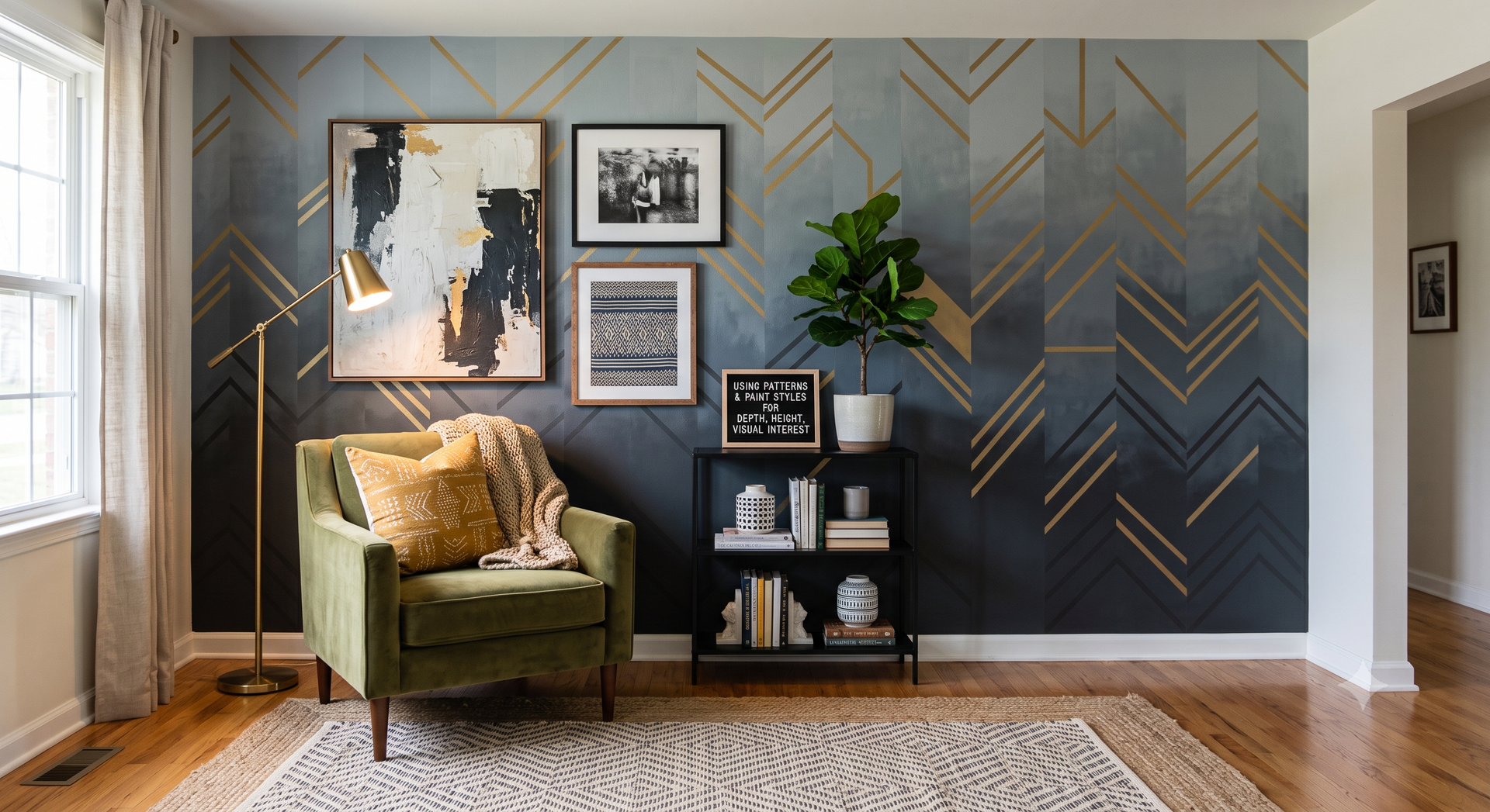
If your rental property isn't making money like it used to, the problem might not be the market. Outdated or overly personalized design choices can make potential tenants walk away before they even schedule a showing. Fortunately, a few expert-backed design principles can transform your space into a tenant magnet that stays rented and profitable. 1. Offer a Neutral Blank Canvas You might love that deep teal accent wall or the custom wallpaper in the dining room, but potential renters want to envision their own belongings in the space. Bold personal choices can actually work against you because quality tenants are looking for a place they can make their own. "Everyone who rents your property wants to transform it into their idea of home. That is only possible if you offer them a blank canvas,” says Realty Management Associates, Inc. “It means that the moment you have added the fundamental elements of the design, you should stop." However, the blank canvas you provide must be nicely done and properly maintained. "If your place isn't showing its best, a good prospect's impression will probably be negative ,” explains Harrisburg Property Management Group, which manages over 2,000 properties across Central Pennsylvania. “Good renters will 'judge a book by its cover' with your rental property, because they're going to seek the same standards in their home that they exemplify themselves." 2. Invest in Durable Materials Rental units take a beating over time, making durability just as important as aesthetics when you're selecting finishes and furnishings. Consider: Countertops: Quartz creates a high-end impression and is easy to maintain. Your tenants can spill coffee or wine without causing permanent damage. Performance fabrics: If you're offering furnished or partially furnished rentals, skip the delicate linens and opt for stain-resistant performance fabrics that can handle real life. Resilient flooring: Luxury vinyl plank flooring mimics hardwood but withstands scratches, moisture and heavy foot traffic. “Always use outdoor area rugs in a rental project, even indoors,” advises designer Sandra Asdourian. “They are better made for lots of wear and tear." Smart material choices mean fewer repair calls, lower replacement costs and easier turnovers between tenants. 3. Maximize Available Storage Ample storage is important for tenants, yet many landlords overlook this simple upgrade. If your rental property isn't making money the way you hoped, consider whether the lack of storage is turning away prospects who have nowhere to put their belongings. “Incorporate clever storage solutions such as built-in shelving, under-bed storage, or multi-functional furniture,” advises Design + Implementation Group. “This not only adds value to the property but also helps tenants keep the space organized and clutter-free.” A well-organized closet with double rods and shelving costs relatively little to install but signals to tenants that you've thought about their daily needs. Attention to detail can be the difference between a quick rental and months of vacancy. 4. Upgrade Lighting and Window Treatments Lighting can completely transform the mood and perceived size of any space. A good lighting upgrade might include: Swapping out harsh bulbs: Replace builder-grade fluorescent or cool-toned bulbs with warm, ambient lighting to make the space feel welcoming. Adding mood lighting for ambience: Layer floor lamps and table lamps in living areas to create depth and make spaces feel more inviting and livable. Installing smart window treatments: Choose options that offer privacy while still letting natural light filter through. Renters want to feel secure without living in a cave. Beyond Design Strategies You've painted the walls neutral, upgraded the countertops and added plenty of storage. But if your rental property isn't making money even after these improvements, it's time to look beyond design. For example, consistent maintenance keeps tenants happy and protects your investment over the long haul. If you prefer a hands-off approach to your rental properties, maintaining consistent maintenance is often easier to set up when working with a property management company. “By working with a property management company, you gain access to an entire network of vetted contractors for all necessary repairs, frequently at a much lower cost than you might be able to secure on your own,” notes Harrisburg Property Management Group. Beyond contractor access, professional property managers can help reduce vacancy periods through effective property promotion. Experts use targeted marketing strategies to reach your ideal tenants, helping your property earn money rather than cost money by standing empty. Setting rent at the right price point for your local market is also essential. Undercharging means missing out on income, but overcharging can discourage tenants and lengthen vacancy periods. “A recently renovated or well-maintained property can command a higher rent,” explains Harrisburg Property Management Group. Professionals with in-depth local market knowledge can advise you on which design upgrades or new amenities will appeal to the right demographic and help your property stand out. Maximize Your Rental Investment If your rental property isn't making money the way it should, going back to basic design principles may help. Add a robust maintenance program and professional property management support, and your rental can remain competitive and profitable for years to come.
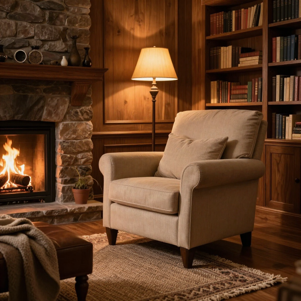
Home design has leaned toward open floor plans, clean lines and what is famously known as “millennial gray” for years. Now, the pendulum is swinging to something a little cozier. Dens are returning, earthy colors are warming up interiors and separate rooms are getting another look. Here’s how the cozy-den trend is changing the look and feel of modern interiors. Warm Colors Replace Minimalism’s Cool Restraint Minimalist interiors favor white, gray, cream and other understated neutrals. Cozy dens take that restrained palette somewhere warmer, bringing shades such as terracotta, rust, olive, ochre and rich brown. The 1stDibs 2026 trend report shows this growing preference for richer colors, with 33% of respondents picking chocolate brown as a top color for the year ahead, nearly twice its 17% share in 2022. You can see the same appetite for stronger color in the popularity of maximalist and eclectic styles. These deeper hues can give your den a more enclosed, intimate quality, especially beside brighter shared spaces. A chocolate brown wall, rust-colored chair and olive rug can create plenty of visual depth through color alone. Your room can feel layered and expressive without filling every surface with decorations. Texture Brings Back the Tactile Side of Interior Design A room can look simple without feeling bare, and texture is a big reason why. Think of the difference between a plain sofa and one covered in linen, boucle, velvet or woven fabric. The shape might stay simple, but the surface gives the room something to touch and look at. This trend of adding texture is certainly not new. Pile fabrics, for example, have been used for many years, with early examples from ancient Egypt and traditional Siberian carpets. You can add patterns to the mix, too. A patterned rug, wallpaper or upholstered chair gives the eye more to explore and makes the room feel less carefully edited. These extra details help a den feel more lived-in, which is a big change from the smooth, pared-back look that has dominated minimalist interiors. Natural Wood Adds Character That Changes With Time Natural wood fits right into the cozy-den comeback because every piece has its own little quirks. You can see the grain, knots, color changes and small imperfections, so it’s rare for a wooden table, door or cabinet to look exactly like the next one. Moreover, natural woods get even more interesting with age. For example, sapele’s coloring can begin with anything from a golden hue to deeper reddish and dark brown tones, then take on a richer, darker appearance as it ages. Walnut goes in the other direction, gradually becoming lighter over time. The slow change gives your interior a sense of history. Separate Rooms Create the Intimacy Open-Plans Often Lack Open floor plans can make your home feel bright, spacious and easy to move through. While that appeal cooled for a while, the love continues flaming up. A 2026 survey by the American Architects Institution found that 60% of people now preferred easy-access or open layouts, compared to 31% in the previous year, proving a renewed interest in open-plan living. However, a separate room gives you something an open space cannot always provide. Closing a door can make a movie night, a reading session or a long conversation feel like its own little event. You don’t need to do a big renovation if you want to develop closed spaces in your open-layout home. You can simply use furniture to separate rooms into designated areas. Personality Takes the Place of Perfectly Edited Spaces The cozy den trend leaves plenty of room for the things that make a space feel like yours, such as a shelf full of action figures, walls covered in artworks and plants filling every negative space. This may explain why the trend also lines up with the return of retro decor, which draws on styles from the 1950s to the 1980s. Although minimalist designs can certainly be personal, the visual language usually means keeping fewer things on display. More and more people want to fill their space with discoveries that say something about who they are, making their home cozier and more personal. Cozy Is Closing the Door on “Open Everything” The return of the cozy den shows that your home can make room for different design languages at once. You can have an airy communal space and a room that feels darker, softer, warmer and distinctly yours.
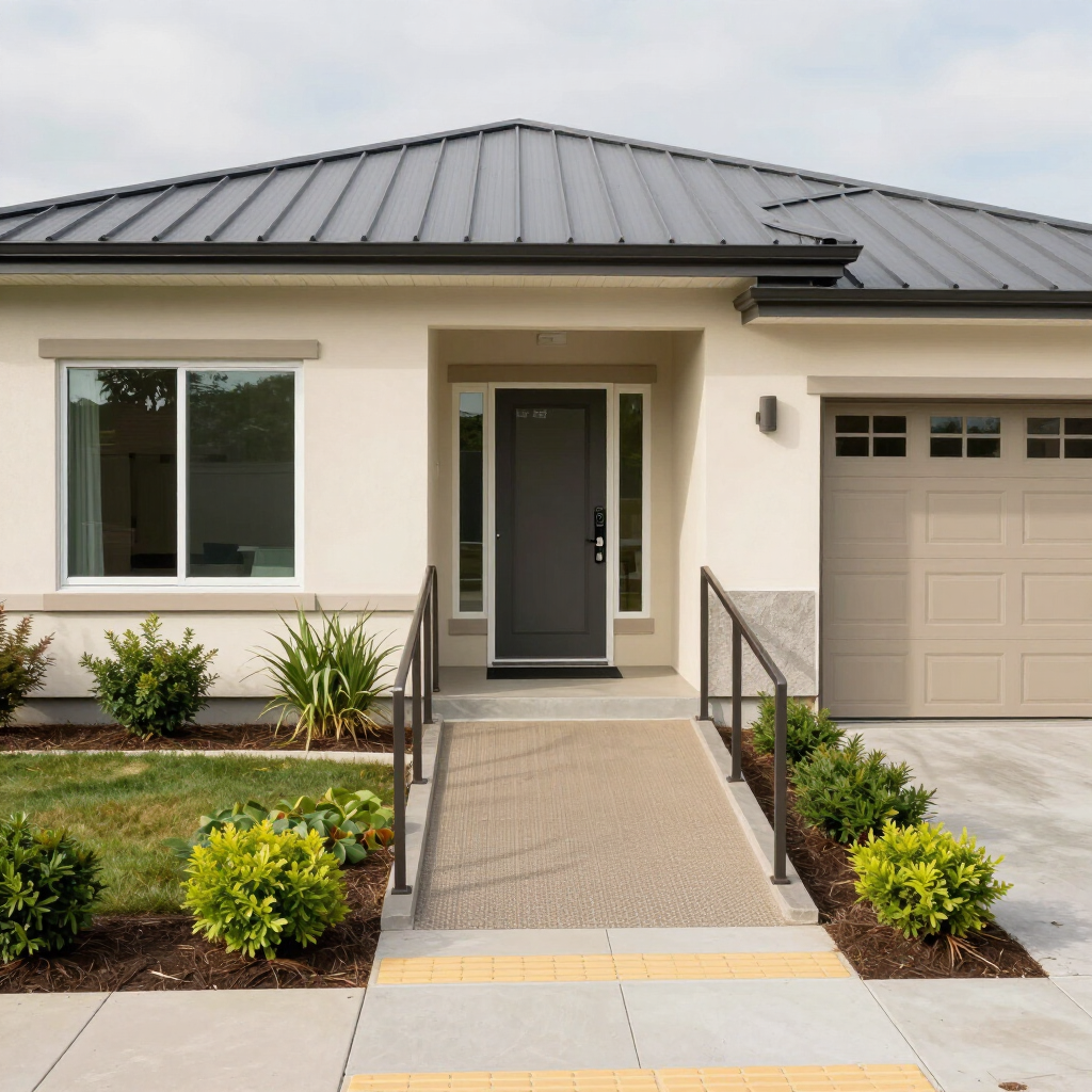
Imagine a home where every room welcomes you, no matter your age, ability or life stage. Accessible or universal design means every choice, from the layout to the furniture, prioritizes comfort and ease of use for all users. Thoughtful choices in design contrast, texture and flow can make your space friendlier, safer and more stylish for everyone. The Importance of Accessible Homes Over one in four adults in the U.S. has some type or level of disability. That means there’s a good chance you, someone you love or a visitor could benefit from more accessible spaces within the home. Accessibility also considers future-proof design features because your needs, routines and household can change over time. For example, adding a wider doorway now can make everyday life easier later, whether you’re moving bulky furniture, pushing a stroller, recovering from an injury, or assisting a loved one who uses a walker or wheelchair. Finish Contrast Highlights Uses and Spaces For a subtle yet accessibility-boosting home update, play with your home’s finish and light reflection. You can keep walls, trim and ceilings the same color to create a calm, cohesive look. Then, use different sheens to define edges and transitions. They catch light differently than flatter wall surfaces, which makes openings, level changes and circulation paths easier to identify. Here are other finish-focused ideas for your home renovation: Use a satin or eggshell finish on doors and trim so openings stand out through sheen. Choose a slightly more reflective finish for stair risers to help people distinguish changes in elevation. Pick cabinet or drawer pulls made from distinctive metals, like brushed brass or polished chrome, so you can identify the handles at a glance. Layer overhead lights and bright lamps to help different finishes remain visible from day to night. Maximize natural light with strategic windows, window treatments and curtains. Texture Adds Comfort and Character Texture evokes different responses and supports everyone. For example, there’s something comforting about feeling a soft rug underfoot. If you mix different materials, such as plush and smooth, you can give your senses more cues and make spaces feel safer and cozier. This is especially useful in rooms where avoiding slips and getting your bearings matter, including bathrooms and entryways. Simple additions, such as textured, color-contrasting strips on stair steps, make it easier for everyone to spot changes in surface level or direction. Here are more ideas for thoughtful textures: Place grip mats in bathrooms or kitchens where the floor is likely to get wet. Swap out smooth handles for ones with tactile details to make them more distinct. Choose sofa fabrics, throw pillows or wall art with a visible pattern so individuals with limited sight can get a feel of the room by touch. Intuitive Flow Makes Life Easier The best homes feel logical to move through, even when you’re distracted, carrying groceries or entertaining guests. Intuitive flow means you always know where to move next. Think naturally wide walkways, clutter-free routes and clear room transitions. Thoughtful furniture placement prevents awkward obstacles by spacing seating, tables and shelves for easy movement. Intuitive flow and accessibility can support independence and ease of movement in multilevel homes. For example, a wheelchair-friendly elevator can make upper floors more accessible for individuals with mobility issues or those who want to age in place. The best home layouts work regardless of someone’s capabilities and age. Here are more flow tips: Mark activity zones by setting down huge rugs or clustering furniture. Use a wide console near your door for easy drop-offs when you come and go. Place hooks, shelves or baskets at comfortable heights for everyone. Accessibility Is Good Design When you design for everybody, you design for a happier, more flexible future. Any change you make — whether it’s a bold color choice or a more thoughtful layout — for comfort, style and inclusiveness is a win for every occupant and visitor.

You have things that matter to you, whether it’s vintage vinyl, favorite books or souvenirs from your travels. Yet often, these special items get tucked away in boxes or squeezed onto shelves. Finding a way to display your collections without disrupting your carefully designed space is a challenge many people face. The good news is you don’t have to choose between displaying your passions and having a stylish home. With a few simple tips, you can turn your favorite items into eye-catching displays that actually enhance your decor. Explore fun ways to highlight what you love while keeping your space looking great. Why Showcase Your Passions Many homeowners fear that displaying personal hobbies will make their space look cluttered or juvenile. This mindset is worth reframing. When displayed thoughtfully, your collections become intentional design elements. They're unique storytelling elements that make a house feel like an authentic home. A space that reflects your personality is far more interesting and welcoming than a generic, catalog-perfect room. Start by identifying three to five hero pieces from your collection. These are the items that hold the most personal meaning or have the strongest visual appeal. Focusing on your favorites makes the task less overwhelming and ensures your display feels intentional rather than haphazard. Tips for Displaying With Intention To curate a collection in a design context means making deliberate, thoughtful choices. Embrace the less-is-more philosophy. A few well-displayed items often have a greater impact than a hundred crowded together. Consider these tips and principles: Group similar items: Display similar things together, whether it’s by color, theme, or type. It’s a simple trick, but it really draws the eye and makes your collection look intentional. Use the rule of odds: Go with odd numbers when you arrange things — threes, fives, or sevens. Odd-numbered groups just feel more natural and visually interesting than even ones. Give it breathing room: Don’t be afraid of empty space. Leave a little breathing room around each piece to help it stand out and keep everything looking neat and purposeful. Creative Display Solutions for Common Collections Different hobbies require different approaches. Here are specific, actionable ideas for common collections. For the Media Lover If you collect vinyl records, CDs or DVDs, use vertical space to your advantage. Tall, narrow bookcases keep media organized without overwhelming a room. Picture ledges work beautifully for displaying album art, and rotating featured pieces seasonally keeps your display fresh and dynamic. For the World Traveler Create a cohesive gallery wall with frames in a similar style or color. This pulls disparate images and mementos together into one intentional feature. Small souvenirs can live on floating shelves within the gallery, and mixing flat pieces with three-dimensional objects adds visual depth. For the Builder and Creator Display cases with integrated lighting are ideal for protecting creations while highlighting them. Acrylic or glass cabinets keep dust away from delicate surfaces. Hanging organizers are also a good space-saving trick , making them an ideal option for less precious accessories. The transparency lets your work shine without adding visual clutter to the room. Create a Dedicated Zone Sometimes, a shelf just isn’t enough, especially if your hobby needs a bit more room or special care. If that sounds like your collection, why not set aside a dedicated spot for it? A cozy den, an unused corner or even a revamped garage can easily become your personal hobby hub. That way, everything has its place, and you can really enjoy your passion to the fullest. Garages are particularly appealing for larger collections. However, proper finishing is essential. Unregulated temperature swings can quickly damage collectibles , which defeats the entire purpose of having a dedicated display space. Successfully incorporating a hobby zone is part of a larger strategy for creative storage solutions throughout your home. Let There Be Light: Illuminating Your Collection Lighting transforms a simple display into a professional-looking feature. Strategic illumination draws the eye and creates visual interest. Accent lighting: Spotlights or picture lights draw attention to specific pieces and create focal points in your room. Integrated lighting: Shelves or cabinets with built-in LED strips provide even, flattering illumination that makes your collection look museum-quality. Moreover, LED bulbs utilize 75% less energy and last longer. Natural light considerations: Position collections away from direct sunlight to prevent fading, but near windows to let ambient daylight enhance colors and textures during the day. Your Home, Your Story Displaying your collections with intention elevates your home's design rather than detracting from it. Curate thoughtfully, find the right display solution for your hobby, consider dedicated zones for larger collections, and use lighting effectively. A well-designed home should always reflect the personality and passions of the people who live there.
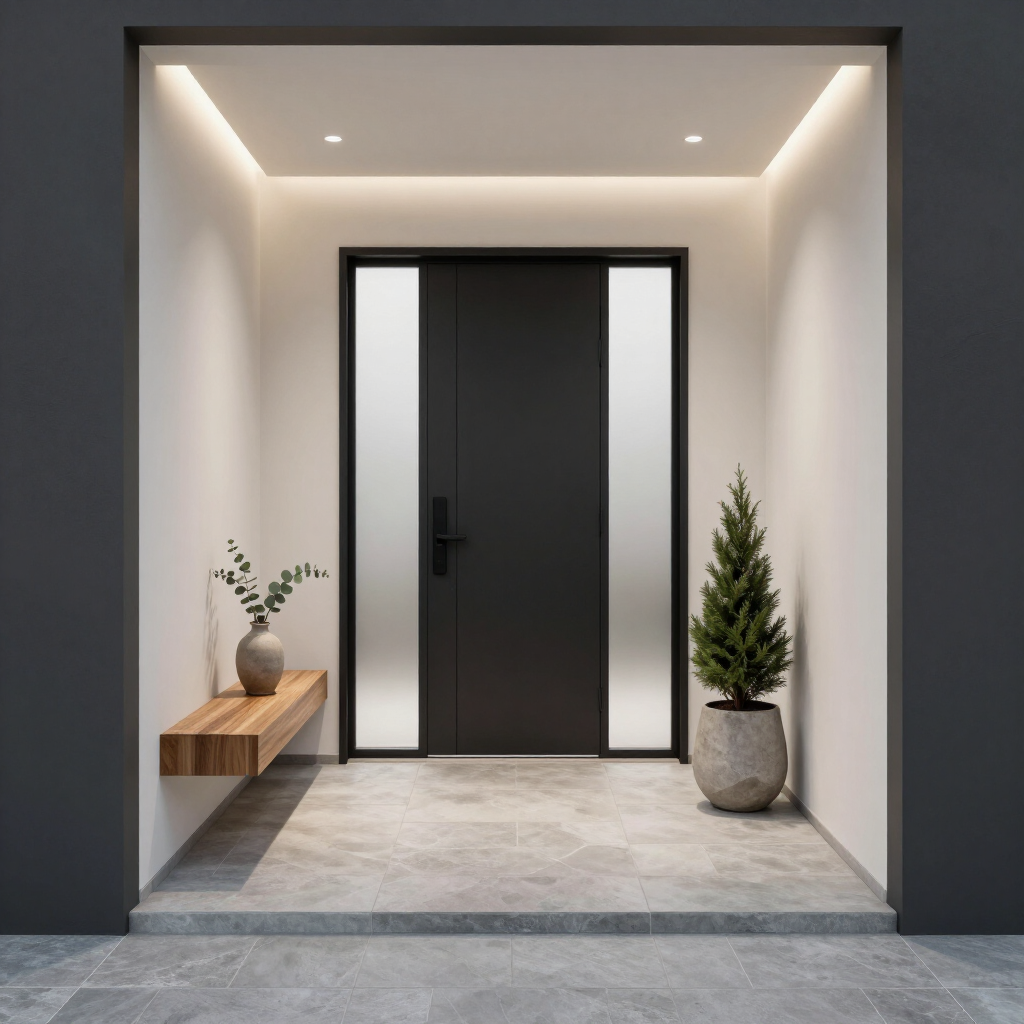
Your entryway makes the first impression, setting the stage for your entire home. Whether guests are greeted by a front porch bursting with flowers or a tidy mudroom with warm lighting, this space instantly signals what's to come. With a few simple seasonal updates, you can create an entry that feels fresh, welcoming and thoughtfully designed all year. Spring Outdoor Styling That Feels Fresh and Inviting Spring is the easiest season for a quick refresh because nature provides much of the inspiration. Start with a lighter color palette such as soft green, pale blue, creamy white or blush. A new doormat, a pair of planters filled with seasonal flowers and a wreath made of fresh or realistic greenery instantly brighten the front porch. If you want to decorate a small table, choosing the right vase is key to a beautiful flower arrangement. Select one that complements your blooms and the overall design style. For instance, tall vases are ideal for long-stemmed flowers , while narrow-necked vases work well for showcasing a single flower or just a few stems. Natural light intensifies in spring, so consider how sunlight falls on your front door throughout the day. Light-colored exterior surfaces generally absorb less heat than dark surfaces, which can help reduce heat buildup around entry areas. Choosing lighter seasonal accessories can keep the porch feeling cooler and more comfortable during sunny afternoons. Summer Porch Styling That Stands Up to Heat and Sun Summer is when outdoor entryways work the hardest. Strong sun, humidity and heat can affect both your decor and your front door. If your door is made of wood, heat and humidity can cause it to expand , making it harder to open and close. Prolonged sun exposure can also fade paint and contribute to chipping and cracking. This is why it is worth choosing durable finishes and regularly checking your door's condition to keep things looking intentionally styled. If your porch receives intense afternoon sun, add shade with a porch awning, exterior shade sail or a large potted plant positioned to protect the door. Inside your front door, leave open baskets for sandals, a tray for sunglasses and a ceramic bowl for keys to help maintain order during the busiest travel season. Swap heavy winter textiles for lighter materials such as cotton, linen or woven grass. A slim runner in a subtle botanical pattern, a vase of fresh branches and a mirror that reflects daylight can make a small hallway feel noticeably brighter. Fall Styling That Adds Warmth and Texture As temperatures cool, your entryway can become richer and more layered. Fall is the season for texture. Think woven baskets, natural wood, matte black accents, and textiles in rust, olive, camel and deep burgundy. Olive green emulates the colors of the season , making it a natural fit for cozy fall spaces. On the porch, use pumpkins, ornamental grasses and lanterns rather than overcrowding the space with many small decorations. A single oversized planter on each side of the door often looks more curated than several tiny pots. If you enjoy seasonal wreaths, choose one with dried leaves, eucalyptus or seed pods for a sophisticated look. Indoors, add a washable rug with a deeper color palette and include a bench with a textured throw. A small table lamp in the foyer can make evening arrivals feel especially cozy as daylight hours shorten. Winter Styling That Feels Welcoming and Festive Winter entryways should focus on warmth, function and light. Snow, rain and mud can quickly make this area feel chaotic, so storage becomes part of the design. Closed baskets, boot trays and wall hooks keep outerwear organized while still looking attractive. For outdoor decor, evergreen branches, simple white lights and a natural wreath provide seasonal charm without overwhelming the architecture of your home. Avoid blocking pathways with large decorations, especially in areas that may receive snow or ice. Lighting in entryways and walkways is especially important in winter to enhance visibility and safety. Use brighter porch lighting near steps and warm ambient lighting indoors to create a comfortable transition from outdoors to indoors. How to Create a Curated Indoor Entryway Year-Round No matter the season, the most polished entryways share a few common traits — limited clutter, consistent finishes and a clear purpose for each item. Start with a foundational palette that stays in place all year, such as white walls, natural wood and black or brass hardware. Then layer seasonal accents on top. A simple formula works well in most entryways: One rug One mirror or piece of artwork One light source One storage element, such as a bench, console or cabinet Adding hooks is also an easy way to make your entryway feel welcoming , since they give guests a space to place their coats or purses as soon as they walk into your home. A Welcoming Entry in Every Season Refreshing your entryway seasonally is easier than it may seem. Updating colors, lighting, greenery and a few carefully chosen accessories helps you keep both your outdoor porch and indoor foyer feeling fresh and thoughtfully curated year-round. Small seasonal changes help your home feel more welcoming, functional and connected to the time of year every time you walk through the door.
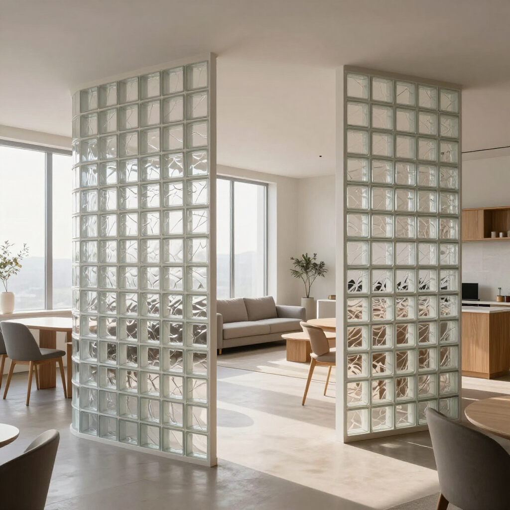
An open floor plan gives off an airy vibe and offers stunning sightlines, but it can sometimes make your home feel like a fishbowl. You love the brightness and flow, but you still need a space to work and relax. Not to mention the privacy issue. Fortunately, translucent glass partitions solve these problems by creating distinct zones that still feel spacious. When placed properly, partitions become a stylish architectural element that’s trendy and beautiful. Understanding the Glass Block Comeback Glass blocks are thick, molded glass pieces that fit together to form walls or partitions. They were a common sight decades ago, but the trend faded. Maybe it’s because it reminded people of Miami Vice. Either way, minimalism took over, and glass blocks fell out of style. Fast forward to today, and designers are seeing the serious design potential. Homeowners are starting to recognize how glass blocks effortlessly blend form and function. Plus, modern manufacturing can give these blocks a more uniform look. Or a jagged look, if you’re fancy. These technological advances are turning a retro relic into something more. Solving the Open Concept Privacy Problem Open floor plans are supposed to brighten up your space and encourage connection. The light is nice, but for some, the openness is a drawback, especially in office environments. Research shows open-plan setups cause mental fatigue , even when you try to ignore the distractions. These issues may also affect casual home environments or work-from-home freelancers. When you’re concentrating on work, and someone is watching TV nearby, you start to see how detrimental an open concept can be. And according to a 2021 Rocket Homes survey, 48.8% of respondents preferred a traditional layout to an open one. Glass partitions give you the best of both worlds. They dampen sound and create visual separation while keeping an airy atmosphere. Zoning Your Spaces While Maximizing Natural Light The right placement can help you define specific parts of your home while maximizing sunlight. Imagine a translucent wall separating your home office from the living room. At 8 a.m., that natural light filters through the textured surface, casting a water-like shimmer across your desk. Your Zoom calls feel more private because the people in the living room can’t see the screen. When the afternoon comes and the sun starts to set, the golden hues keep reflecting through. It keeps that open feel while marking where work ends and relaxation begins. Rachel Robinson, in an article from House Beautiful, stresses the point of treating them like architecture. When glass blocks function as a window rather than as decor, it feels more intentional and less like a nostalgic choice. Pairing High-End Materials With Your Partitions A well-decorated house is a series of intentional choices that add up to a coordinated whole. With this in mind, glass blocks work well with other luxurious textures and materials. Marble countertops, for example, create great visual contrast. The marble stone’s veining plays well against the geometric glass, while natural stone like quartzite and dolomite offers swirling patterns that complement the clean lines of the partition wall. Engineered quartz also works well for similar reasons and provides durability with a high-end aesthetic. The key is to balance the modern quality of translucent glass with the organic richness of natural stone. When together, they make spaces feel contemporary. Exploring Modern Applications Like Glass Block Flooring While glass block partitions are fun, you can also use glass blocks in floors. Forward-thinking designers are incorporating them into hallways and staircases to create a translucent walkway. Underneath the blocks, a designer may add backlighting or images. Just picture a second-floor hallway with sections that transmit natural sunlight from a skylight to a darker first-floor living room. If you have a loft or a modern townhouse, these installations can set your home apart from the rest. But try to avoid areas that require privacy, like bathrooms. Building Budget-Friendly Alternative Partitions If you want a full glass partition installation, you’ll need professional expertise and an up front investment. But if you’re still saving and need a temporary separator, there are plenty of budget-friendly options. For example, you can separate areas with homemade partitions. Tension rods with sheer curtains, movable folding screens or repurposed pallets offer affordable and flexible room division. You can also use these walls to assess where you want to put your glass blocks in the future. Enjoying Your Newly Zoned Home A glass block partition can completely change how you experience your home. You’ll appreciate the dedicated space for focused work while your entertainment and private parts of your life stay semi-separate. Start planning your partition project today to discover these benefits for yourself.
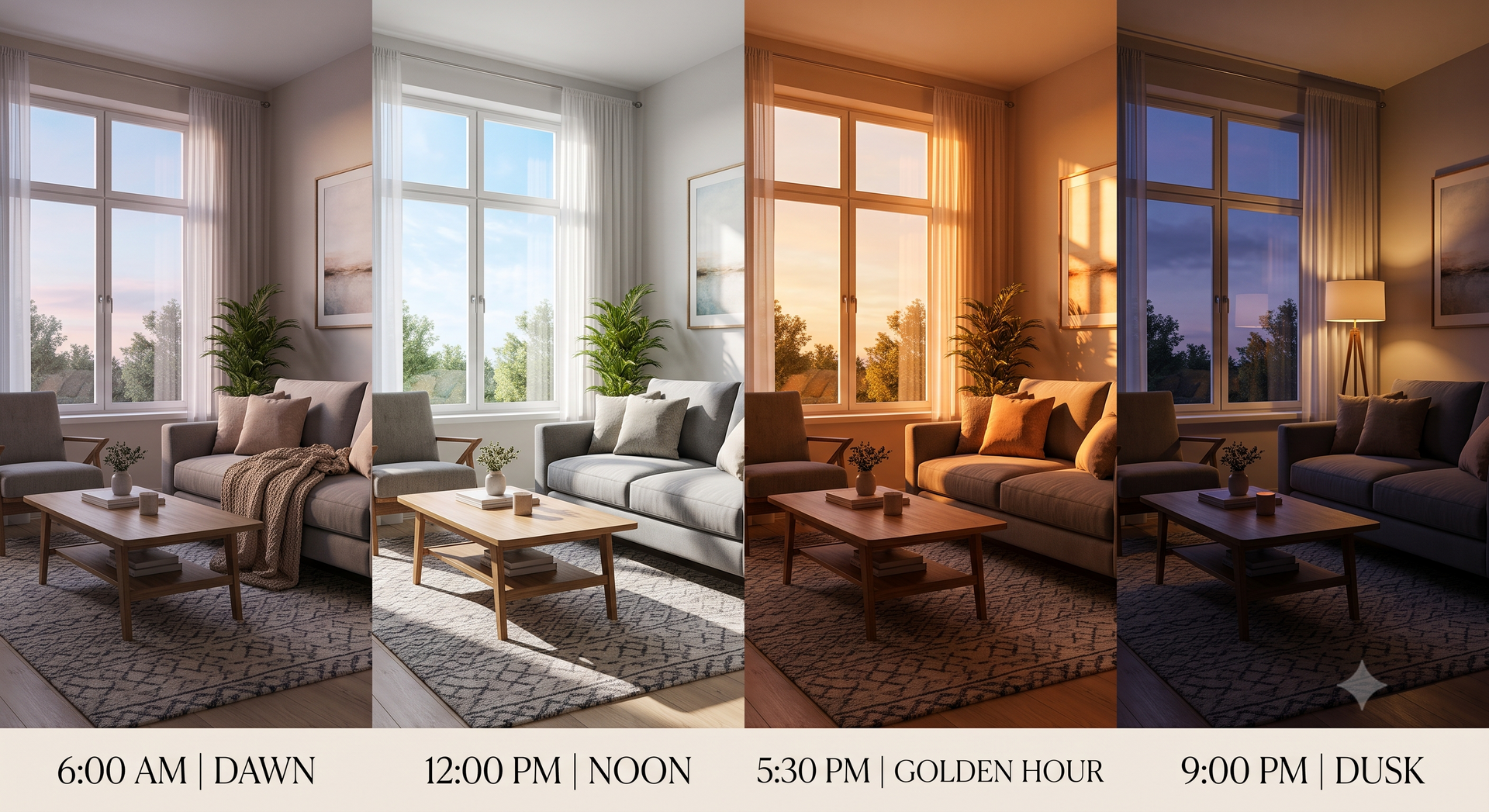
Your living room can feel completely different depending on the time of day. As the sun moves across the sky, it alters the shadows, temperature and the shade of paint on your walls. Whether you're picking new paint colors or making your patio more comfortable, understanding how light shifts helps you take control of your design. The Science Behind Sunlight and Your Space Sunlight’s appearance moves from cool, bluish light in the morning to bright white at noon to warm, golden tones by evening. Your biology responds to these changes, which is why bright rooms wake you up while dimly lit spaces make you sleepy. Research shows that natural light “contributes to mental well-being in various settings” by regulating circadian rhythms , boosting mood, reducing stress and enhancing visual comfort. When designing a home, you're actively designing for your health and comfort. Navigating Cool Morning Light and Fresh Color Tones East-facing rooms showcase the crisp, bluish tint of early morning light at its finest. Lighter paint colors thrive in this environment. Soft white walls appear exceptionally clean, while pale blue rooms take on an airy quality. Imagine sipping coffee in an east-facing breakfast nook with soft, fresh tones on the walls. Natural light amplifies that “awake” feeling, helping you start your day energized. Reserve these palettes for spaces where you want to feel alert early, such as a bathroom, kitchen or home gym. Managing Midday Heat and Intense Afternoon Glare As the clock strikes noon, the sunlight turns from crisp to harsh. It casts sharp shadows and intense glare across your floors and furniture. South and west-facing rooms can quickly heat up, making them uncomfortable and forcing your air conditioning to work overtime. Installing high-quality shades can help you regain control. They block up to 90% of heat before it reaches your windows and can help save up to 30% on energy bills. Motorized options let you adjust the shades with a remote or schedule configurations in advance to keep your space cool during peak hours. Creating Depth and Warmth During the Golden Hour In the late afternoon, the harsh glare of midday softens into a rich, golden hue. West-facing rooms come alive, with wood tones looking richer and paint colors like terracottas glowing beautifully. WebMD points out that people universally associate color with emotions , though responses may vary by individual and culture. “Hue, saturation and brightness affect how you respond to the color in your environment.” For rooms where you spend your evenings, such as a dining room or den, choose earthy tones that harmonize with the golden hour. It’s a subtle signal that it's time to relax. The Impact of Artificial Lighting After Sundown Your home relies entirely on artificial lighting once the sun goes down. A room that feels bright at noon can feel flat at night with harsh, overhead lighting. Layering different sources, such as floor lamps or wall sconces, adds depth and richness to saturated spaces. The color temperature of your bulbs plays a major role in setting the mood. A study found that colored lighting can increase and decrease different emotions among occupants. “Red light reduces feelings of calm, relaxed, stability and pleasure, and elevates feelings of irritated and nervous,” the researchers explained. “Blue light reduces feelings of relaxed and stability and increases irritated feelings. Green light reduces the feeling of pleasure and yellow light reduces irritated feelings.” Stick to warm, soft-white bulbs for relaxation, or use smart lighting to adjust the color temperature depending on your activities. Frequently Asked Questions Here are answers to common questions about how light impacts your home. How does natural light change the appearance of paint color? According to RKM Homes, light intensity and direction can change how color appears throughout the day. “Bright, high-intensity daylight can wash out delicate pastels and accentuate cool or warm biases in near-whites, while low-intensity, diffuse light tends to soften colors and reduce perceived contrast,” the homebuilder shares. Always test paint swatches on your walls at different times before committing. Are motorized patio shades worth the investment? Yes. According to Shading Texas, shades can reduce your energy bill by blocking up to 90% of the sun's heat before it hits your windows. Beyond energy savings, motorized patio shades keep out bugs, block the hot summer sun and protect you from chilly winter winds. The convenience of adjusting the shades with a remote makes them a smart investment. How does the direction a room faces affect natural lighting? Room orientation influences the light you receive. North-facing spaces receive cool, indirect light all day, while east-facing spaces enjoy bright morning sun. Intense light floods south-facing areas most of the day, and western exposures capture the golden glow. Understanding these patterns helps you choose the right paint colors and treatments. Designing a Home That Shines Around the Clock Manipulate light and color to serve your lifestyle, from morning coffee to evening relaxation. Embrace the changing shadows, use shades to reduce intense heat and layer your lighting. With the right strategies, your home will look and feel beautiful every hour of the day.