5 Unexpected 2027 Color Pairings Worth Testing Next Year
Stepping out of a neutral comfort zone can feel scary, especially when it comes to your home interior. You don’t have to worry — many 2027 color-of-the-year picks work beautifully in surprising, expressive pairings.
Designers are embracing rich, layered combinations that bring warmth, depth and character back into the home. Whether you want to refresh your interior walls, upgrade your furniture or boost your curb appeal, these five unexpected 2027 color pairings can be easily tested in low-commitment ways.
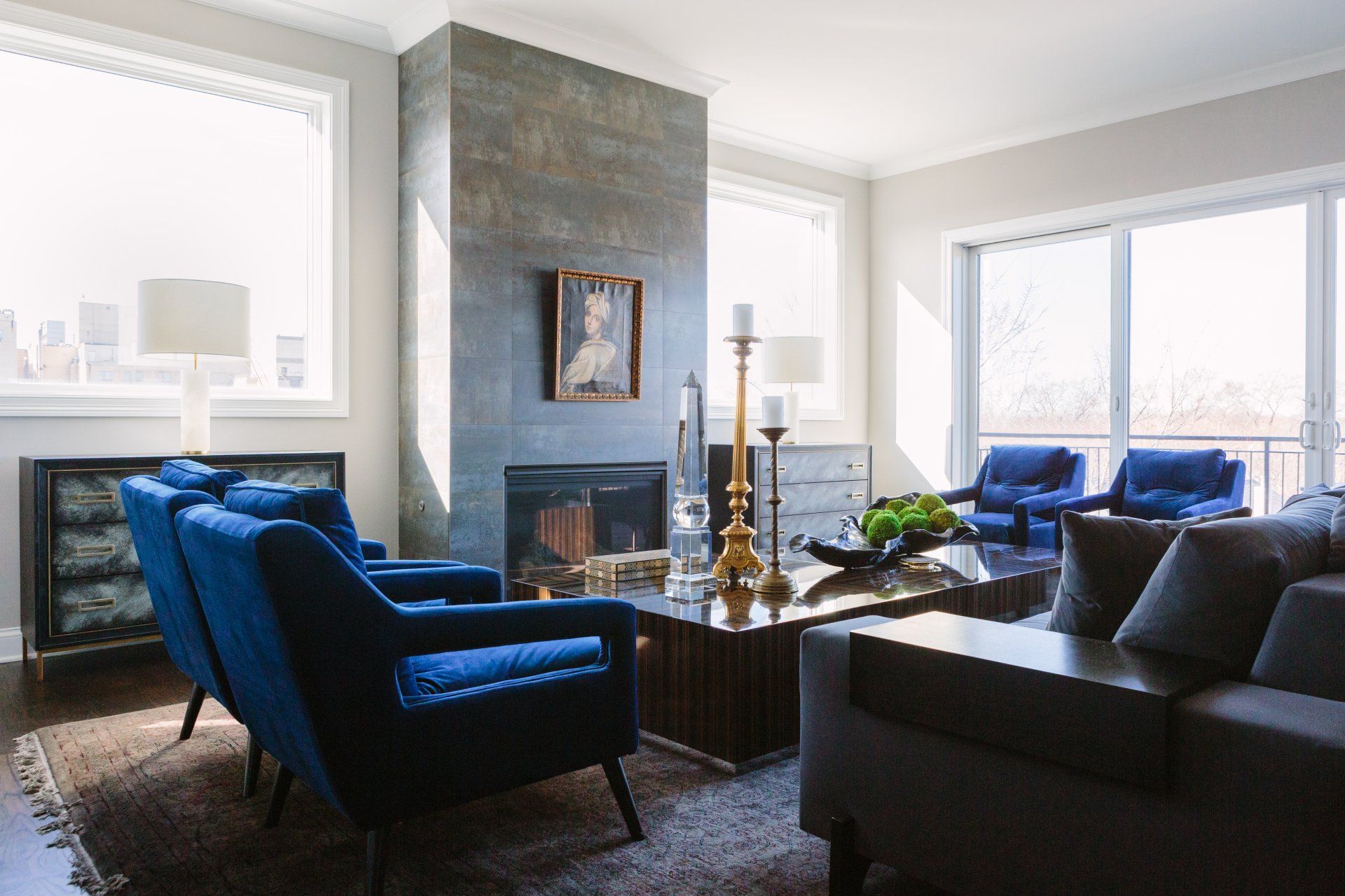
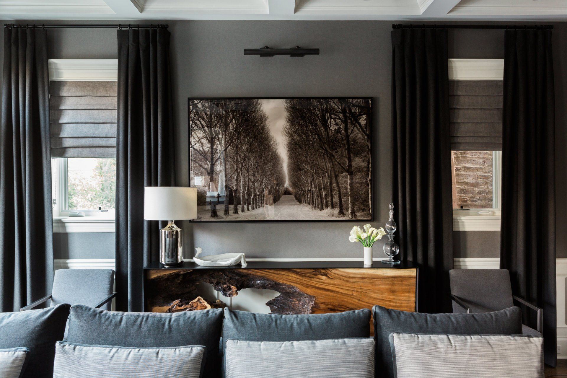
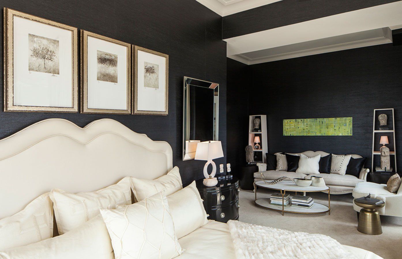
Brown and Beige Can Soften Blue in a Living Room
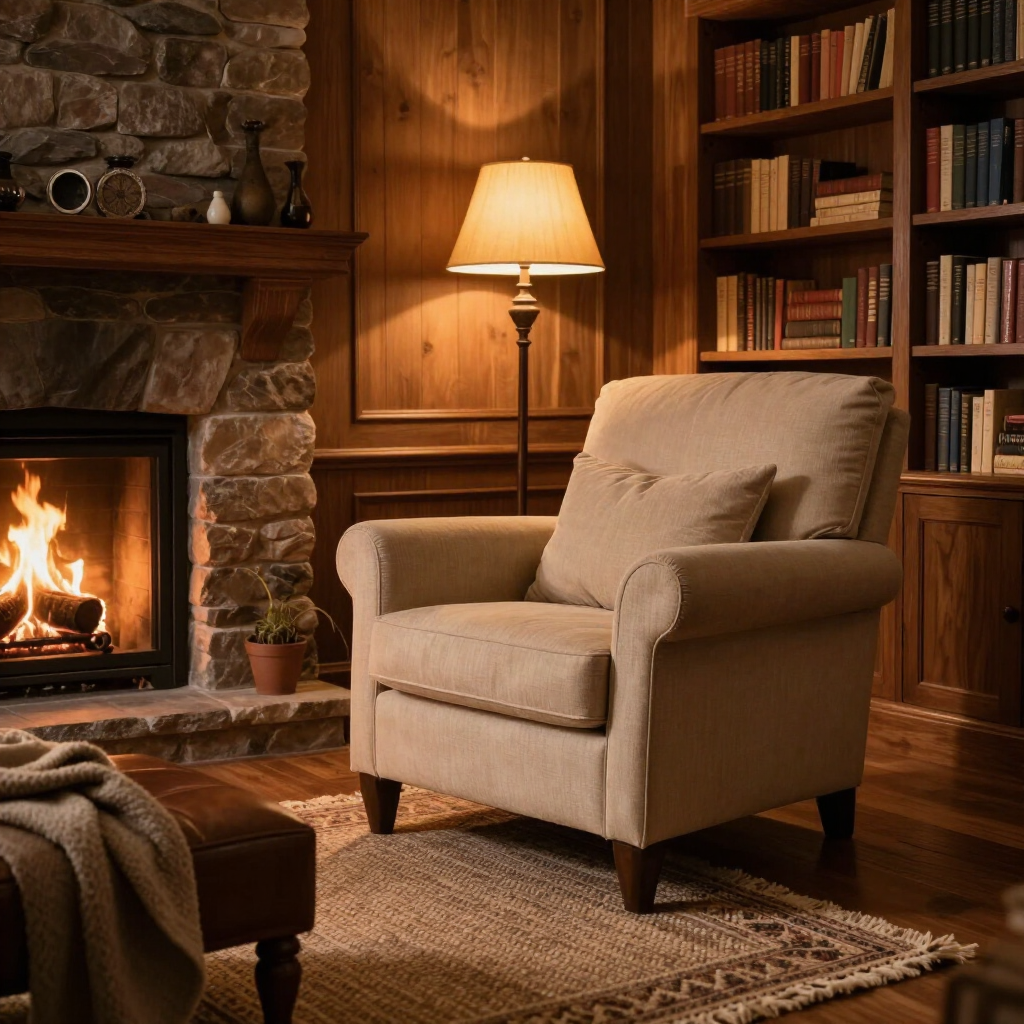
California Paints' Quiet Peace, named a top 2027 color of the year, redefines how people approach deep blues. The color was designed primarily as a soothing, grounding neutral rather than a loud accent. As a result, Quiet Peace anchors a room with a serene sense of balance.
Try pairing this rich shade with subtle wood tones, such as earthy browns and creamy beiges. The restorative, nature-inspired palette creates a cozy feeling. You can start small and use this color combination through a soft wool throw blanket draped over a tan leather sofa. Another easy application is placing an upholstered accent chair against a beige wall.
Green and Brick Red Work Beautifully in a Front Yard
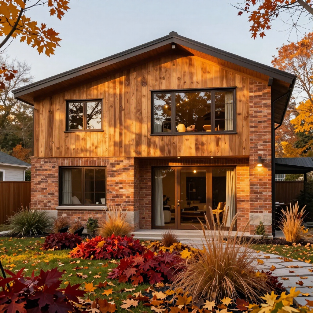
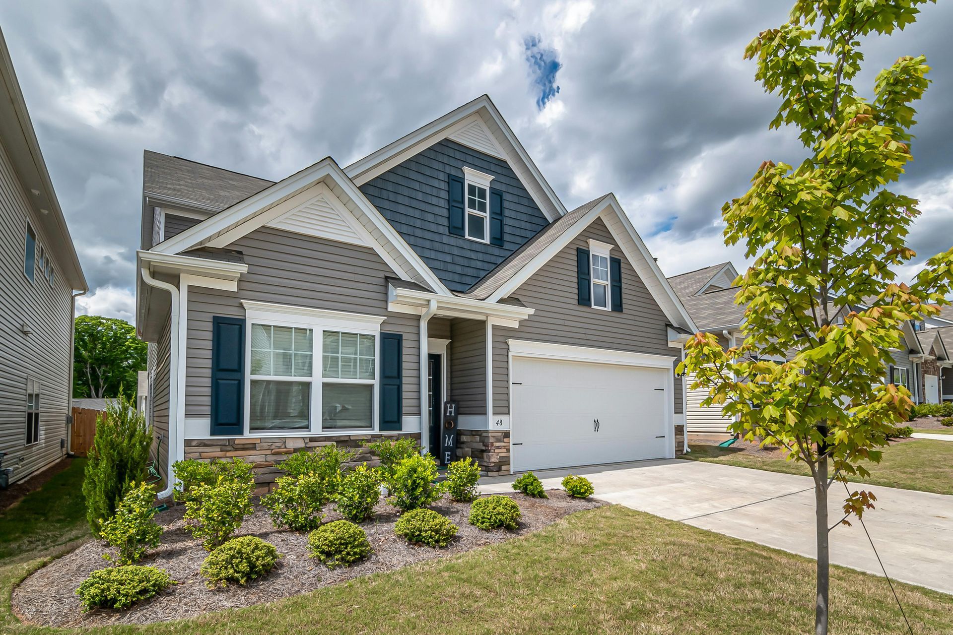
When people think about updating exterior brick, their first instinct is often to stick with white trim. Benjamin Moore’s Webster Green offers an unexpected yet striking match for classic red brick exteriors. The color draws out the natural, earthy undertones of fired brick, improving your home’s curb appeal.
Use your front yard to test this high-impact combination in small, flexible ways. Incorporating
plants in front of your bushes or along your entry walkway can make your home feel more inviting. Repeat the green through details like painted planters, a wreath, updated house numbers or a doormat. These accents let you echo Webster Green against brick without repainting the entire exterior.
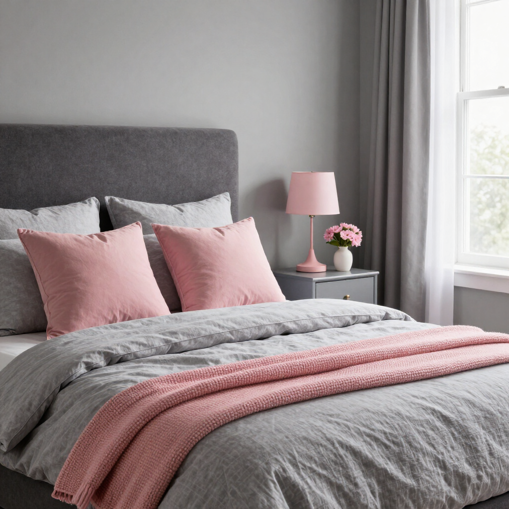
Pink Can Brighten Gray in a Bedroom
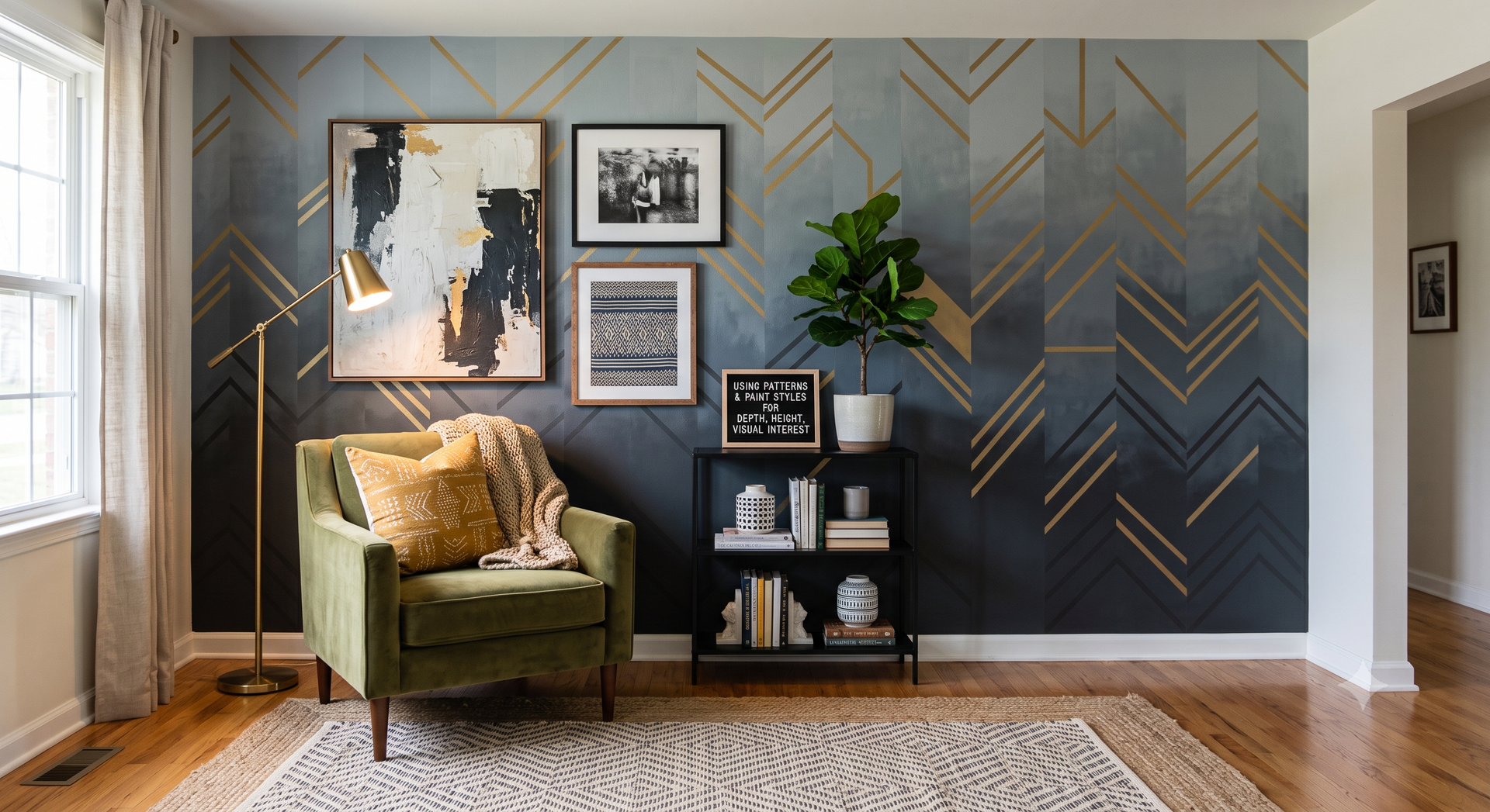
Gray bedrooms have dominated interior design for years. However, standard grays can occasionally feel a bit flat or utilitarian on their own. Valspar's 2027 forecast solves this by pairing Moon Shot, a warm-toned gray, with Cottage Door, a grayed-out blue, and a creamy pink such as Apricot Blush. This soft palette creates a balanced mood that feels sophisticated, restful and gently energizing.
If your room currently features gray bedding or light gray walls, introduce these colors in tiny, low-risk doses. For example, you can add a pair of textured blush accent pillows or a folded gray-blue throw blanket.
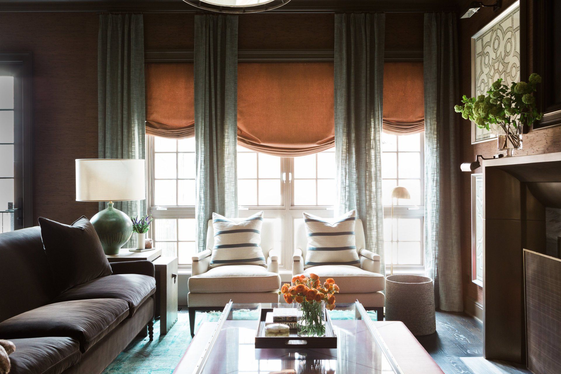
Rose and Chocolate Brown Mix Well in a Dining Room
For a long time, dining spaces relied on safe, low-contrast wood tones or strict monochrome furniture sets. C2 Paint breaks that mold by pairing Pueblo, a warm, dusty rose hue, with "Death by Chocolate," a deep, luxurious brown. Contrasting rich cocoa tones with soft rose has emerged as a favorite way to add instant elegance and intimacy to gathering spaces.
You can easily sample this look at your dining table by reupholstering seat cushions with a warm rose or terracotta fabric. You can also drape a rich chocolate-brown linen runner on a rose-toned table to see how the dark contrast grounds the softer base color.
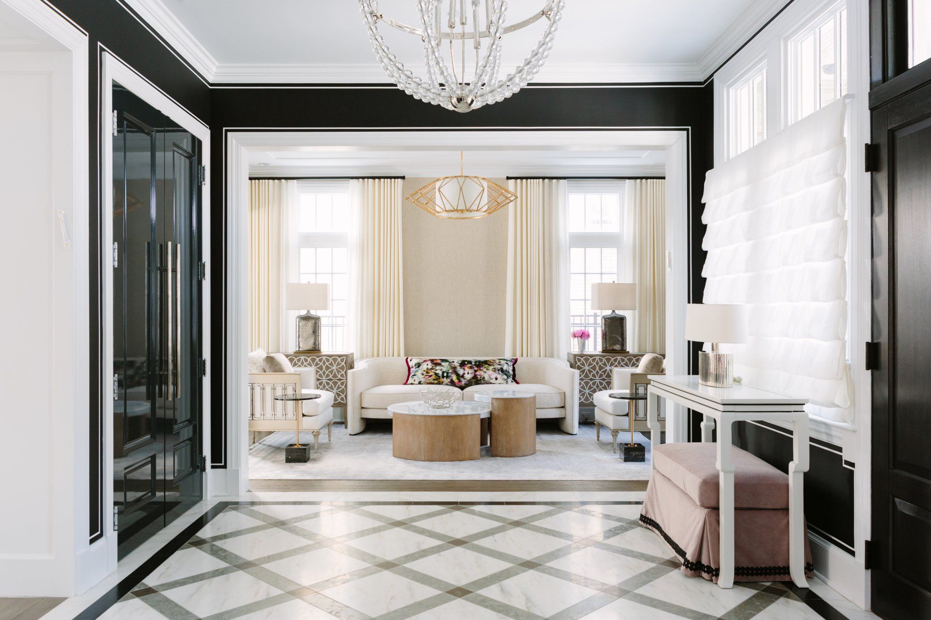
Taupe and a Touch of Green Blend Effortlessly in an Entryway
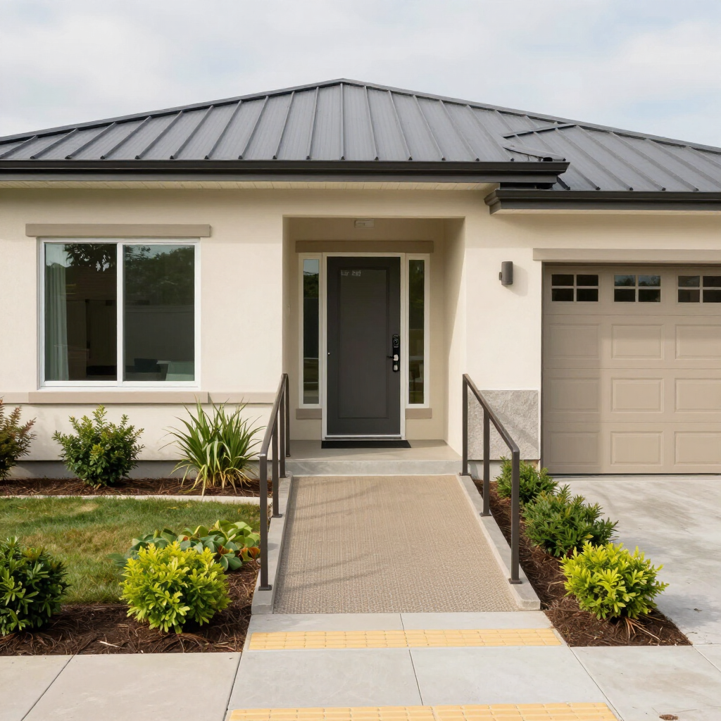
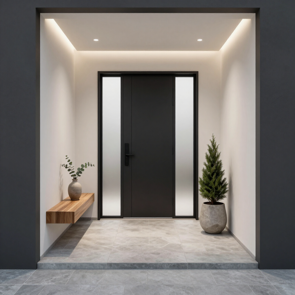
Entryways and hallways serve as the ultimate low-stakes testing grounds for new color ideas. Little Greene’s Marle, an elegant and dynamic taupe, provides a good base for such transitional areas.
When paired with a vibrant garden-green accent, taupe transforms into a rich, sophisticated backdrop. Even a small pop of green against a taupe wall creates an inviting, memorable first impression as soon as you step through the front door.
To ensure the combination feels intentional rather than overwhelming,
apply the 60-30-10 design rule. Let taupe serve as your dominant 60% base color on the walls, balance it with 30% secondary neutral tones on woodwork or flooring and reserve the deep garden green for your 10% accent line.
It All Starts with One Small Change
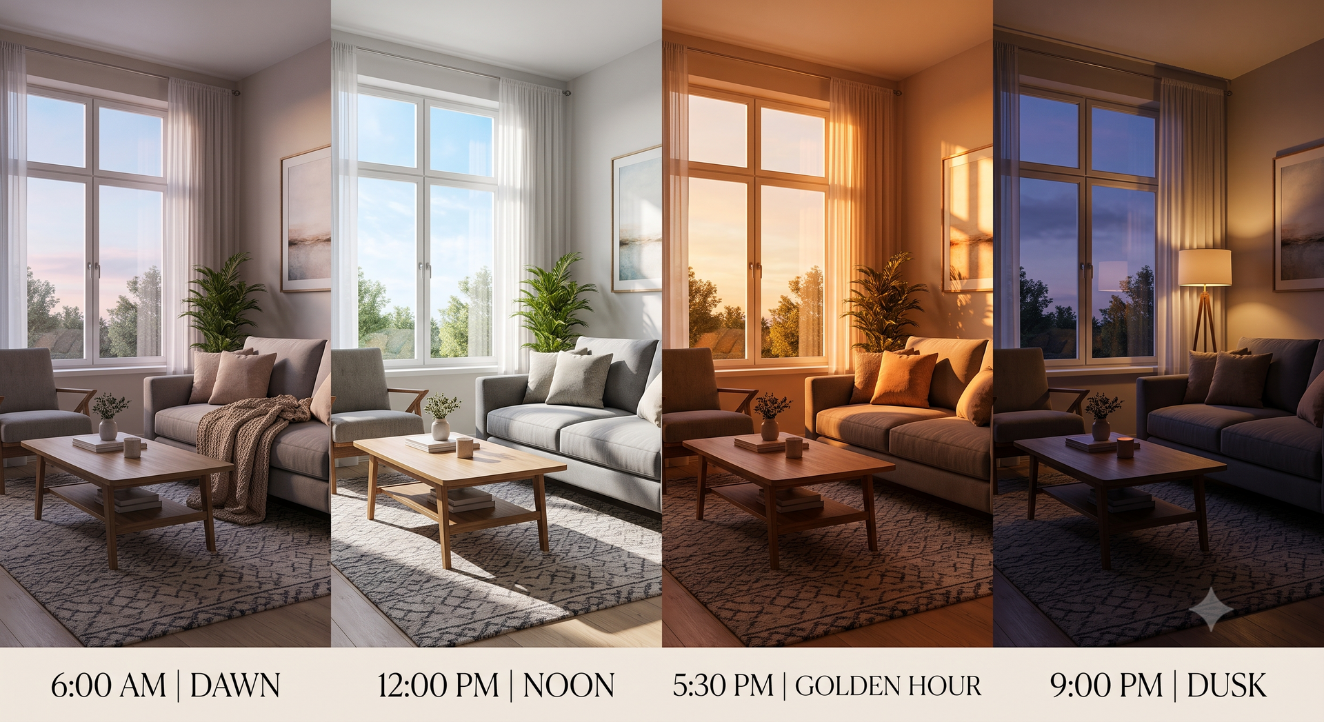
These 2027 forecasts celebrate creative expression through simple, low-risk experimentation. By introducing new shades in manageable doses, you can watch how colors interact with your existing decor and lighting.
You can use peel-and-stick samples, pillow covers, planters or small decor first to test the color pairings before committing to something bolder. Watch your space transform with these small, delightful color combinations.