Red Hot Interiors: Elevate Your Dining Room Design - AMID
From Chris de Burgh’s sultry Lady in Red, UB40’s reggae Red Red Wine, and Taylor Swift’s contemporary Red album, everyone is seeing red.
And why shouldn’t they?
It’s the color of love.
It’s the color of passion.
Red is the color of life.
So why do so many people shy away from using the heart of the color wheel (so to speak)? Using red in interior designcertainly makes a bold statement. If you’re not afraid of taking risks in amount and saturation of color, the payoff can be stunning. Or, if you are more faint of heart, using this daring hue thoughtfully can add the subtle stimulation you need in an otherwise neutral room.
How To Use Red
Total saturation: traditional
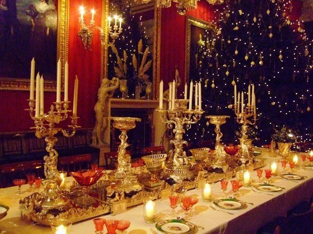
For a traditional feel, you’ll want to choose deep tones, such as burgundy or scarlet, and stay away from primary reds that scream modern. By using these rich shades, you’ll add instant drama to a dining room that makes a classically bold statement. Break up the colorby incorporating traditional, elegant accent pieces- in gold, silver, or mercury glass, for instance- as in the lavish dining room below. The oversized paintings, extravagant candelabras, and various serving pieces break up the red walls for a completely balanced atmosphere.
Total saturation: modern
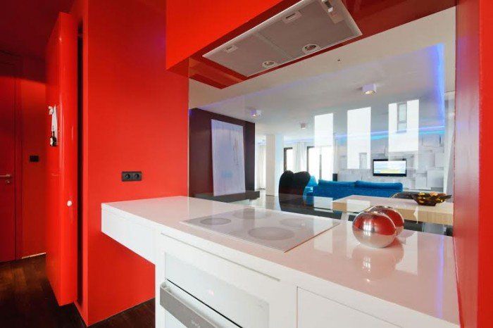
To achieve a fresh, confident, modern tone, go back to the basics with primary colors. Think back to your favorite Fire-Engine Red Crayola crayon for inspiration. You can immediately add energy to a simplistic, modern kitchen designby infusing it with red from head to toe- appliances included! The clean juxtaposition of the sleek, white countertops stabilizes this high-energy room; when using primary red on so much wall space, aim for clean lines and a simple design for an invigorating, energetic vibe.
Careful use of accents
Not ready to commit to so much red? You can achieve the same stimulating statement by carefully choosing how and where to use the color. By subtly incorporating accents, you can draw the focus to really interesting, beautiful, and unique pieces without overdoing it.
How to use:
A pop of red accent works well in any (and possibly every) room of your house.
- Use it on your walls through artwork, a mirror, or window treatments
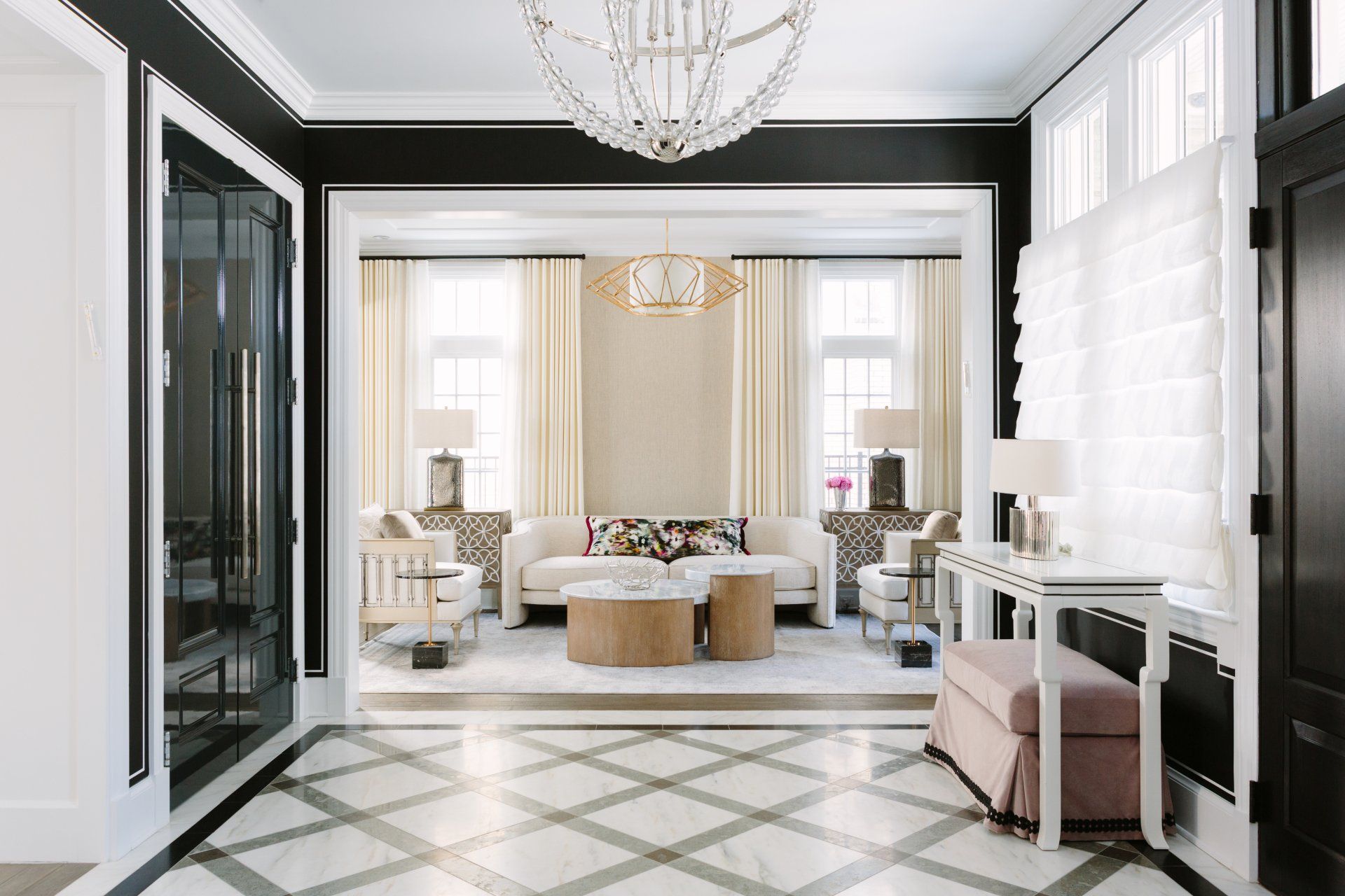
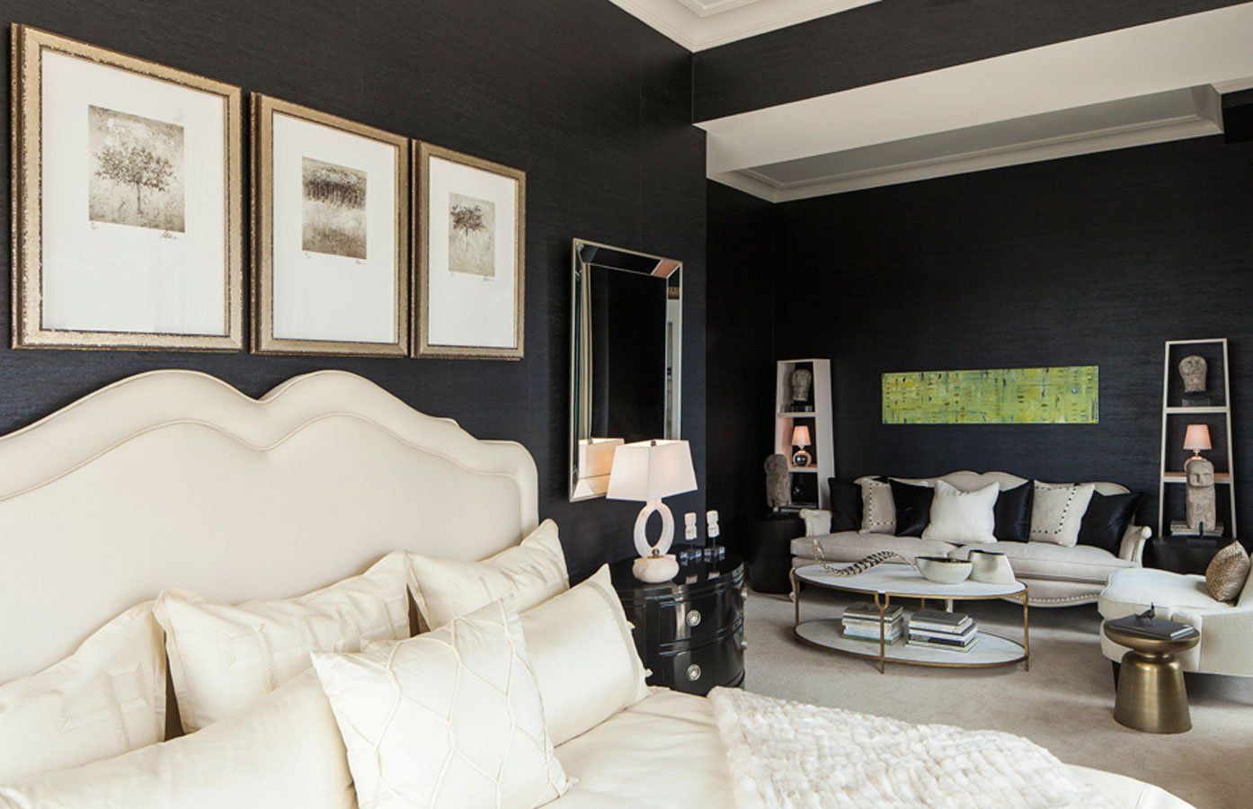
- Enliven a neutral room with a red accent rug, piece of furniture, vase, or even coffee table book. See how the cherry red upholstered seating punctuates the neutral, geometric black and white space (below).
- Choose the right shade of red and incorporate into patterned pillows or fabric on a chair. Look for softer, chalkier tones for an earthy appearance that blends in or brighter hues to make more of a statement.
- In a kitchen, bring in pops of red with a few utensils, accessories, a rusted back splash, or stools

No matter your personal style preference, whether sharp and modern, classic sophistication, or sensual and daring, the right shades of red are out there begging you to incorporate them into your home. For more inspiration, visit me on Houzz http://bit.ly/14ouPom.
What does red mean to you? How do you use red? Follow me on Facebook and post your ideas http://on.fb.me/1xFkr7o.
Go ahead. Inspire me.
Frequently Asked Questions
What kind of dining room design styles does Red Hot Interiors specialize in?
Red Hot Interiors, led by Anthony Michael, embraces a bold and passionate approach to design. We can create stunning dining rooms that range from classic elegance with rich tones and luxurious accents to modern and invigorating spaces with pops of color and clean lines.
Can you help me choose the right furniture for my dining room?
Absolutely! Our expertise goes beyond just aesthetics. We consider factors like functionality, traffic flow, and seating capacity to ensure your dining room is not only beautiful but also comfortable and practical for everyday use or entertaining.
What are some tips for using red in my dining room design?
Red is a powerful color that can add drama and personality to your dining room. Red Hot Interiors can help you incorporate red thoughtfully, whether through statement accent walls, vibrant artwork, or carefully chosen furniture pieces. We'll ensure the red complements the overall design and creates a balanced and inviting atmosphere.
How long does a typical dining room design project take?
The timeframe for your project depends on the complexity of your vision and the availability of materials. During the initial consultation, we'll provide an estimated timeline based on your specific needs.
What is the consultation process like with Red Hot Interiors?
We believe in open communication and collaboration. Our initial consultation allows you to share your ideas and inspirations for your dining room. We'll listen attentively, assess your space, and offer design solutions that fit your taste and budget. We want you to feel confident and excited about the transformation of your dining room.