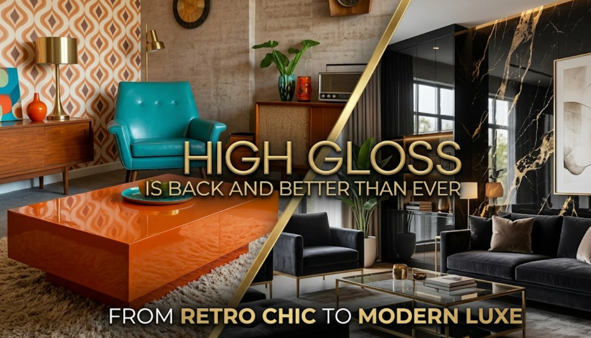
5 Color Palettes Based on the 2026 Colors of the Year
Updating your home’s color scheme is a great way to welcome the new year, and what better way is there to tackle this project than to take inspiration from the 2026 colors of the year? Most of these hues are earthy and sophisticated with a strong connection to nature. Grounding and restorative, they reflect a strong desire for serene sanctuaries. If you’re interested in welcoming the new year with a palette refresh, the following combinations bring out the best in these shades.
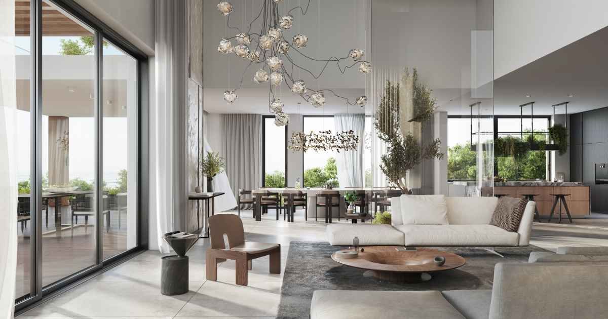
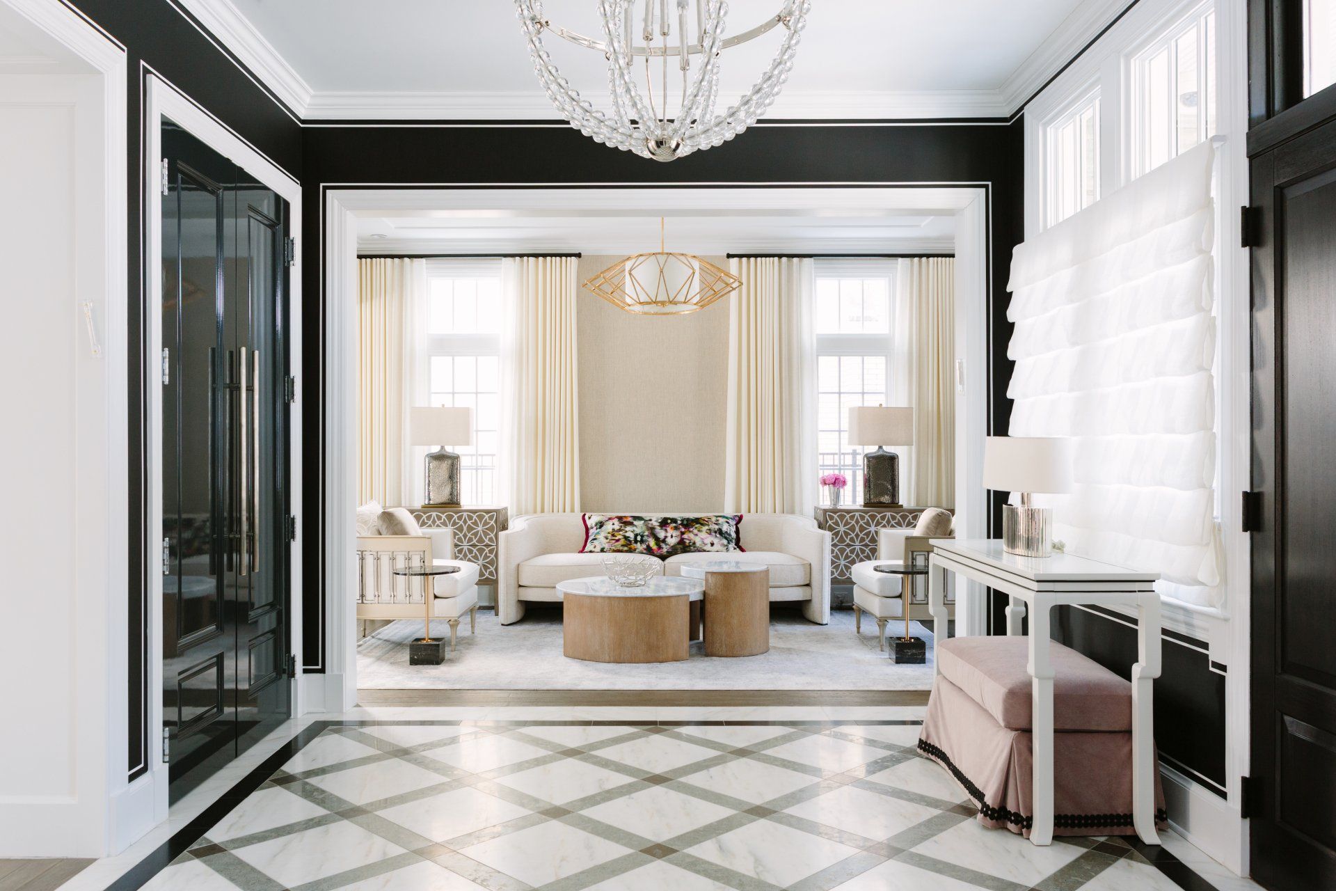
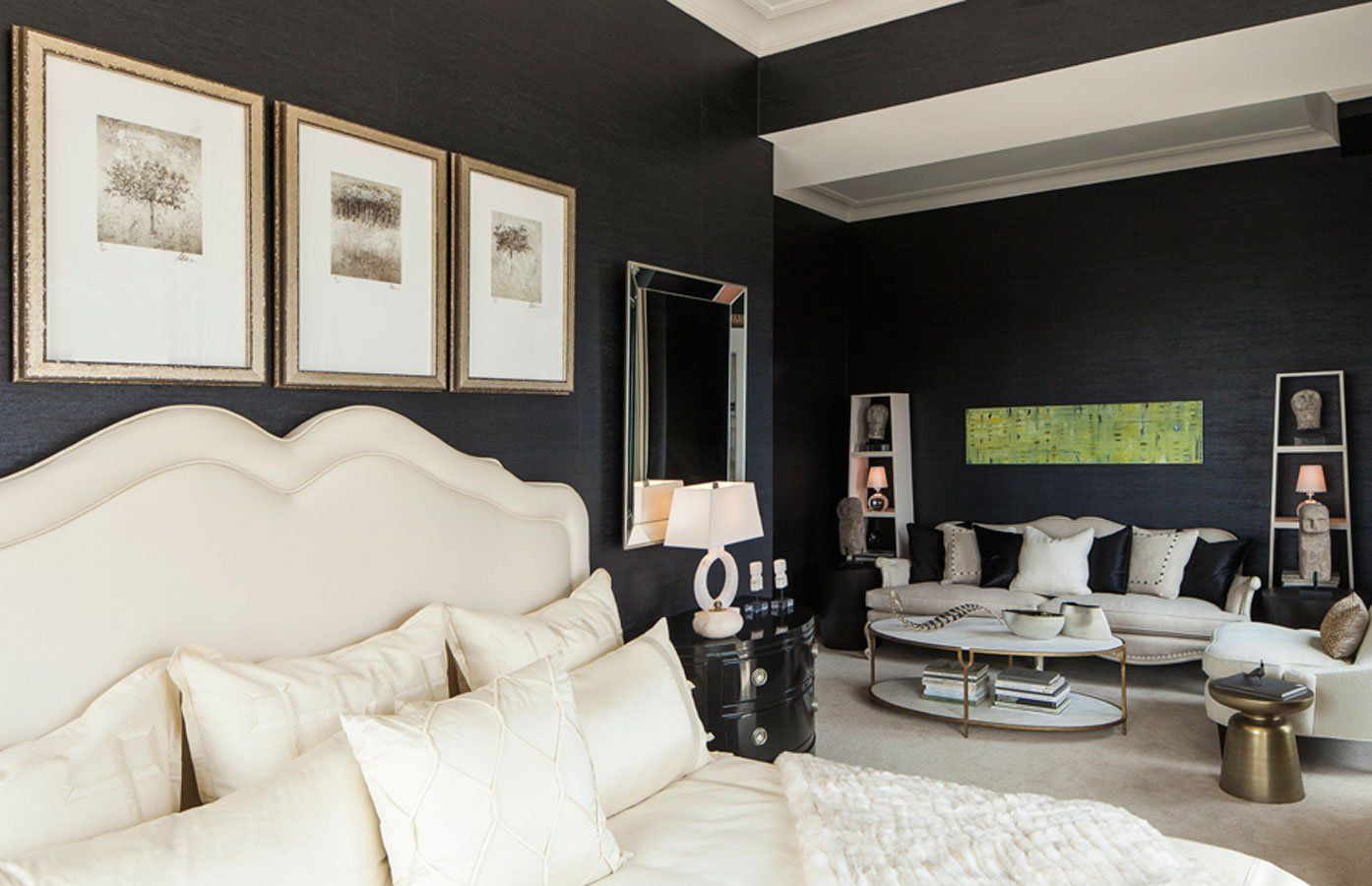
1. Benjamin Moore's Silhouette: Sophisticated and Graceful
Benjamin Moore’s 2026 color of the year is a deep, luxurious brown with a soft charcoal undertone, giving it a sense of refined elegance. Silhouette is perfect for creating an intimate, cozy and high-end atmosphere.
Consider painting this on walls for a dramatic, enveloping feel. Use creamy off-whites for trims, ceilings or a large area rug to provide contrast and keep the space from feeling too dark. Accent the pairing with soft, dusty pinks through velvet pillows, throws or artwork for a touch of warmth and romance. Complete the look with polished brass or gold hardware and dark walnut wood furniture.
2. Behr's Hidden Gem: Elegant and Modern
Hidden Gem is a smoky, jewel-toned jade with blue undertones. It’s muted enough to feel elegant and versatile without overpowering, making it ideal for modern-organic and midcentury modern aesthetics.
Use Behr’s 2026 color of the year on kitchen cabinets, a living room accent wall or a vanity in a bathroom. Complement it with light wood tones like white oak or maple for flooring and furniture to keep the room feeling bright and modern. Ground the look with sharp black accents in light fixtures, side tables and wall decor. Finally, add texture and color with rich brown leather furnishings, woven natural fiber rugs and green indoor plants.
3. Valspar's Warm Eucalyptus: Earthy and Serene
Valspar’s 2026 color of the year is a mid-tone green with a gentle warmth. With its strong connection to nature, this biophilic hue promotes a sense of peace and well-being.
Warm Eucalyptus goes well on the walls of a bedroom or bathroom. Pair it with sandy beige through linen curtains or a comfortable armchair. Lean into its earthy tones with pops of muted terracotta color in mugs, planters or patterned textiles. Complete the look with natural textures like rattan or wicker baskets, jute rugs, and unglazed pottery.
4. Sherwin-Williams' Universal Khaki: Comforting and Timeless
Universal Khaki is a mid-tone beige with warm undertones that never goes out of style. It has a “chameleon” quality, as it can feel modern or traditional, depending on what it’s paired with.
Paint Sherwin-Williams’ 2026 color of the year on the walls of a large, open-concept space to unify the area. Pair it with a classic, crisp white for trims and doors, then add dusty blues and olive greens to the palette through decor, textiles and art. Opt for materials like brushed nickel, aged brass and traditional wood furniture for a classic look.
5. Pantone's Cloud Dancer: Tranquil and Airy
Pantone’s 2026 color of the year is a soft, billowy off-white with minimal undertones, representing a desire for simplicity. While Cloud Dancer can serve as a quiet, peaceful canvas for any palette, it looks stunning in Scandinavian and coastal-inspired looks.
Paint walls with this shade to maximize light and create an open, airy feeling. Layer the palette with other light neutrals — like a soft, pale gray sofa or bedding — and accent the look with textures instead of color. Use materials like light, weathered wood, natural linen and chunky knit wool throws. Enhance the setup’s comforting atmosphere with boucle fabrics, sheer linen curtains and light-toned flooring.
How to Choose and Use the 2026 Colors in Your Home
To plan the perfect palette for your space, think of these big-picture considerations before picking up a brush or shopping for decor:
- Consider the room’s purpose: Valspar’s Warm Eucalyptus is ideal for bedrooms because it’s a soothing shade of green, while a more dramatic hue like Benjamin Moore’s Silhouette is perfect for dining rooms.
- Factor in lighting: How much light a room gets and from what direction can affect color quality, so assess your space’s lighting conditions at different times of day.
- Create energy with complementary colors: Combine shades on the opposite sides of the color chart — such as turquoise and cream — to create powerful, high contrast combinations.
- Start small when integrating color palettes: Consider low-commitment ideas, such as painting an accent wall or the back of a built-in bookshelf, getting new duvet covers, or finding area rugs and artwork that feature the palette.
Refresh Your Home’s Palette for 2026
These color trends and palettes are a great source of inspiration. There are no hard rules for how to use them, so feel free to create your own combinations or find what blends well with your current scheme. Find the perfect palette to express your style for the year ahead.