7 Dramatic Ways to Use Pops of Color for Visual Interest

Though a neutral color palette is timeless, classy and chic, the whites, grays and browns may make a space feel a little flat. Revitalize your home by adding the secret to a lively, interesting and creative design — a pop of color. Discover the best places to add just a touch of color to your home, keeping it looking and feeling fresh without going overboard.
Why a Pop of Color Is a Designer’s Secret Weapon
Home designers use color deliberately to reflect a home’s character, make it comfortable for the homeowners and inspire visual interest to draw attention to a focal point. Working with neutrals, the pop of color adds personality without overwhelming the space, creating just the right amount of visual appeal to add an intentional, unique flair.
Color has a profound effect on people’s psyche, and designers can use this to curate the perfect vibe for every part of your home. For example, warm colors like
red can elicit positive emotions and even higher energy in the context of a warm and inviting space. Softer tones can create a soothing response for a more relaxed area. Balanced with neutrals, a pop of color can create an atmosphere perfect for every part of your home.
7 Areas to Add Color, Inside and Out
Whether you’re painting one room or renovating your entire home, these seven ideas for adding a pop of color can refresh and energize your space.
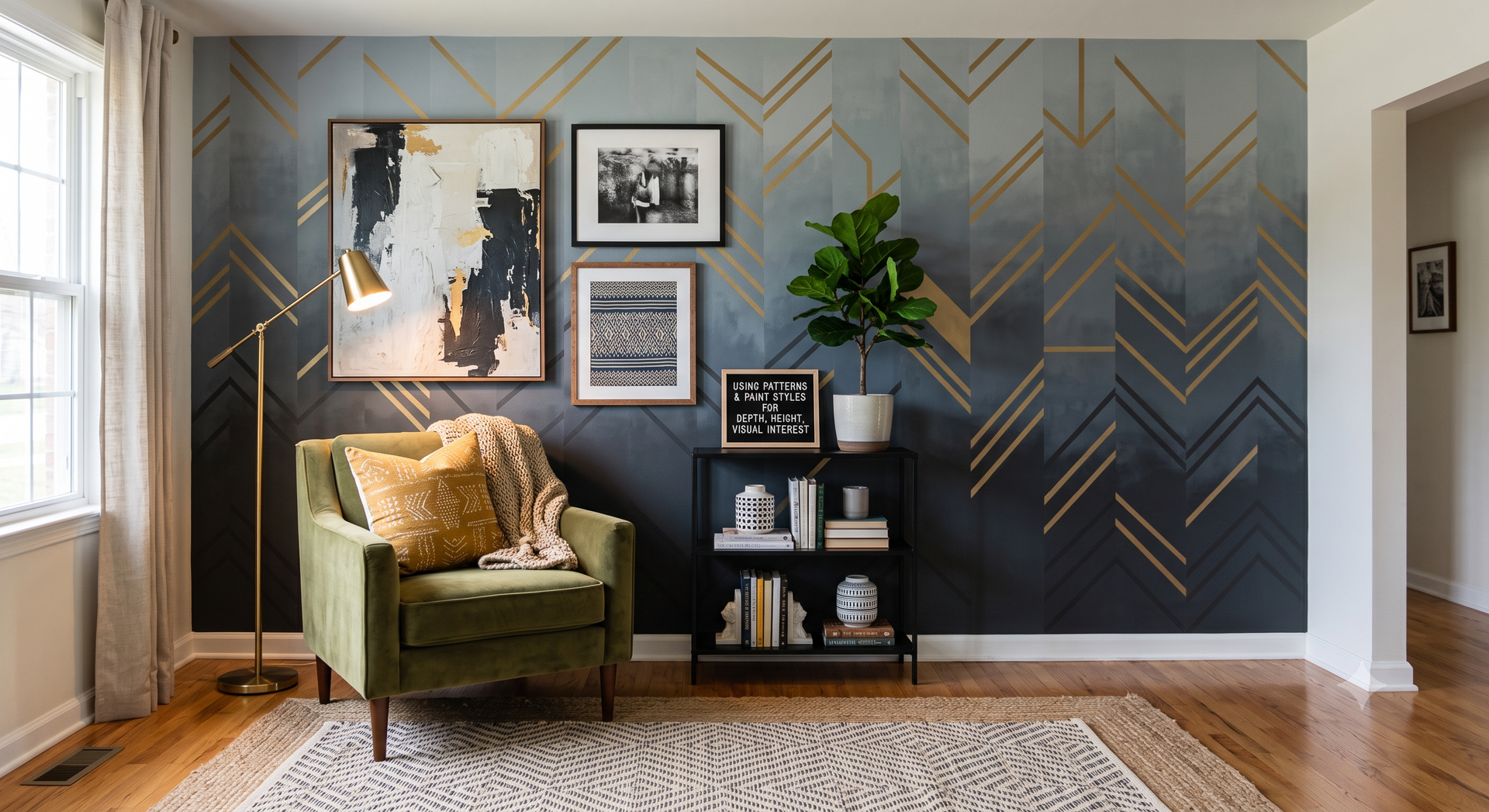
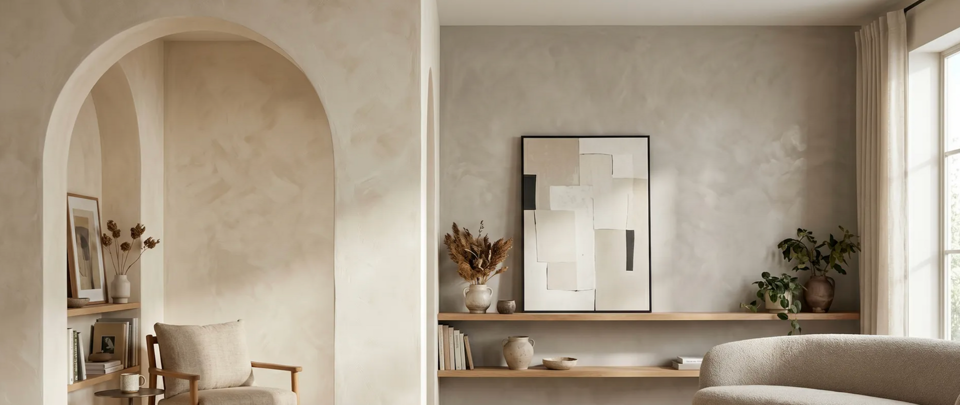
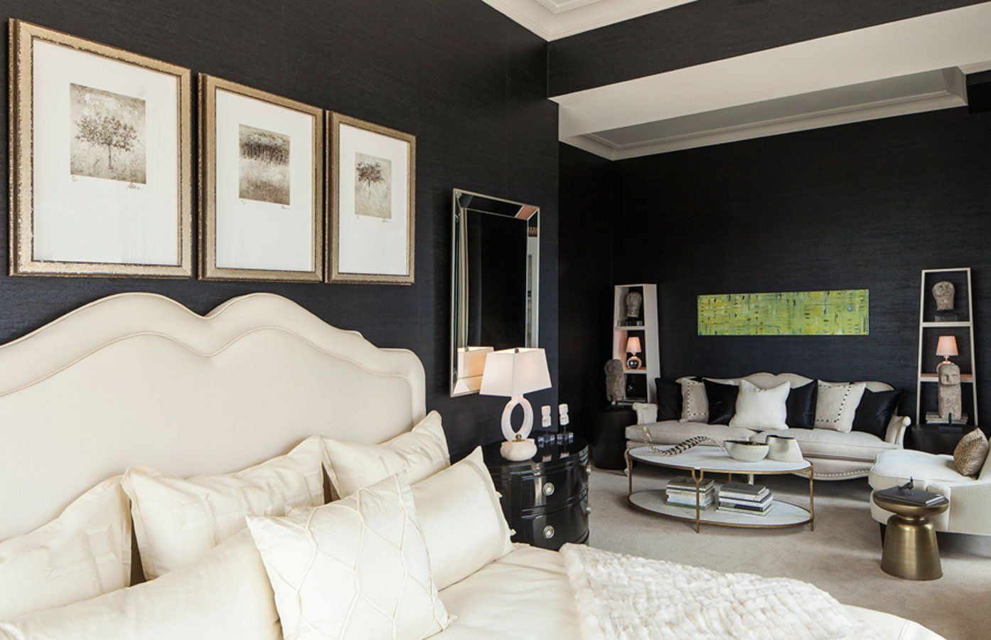
- Add an Unexpected Accent Wall
Accent walls are a simple and strong way to add color in just about any room. By painting or adding a unique color to one of the four walls — or to the ceiling or floor, the “fifth” and “sixth” walls, respectively — you immediately draw visual interest to a unique area of the room. This wall can then feature display pieces that your eye naturally gravitates toward.
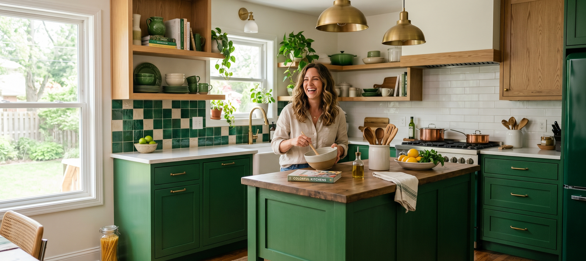
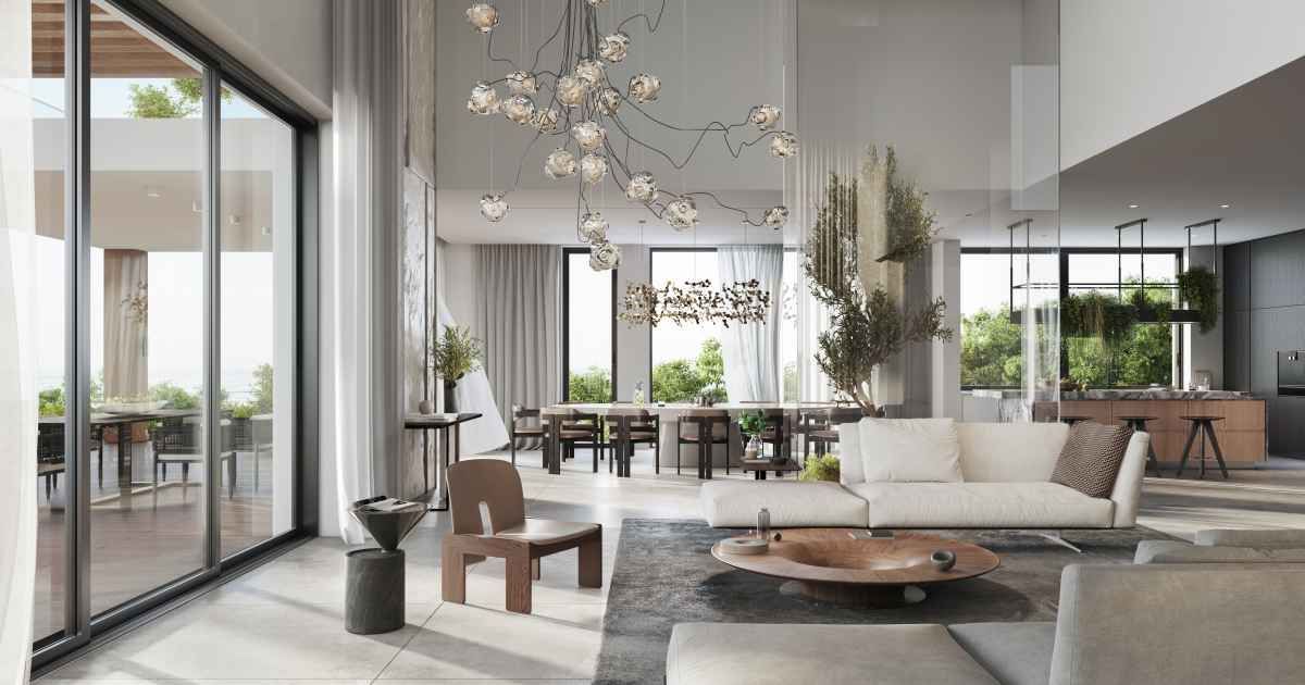
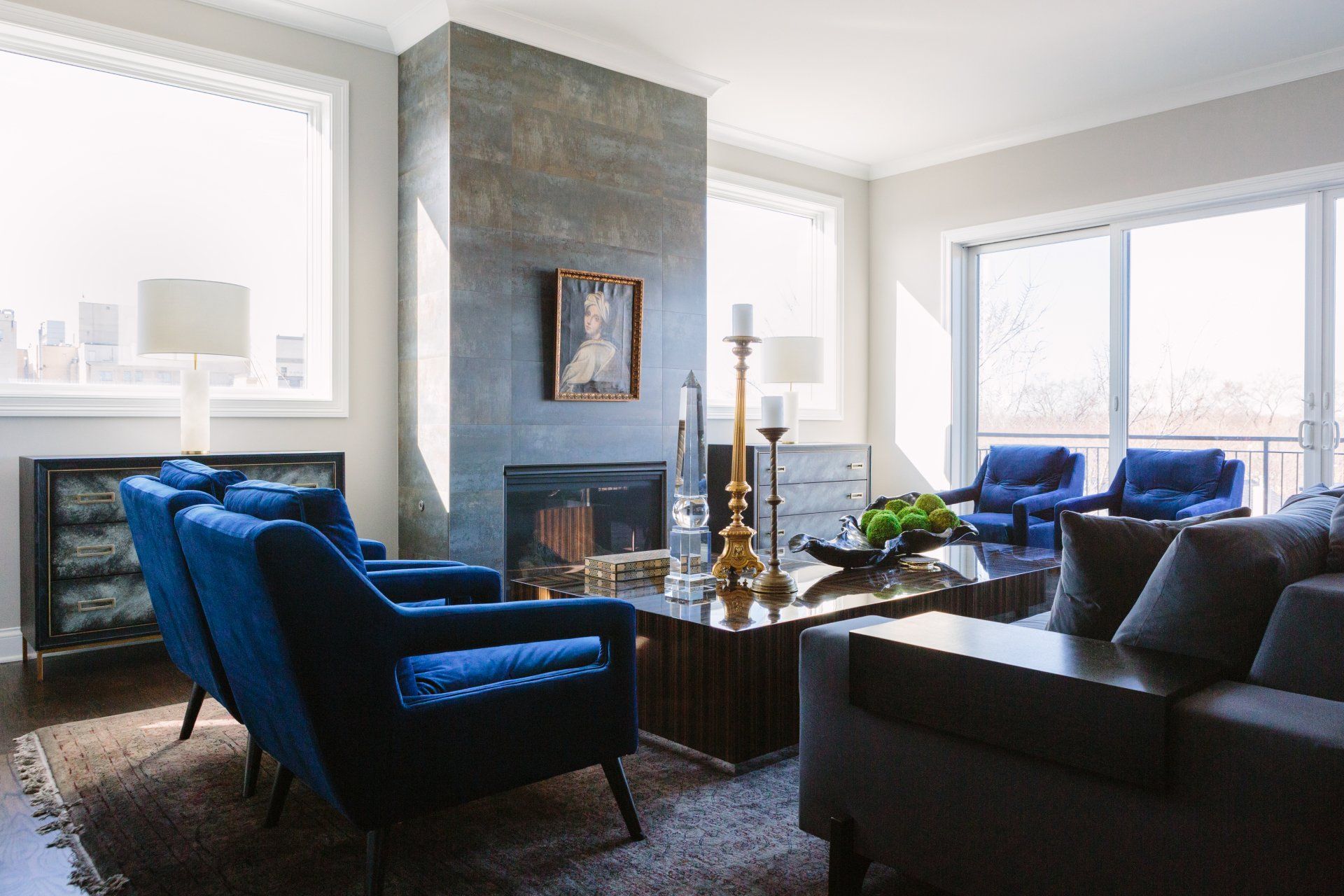
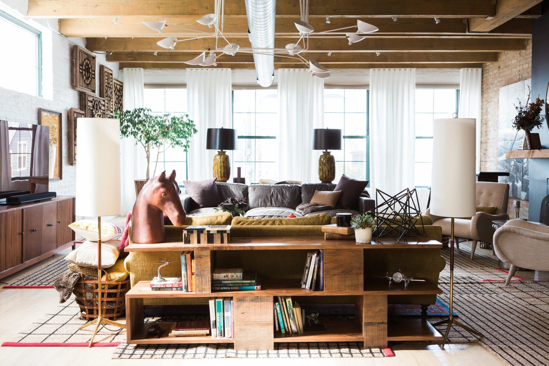
- Feature Bold Furniture or Statement Pieces
If the rest of the room features a cohesive, neutral palette, adding one piece of furniture or a statement art piece can become the visual draw. Think a contrasting colored couch, an orange chair in a blue room or a gold chandelier glistening against darker hues. The piece draws the room's focus while anchoring the color scheme around it.
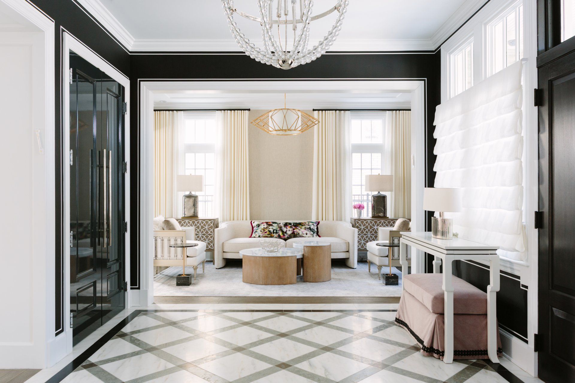
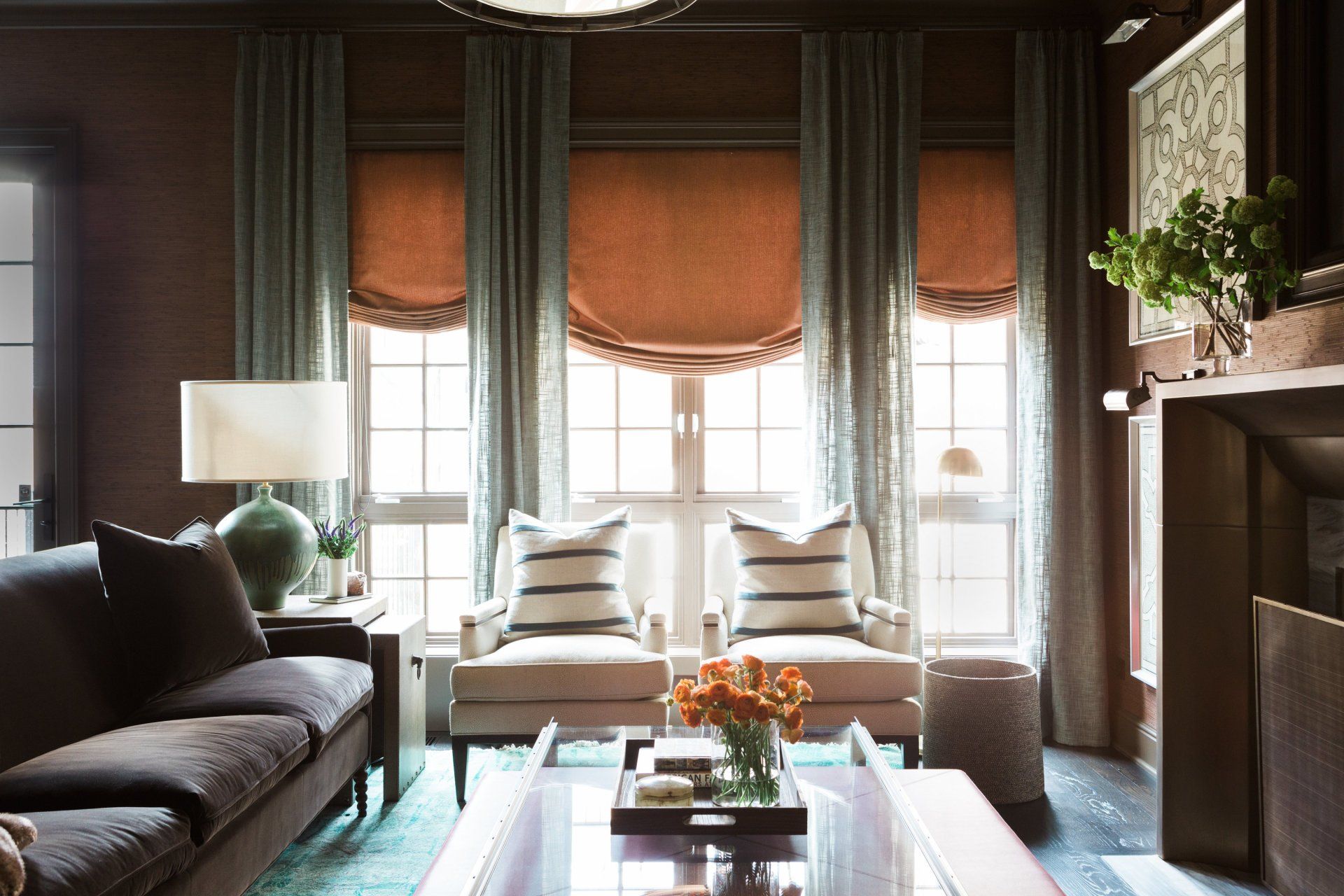
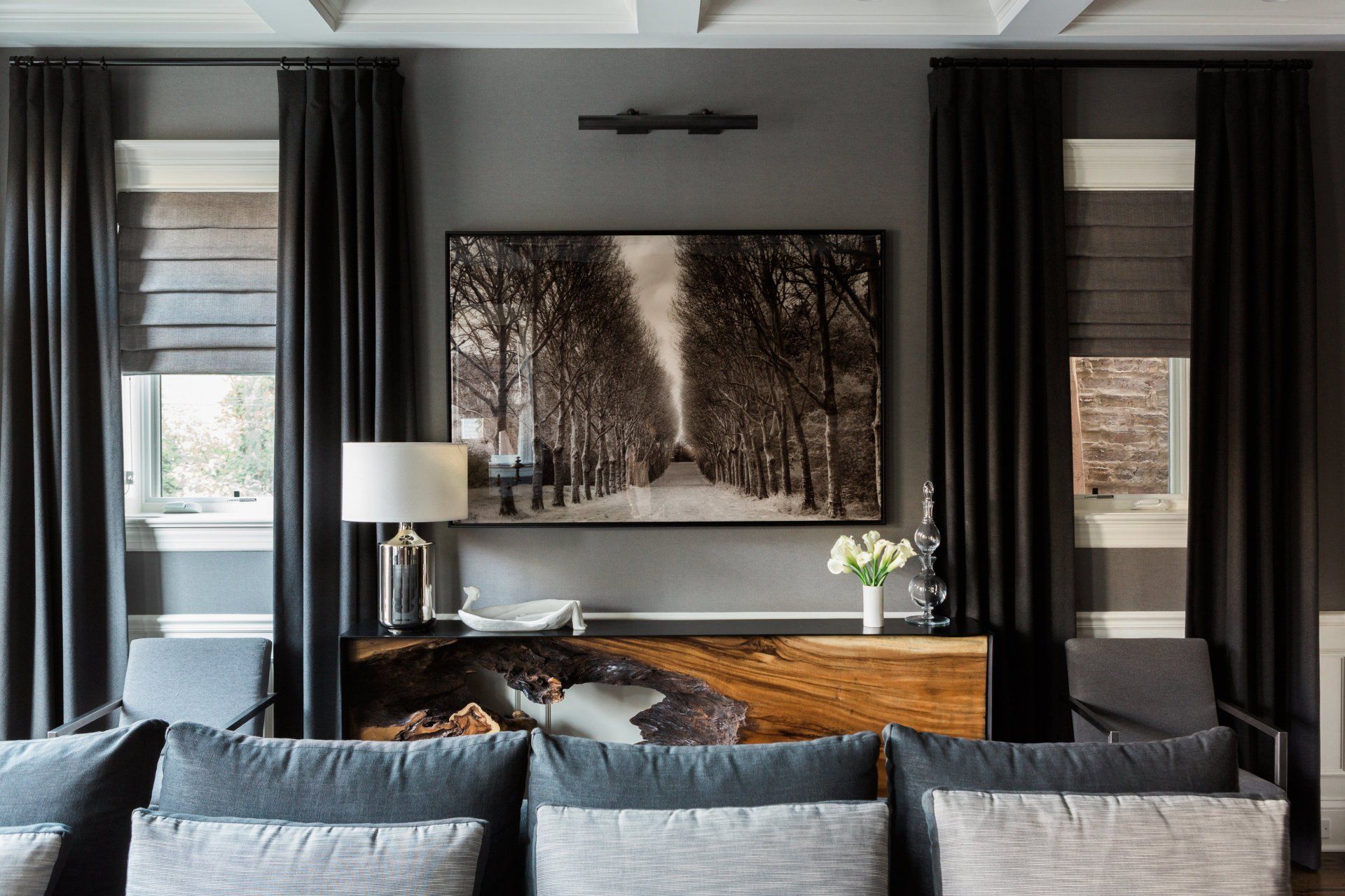
- Drape Colorful Blankets, Pillows and Curtains
Adding textiles for color is a simple and easily adjustable enhancement. Throw pillows, blankets, curtains and rugs are impermanent features of a room and can be swapped out as needed if a different color trend or vibe catches your eye. Pick striking, uniform shades like saturated jewel tones or add interesting patterns.
- Upgrade Unassuming Fixtures
Fixtures in your home that often go unnoticed can be an unexpected way to add creative flair and interest. Paint your light switch covers, or upgrade your door handles to striking metals or even crystal. Add patterns to baseboards or swap out your vent covers for a simple but noticeable upgrade.
- Highlight Your Front Doors and Shutters
Colorful front doors and shutters can transform a house into a home from the exterior. Pinks and pastels add a sweet, cozy cottage feeling, while bright, vibrant hues can feel modern and artistic. Coordinated shutters frame the home beautifully, and a colorful front door stands out as an inviting, personalized touch.
- Customize Your Gutters
Every home has gutters, but these can be more than just a necessary fixture. Painting them is a cost-effective way to revamp your exterior and even offer corrosion and weather protection, keeping your house looking fresh longer. This simple change can add more visual appeal to your home that increases your curb appeal.
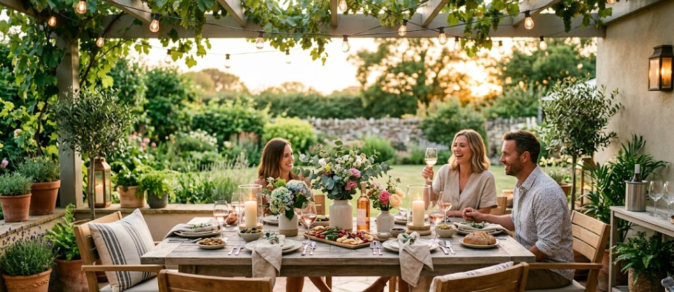
- Liven Outdoor Spaces
You can add plants to patios, decks or balconies to refresh the outside of your home with pops of green and vibrant, colorful flowers. In greener spaces like gardens, contrast the natural hues with red planters, yellow umbrellas or purple deck chairs.
How to Balance Color With Neutrals
Adding a touch of color to a space requires balancing it with neutrals so the pop is effective. Many designers follow the 60-30-10 rule, in which a space uses 60% for a main color, 30% for a similar secondary hue for variety, and 10% for a colorful accent. This rule keeps a space balanced, following a “golden ratio” for tried and true harmony.
Neutral shades serve as necessary visual breaks, allowing the pops of color to stand out. Homeowners should choose a whole-home palette, with consistent neutrals as a base to ensure cohesive flow from room to room. The accents will stand out even more, drawing attention and interest to your focal points intentionally.
Hue Got This
Refreshing your house can be as simple as a one-wall paint job or adding new throw pillows, or as impactful as repainting exterior elements for a whole-home colorful reset. Balanced with neutrals, adding a pop of color can revitalize your space with personality and a creative touch.